Together we will create digital materials for your business: branding, brandbooks, guidelines, landing pages, illustrations, etc.
Careative
sustainability
sustainability
Вернуться


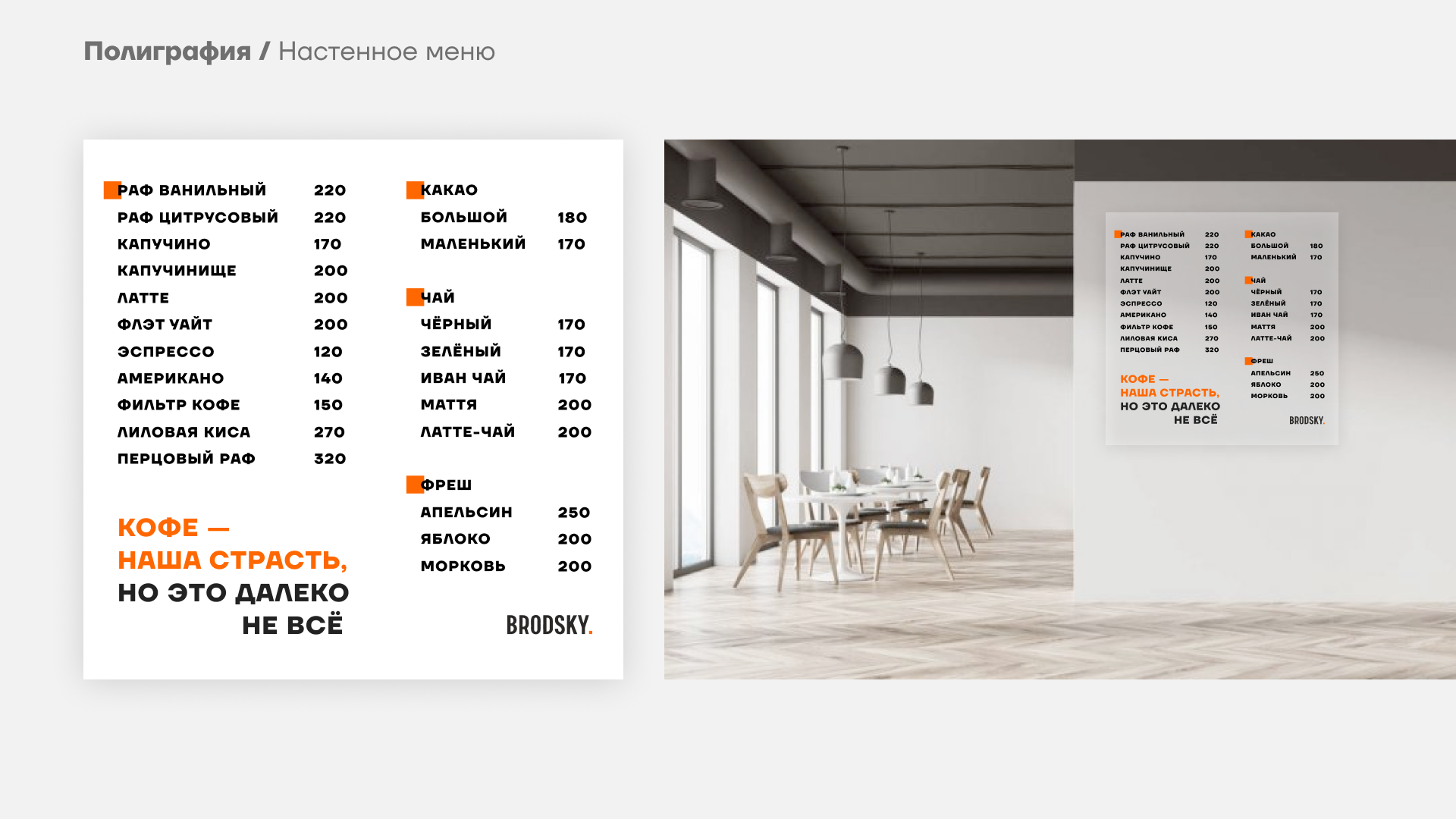
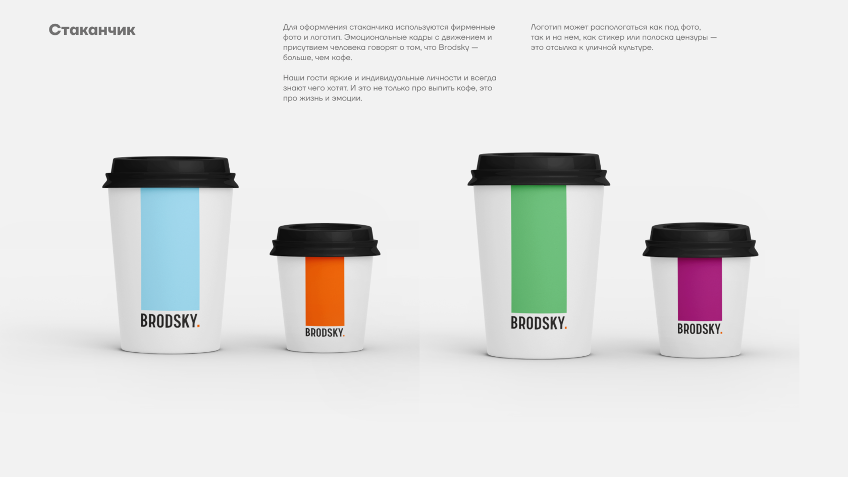
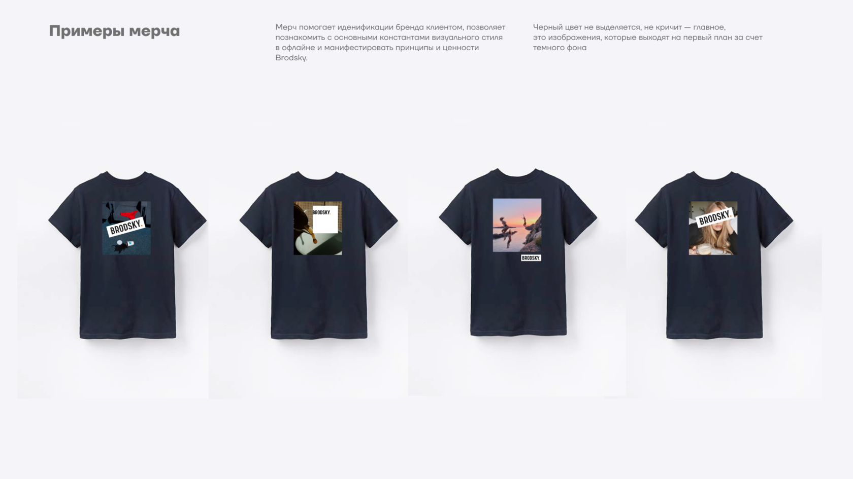
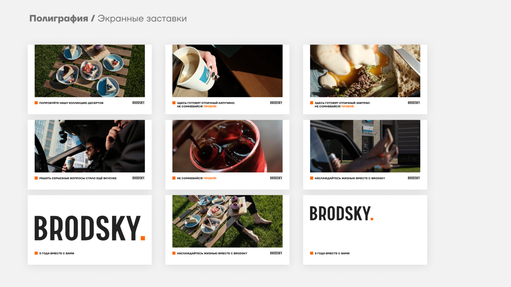
Brodsky · Coffee Shop
р.
р.
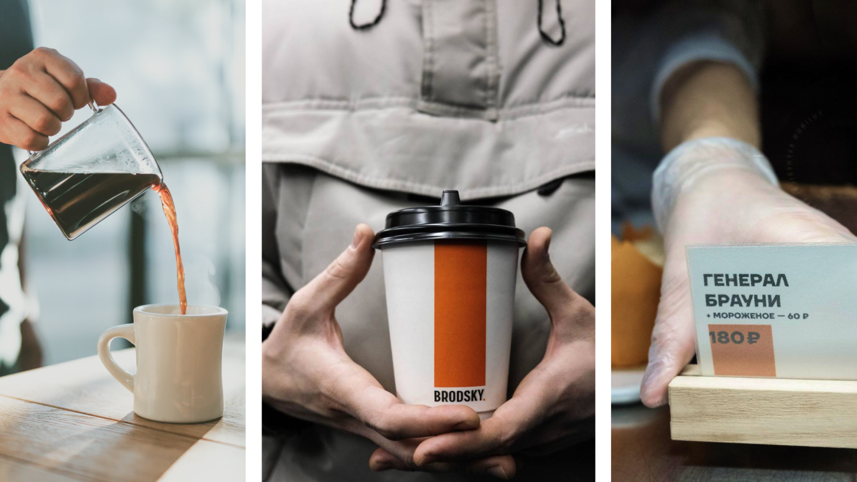
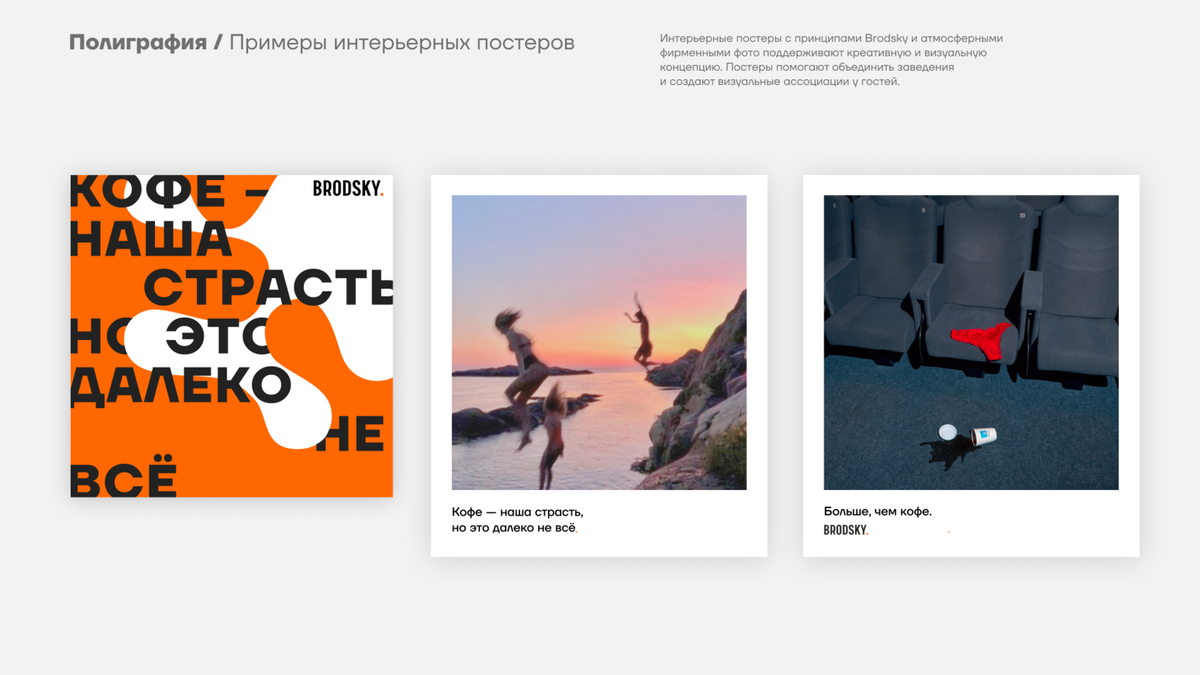
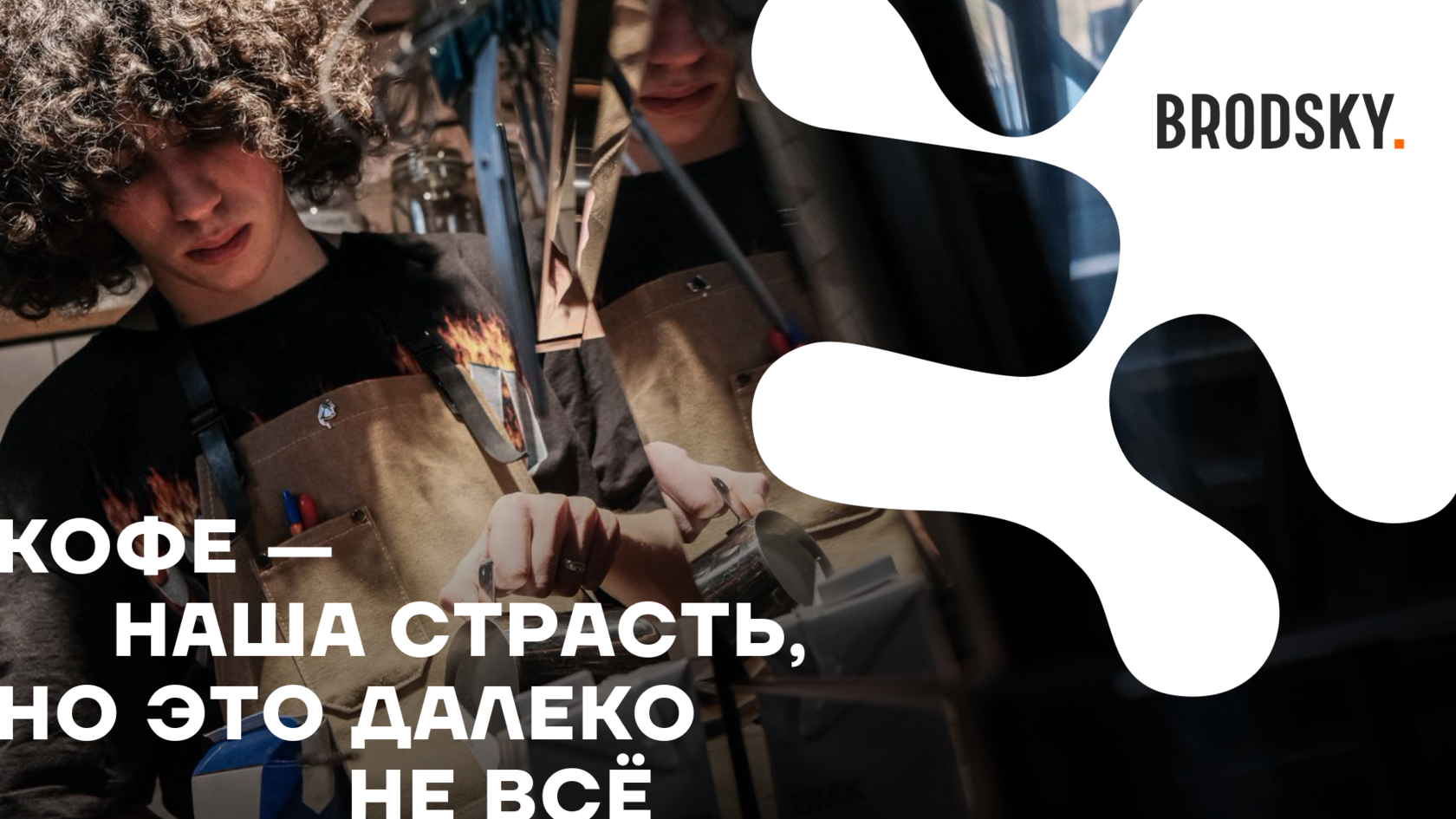
BRODSKY COFFE is a coffee shop chain created by people who are passionately in love with coffee. Here, every barista is more than just a staff member — they are a carrier of the brand’s core idea. The main goal of the brand is to talk about coffee boldly, confidently, and honestly.
The visual identity reflects this character: bold, sharp, intellectual, and expressive — it immediately stands out among generic and impersonal coffee brands.
Target audience
Competitive analysis
We researched both local and international specialty coffee brands, such as: Double B, Skuratov, Right Coffee, Surf Coffee, Stars Coffee, and others.
Most competitors either rely on sterile minimalism (Scandinavian aesthetics) or noisy, youth-oriented expressiveness. BRODSKY offers a third way: a visual language with literary depth, graphic strength, and emotional sincerity.
Where others say "good coffee", BRODSKY declares: "COFFEE IS OUR PASSION. BUT THAT’S FAR FROM EVERYTHING."
Key tasks:
Concept: Coffee as passion. Identity as a statement.
The brand was conceived as a visually loud and concept-driven statement. Every design decision aims to convey passion, honesty, and character.
Core visual principles:
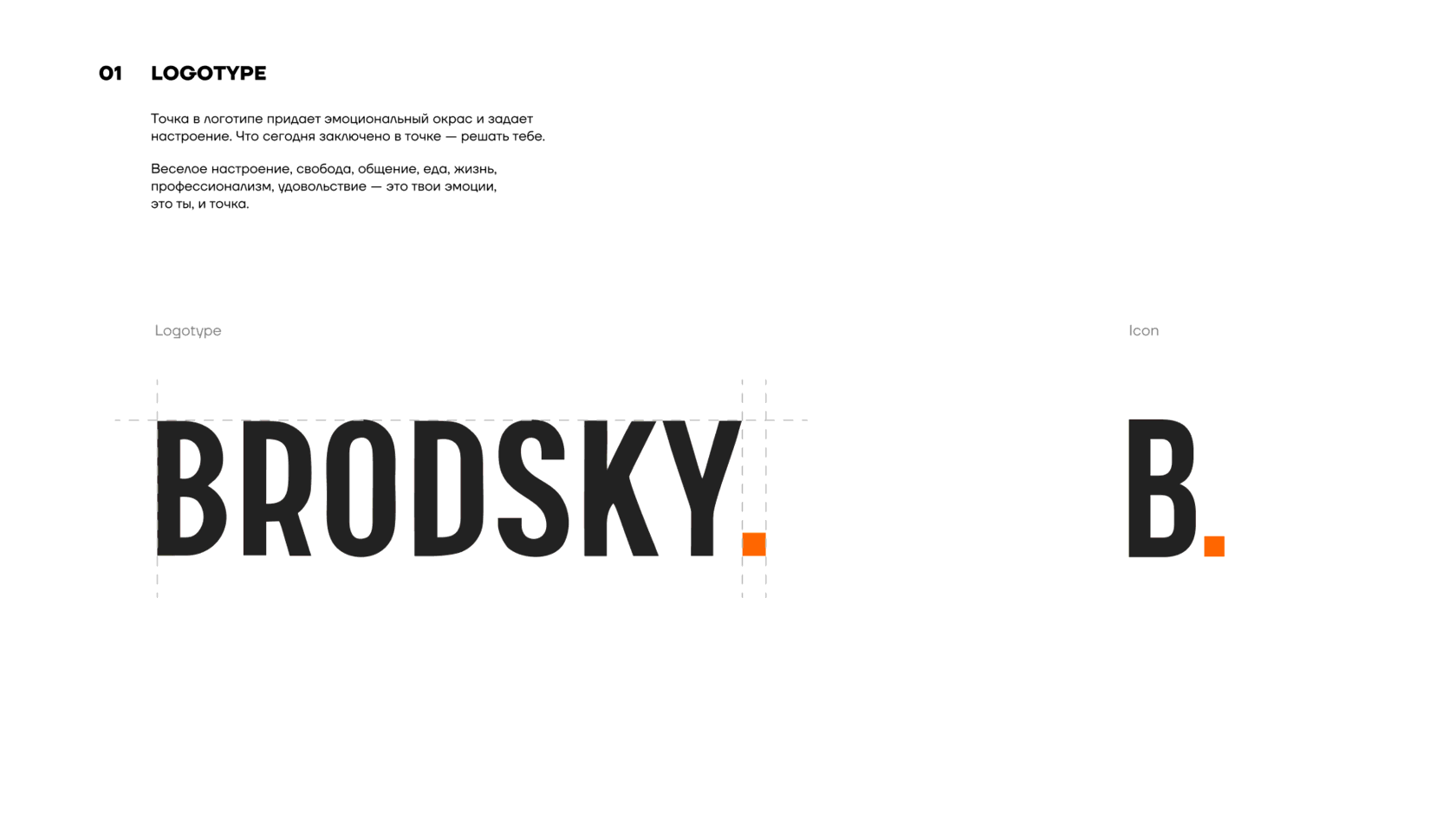
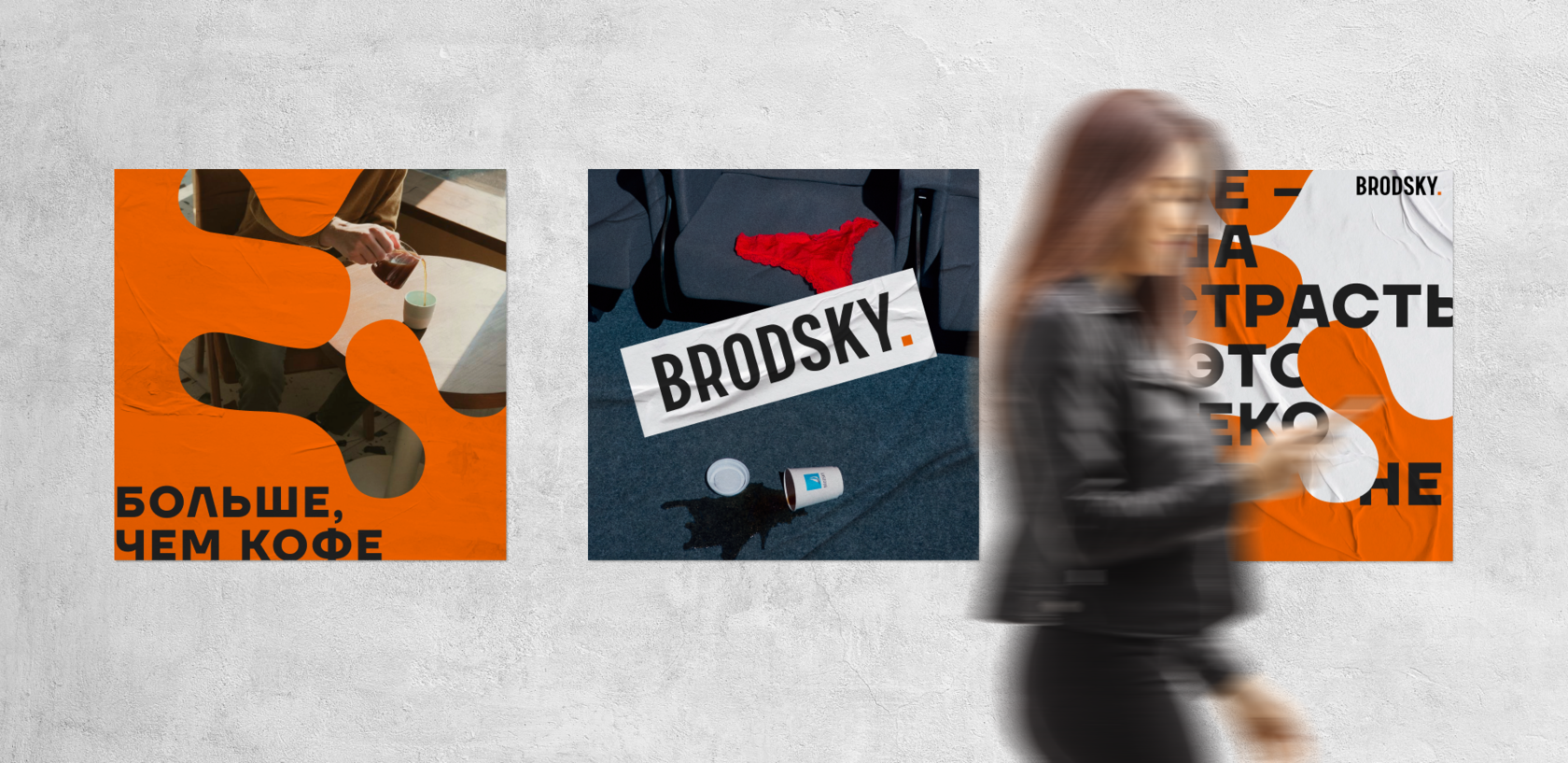
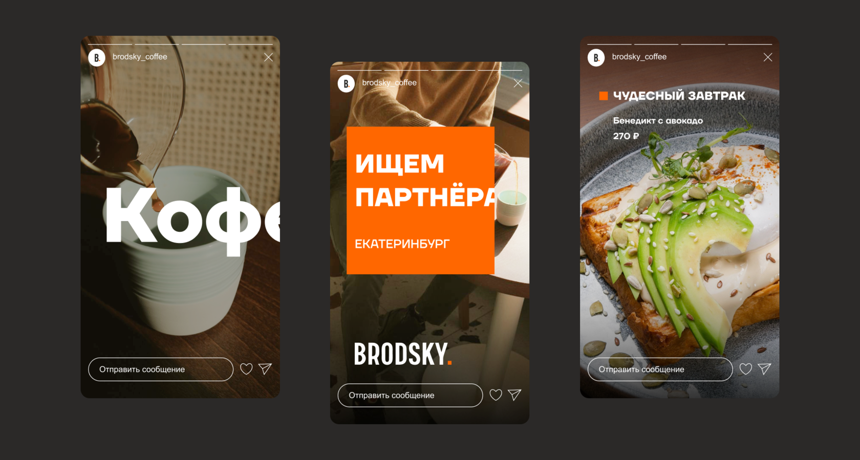
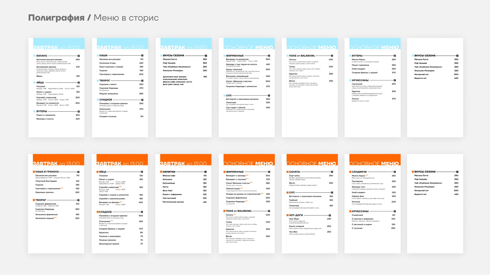
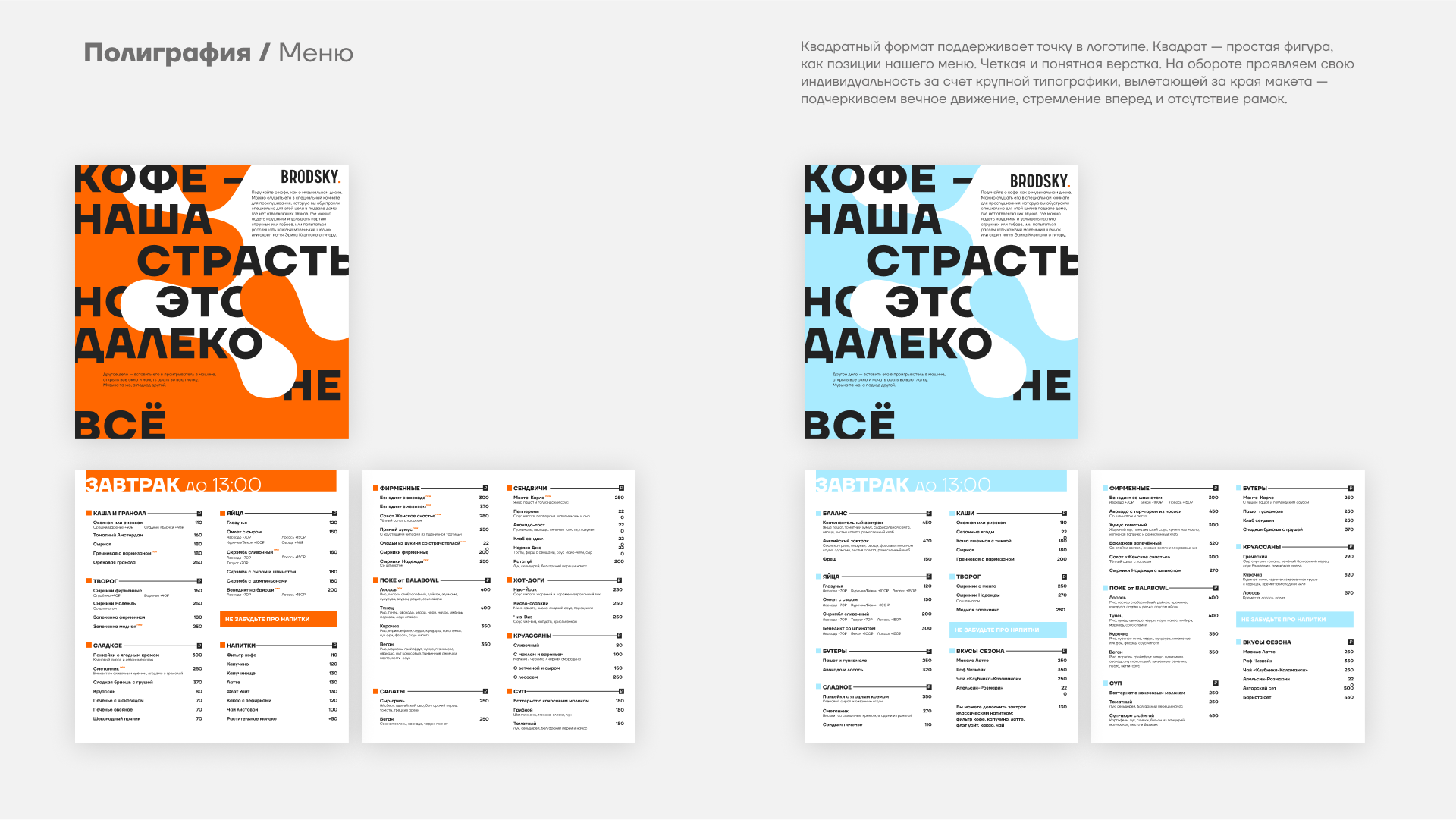
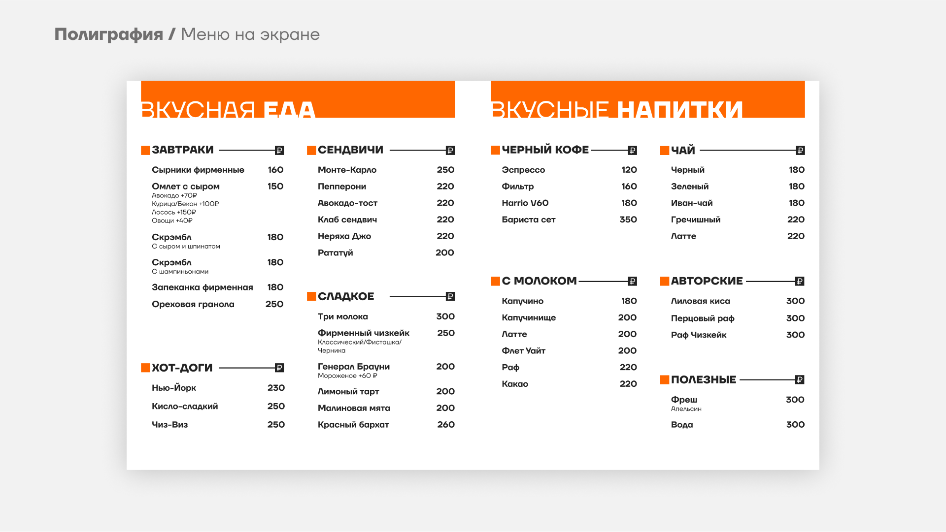
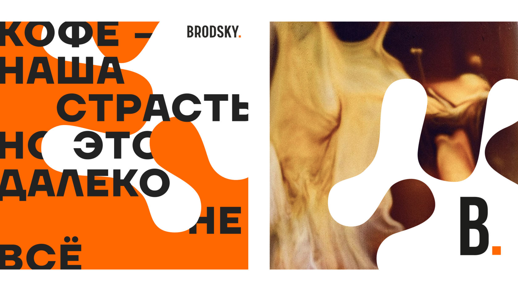
Typography as a voice. Large, sharp fonts with broken lines and expressive layout. These aren’t decorative — they speak, shout, and proclaim.
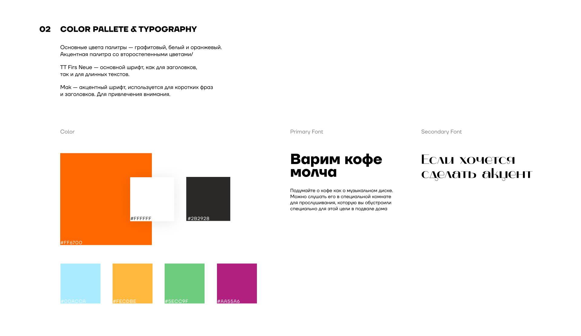
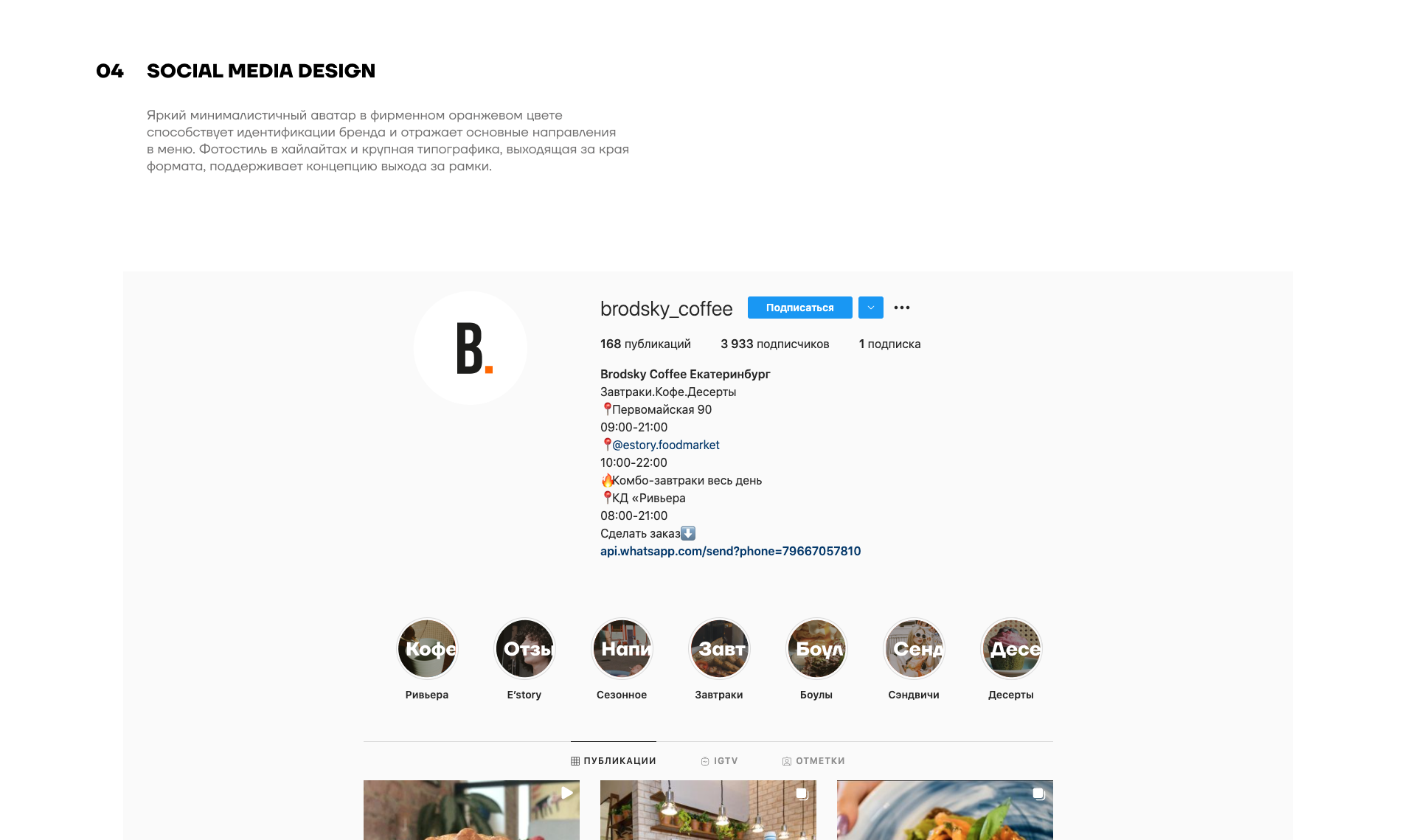
Color palettе. Black and white as the base — clarity, honesty, foundation.
A bright orange accent symbolizes energy, caffeine, impulse, warmth, and boldness.
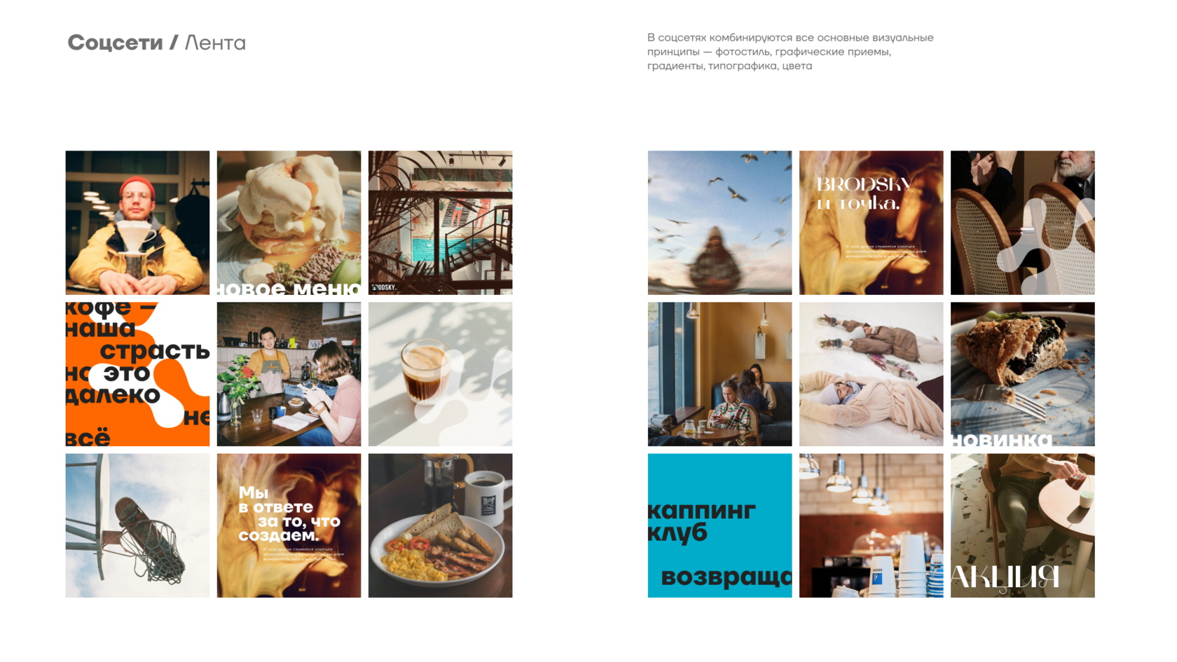
Organic shapes and patterns. Inspired by coffee spills, drops, milk swirls — these elements live on the brand’s surfaces, disrupting layouts and adding organic rhythm.
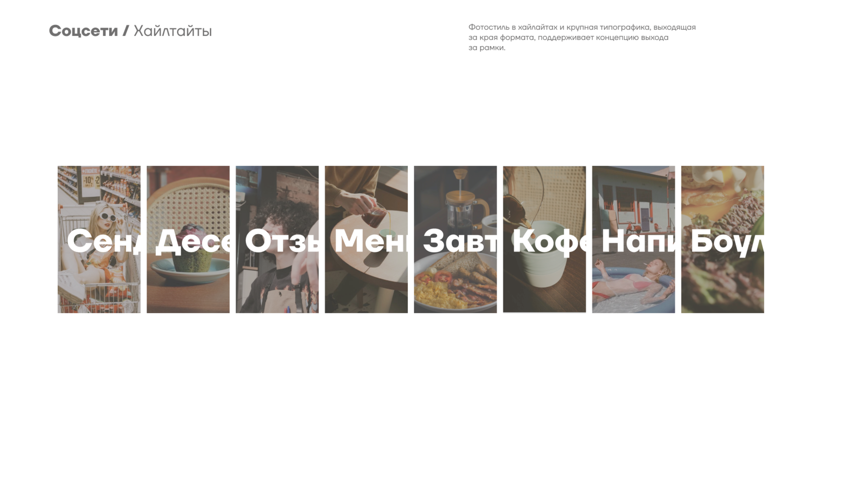
Photography of staff and preparation process. Honest, tactile, and real — focused on hands, the brewing ritual, and human emotion. It’s not glossy fast food; it’s honest coffee, made by hand.
Verbal tone. Short. Sharp. To the point. Period. All phrases sound like quotes. The slogan — like a poetic aphorism.
Result
The developed identity system:
My role
The visual identity reflects this character: bold, sharp, intellectual, and expressive — it immediately stands out among generic and impersonal coffee brands.
Target audience
- Young professionals and the creative class, aged 25−40
- Specialty coffee lovers who understand beans, brewing methods, and coffee culture
- People who value design, typography, meaning, and personality
- An audience that seeks authentic experiences, not just "coffee machines with vibes"
Competitive analysis
We researched both local and international specialty coffee brands, such as: Double B, Skuratov, Right Coffee, Surf Coffee, Stars Coffee, and others.
Most competitors either rely on sterile minimalism (Scandinavian aesthetics) or noisy, youth-oriented expressiveness. BRODSKY offers a third way: a visual language with literary depth, graphic strength, and emotional sincerity.
Where others say "good coffee", BRODSKY declares: "COFFEE IS OUR PASSION. BUT THAT’S FAR FROM EVERYTHING."
Key tasks:
- Logo and identity system development
- Typography concept creation
- Color palette and graphic element selection
- Packaging, merchandise, and branded collateral design
- Brand visualization in space and digital
- Verbal identity and slogan development
Concept: Coffee as passion. Identity as a statement.
The brand was conceived as a visually loud and concept-driven statement. Every design decision aims to convey passion, honesty, and character.
Core visual principles:
Typography as a voice. Large, sharp fonts with broken lines and expressive layout. These aren’t decorative — they speak, shout, and proclaim.
Color palettе. Black and white as the base — clarity, honesty, foundation.
A bright orange accent symbolizes energy, caffeine, impulse, warmth, and boldness.
Organic shapes and patterns. Inspired by coffee spills, drops, milk swirls — these elements live on the brand’s surfaces, disrupting layouts and adding organic rhythm.
Photography of staff and preparation process. Honest, tactile, and real — focused on hands, the brewing ritual, and human emotion. It’s not glossy fast food; it’s honest coffee, made by hand.
Verbal tone. Short. Sharp. To the point. Period. All phrases sound like quotes. The slogan — like a poetic aphorism.
Result
The developed identity system:
- Makes BRODSKY stand out from competitors
- Resonates emotionally and visually with the target audience
- Scales easily across packaging, digital platforms, and interior design
- Builds a strong, recognizable, and honest brand
My role
- Art direction
- Visual concept development
- Identity and design system
- Copywriting: slogans, brand messages
- Leading designers and contractors
- Presentation and brand guidelines


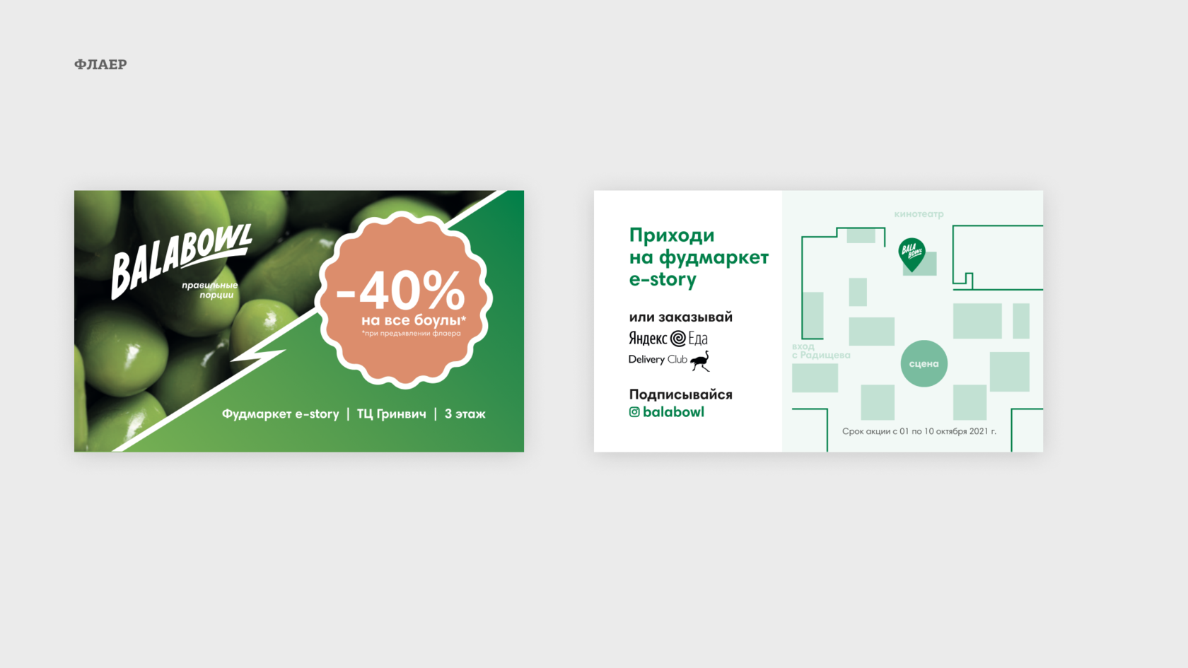
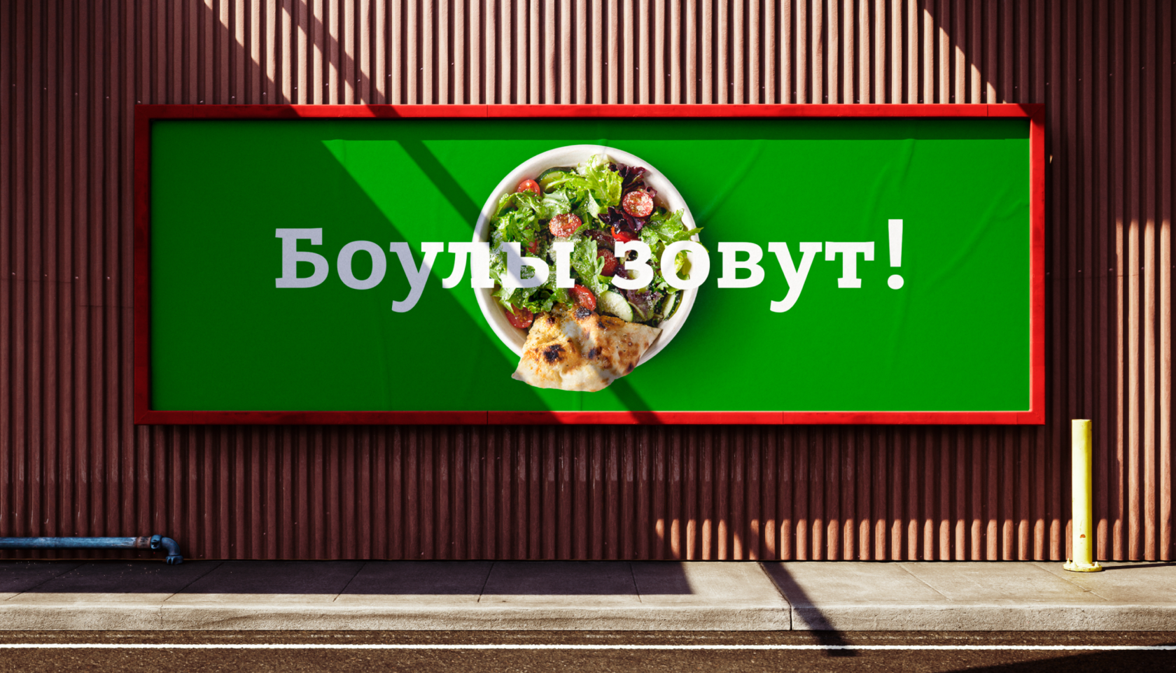
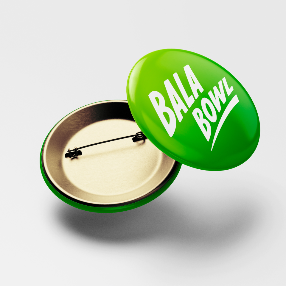
Balabowl · Healthy food cafe
р.
р.
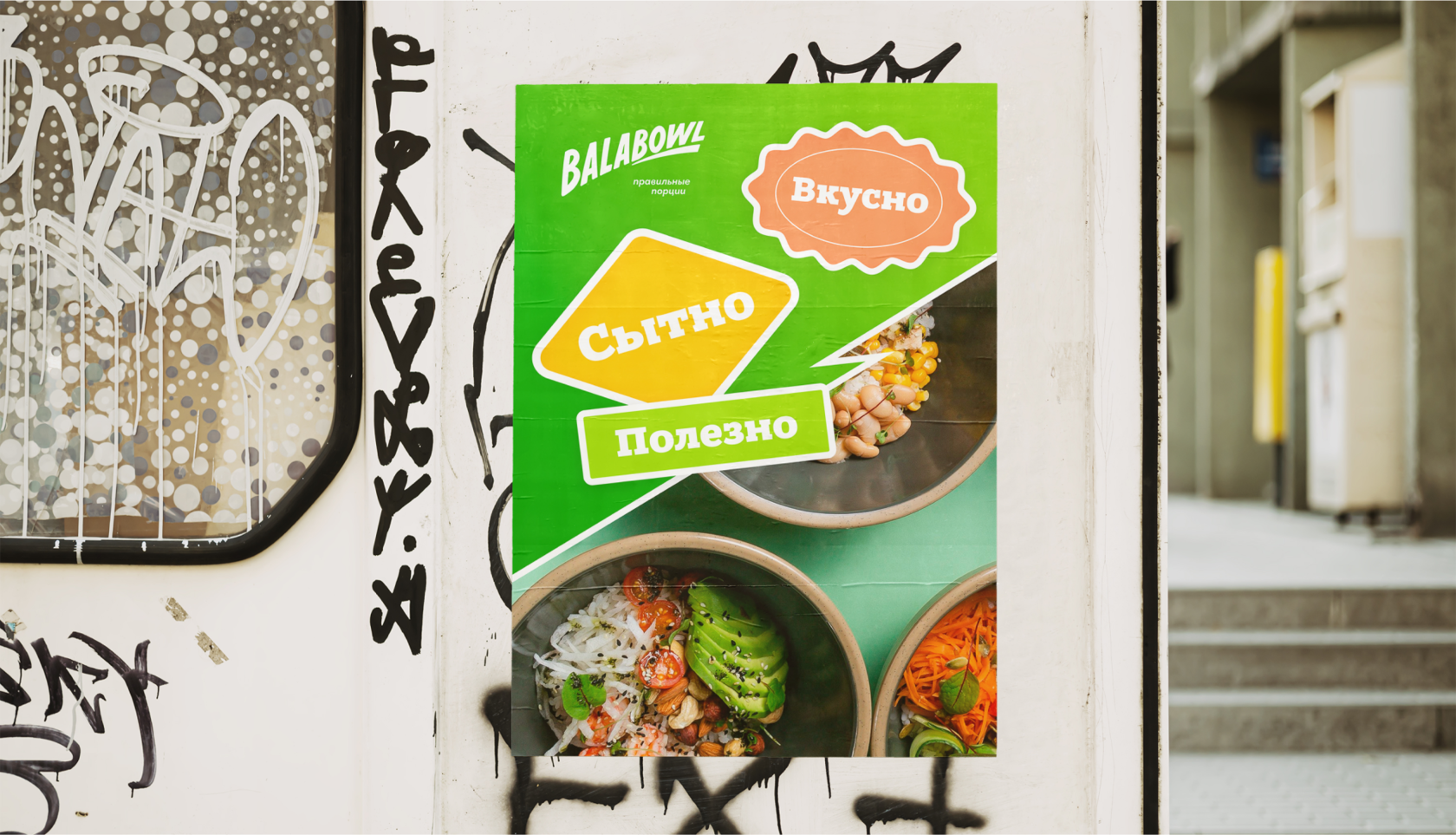
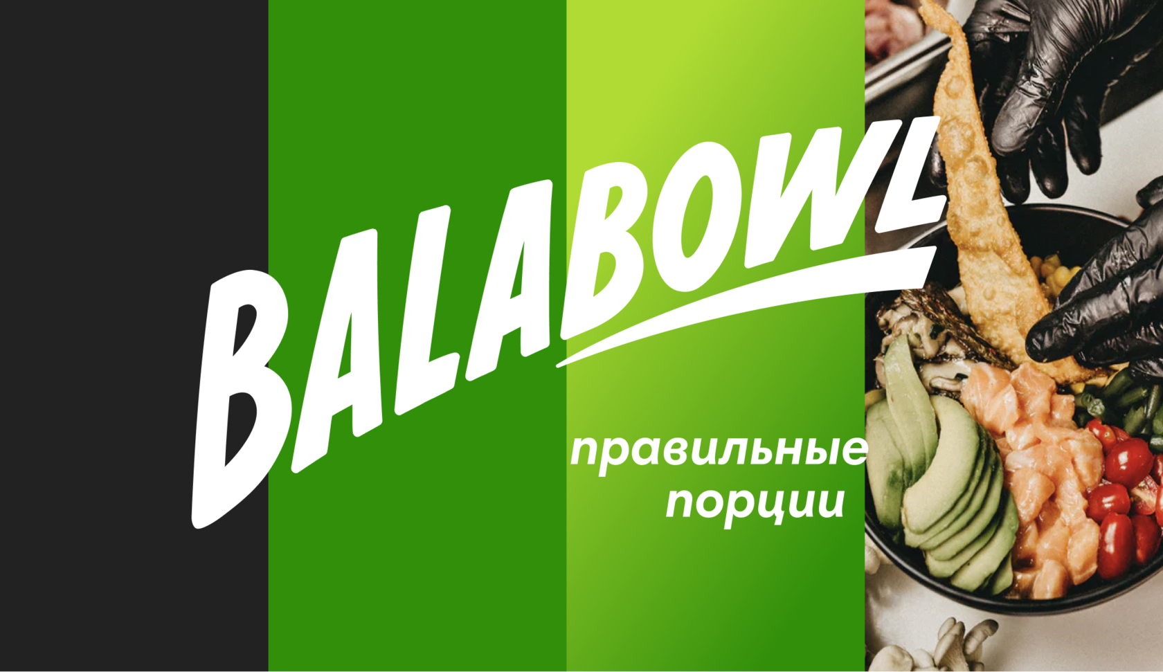
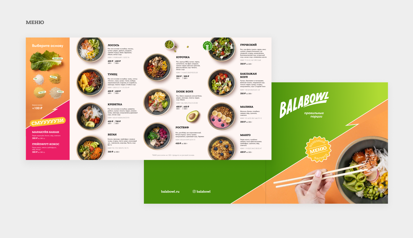
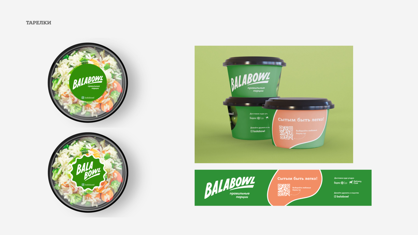
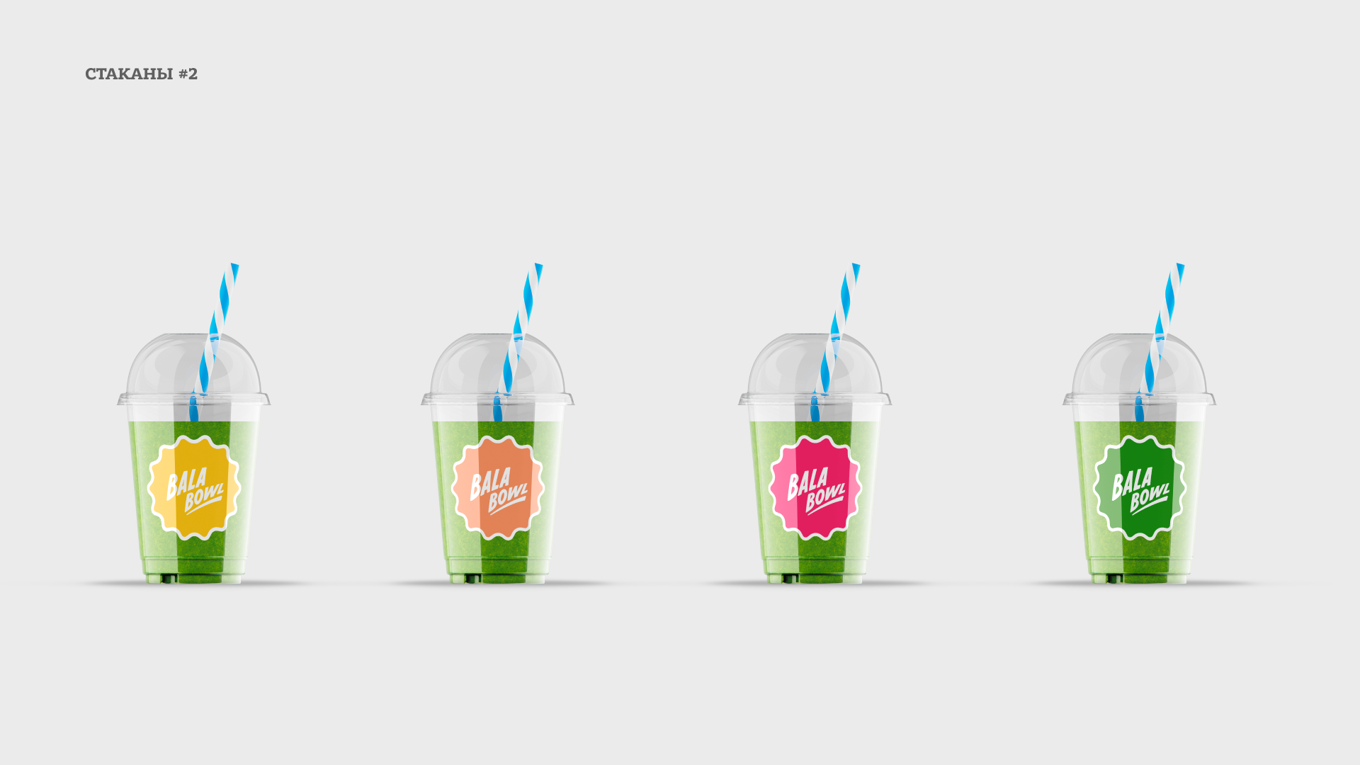
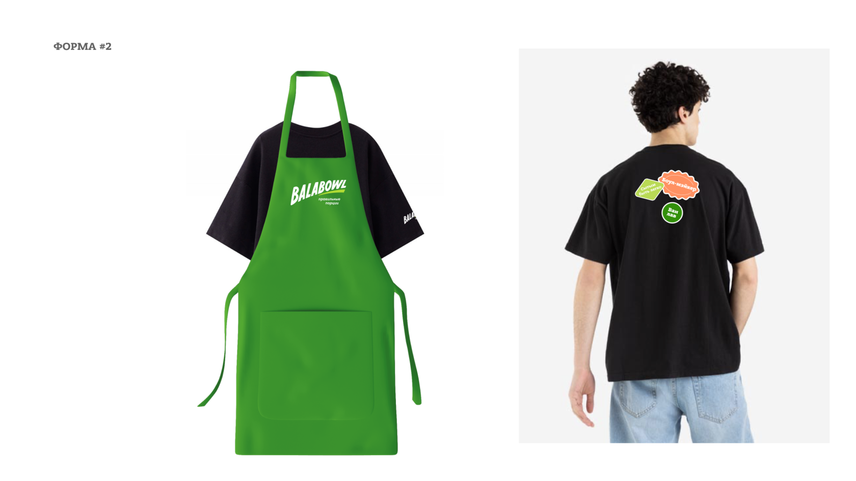
Balabowl is a next-generation fast-food franchise focused on healthy, balanced meals served in convenient bowl formats. The goal was to develop a memorable, vibrant, and cheerful visual identity that reflects the brand’s philosophy: "Proper portions — proper food."
Competitor analysis
Before starting the design process, we conducted a market analysis of key competitors such as Prime, Teremok (healthy line), Drinkit, Freshbox, and Salad Bar. Most of them rely on minimalist design, "sterile" colors, and neutral imagery, resulting in restrained and often indistinct branding.
Balabowl aimed to break free from the typical "healthy but boring" aesthetic, instead creating an emotional, lively, and character-driven identity. Through a bold color palette, expressive typography, and a strong personality, the brand stands out and forms a friendly, energetic, and highly recognizable presence in the health food sector.
Key objectives
Concept: Tasty. Bright. Healthy.
The visual concept is rooted in the belief that healthy food shouldn’t be bland or boring. Balabowl is a bold and joyful brand that celebrates flavor, originality, and nutritional value.
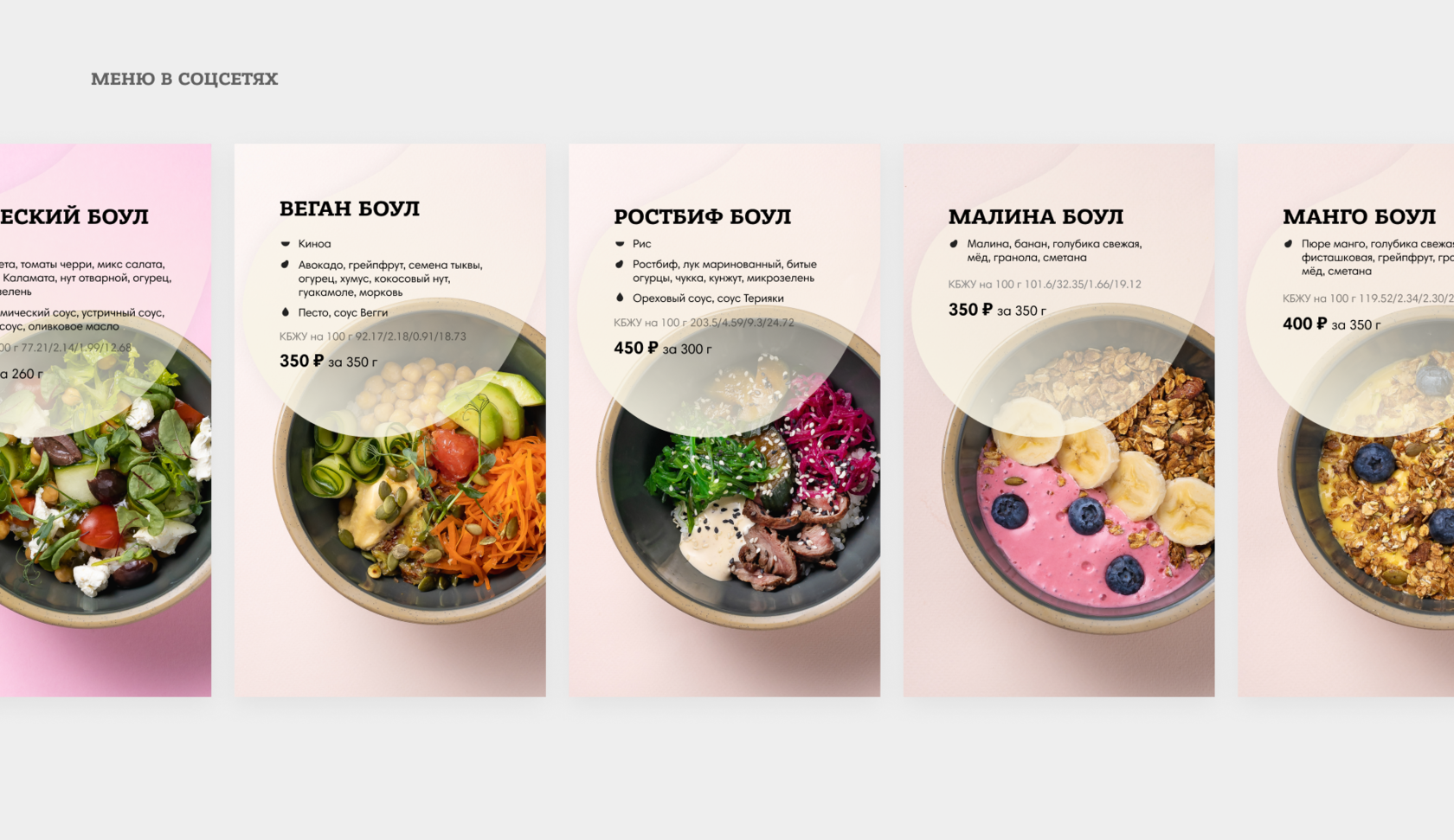
Each bowl is a curated mix of nutritious, whole ingredients, brought together in unique and unexpected combinations. Grains, vegetables, proteins, and sauces are carefully paired to create meals that feel exciting and fulfilling — never just “another healthy option.”
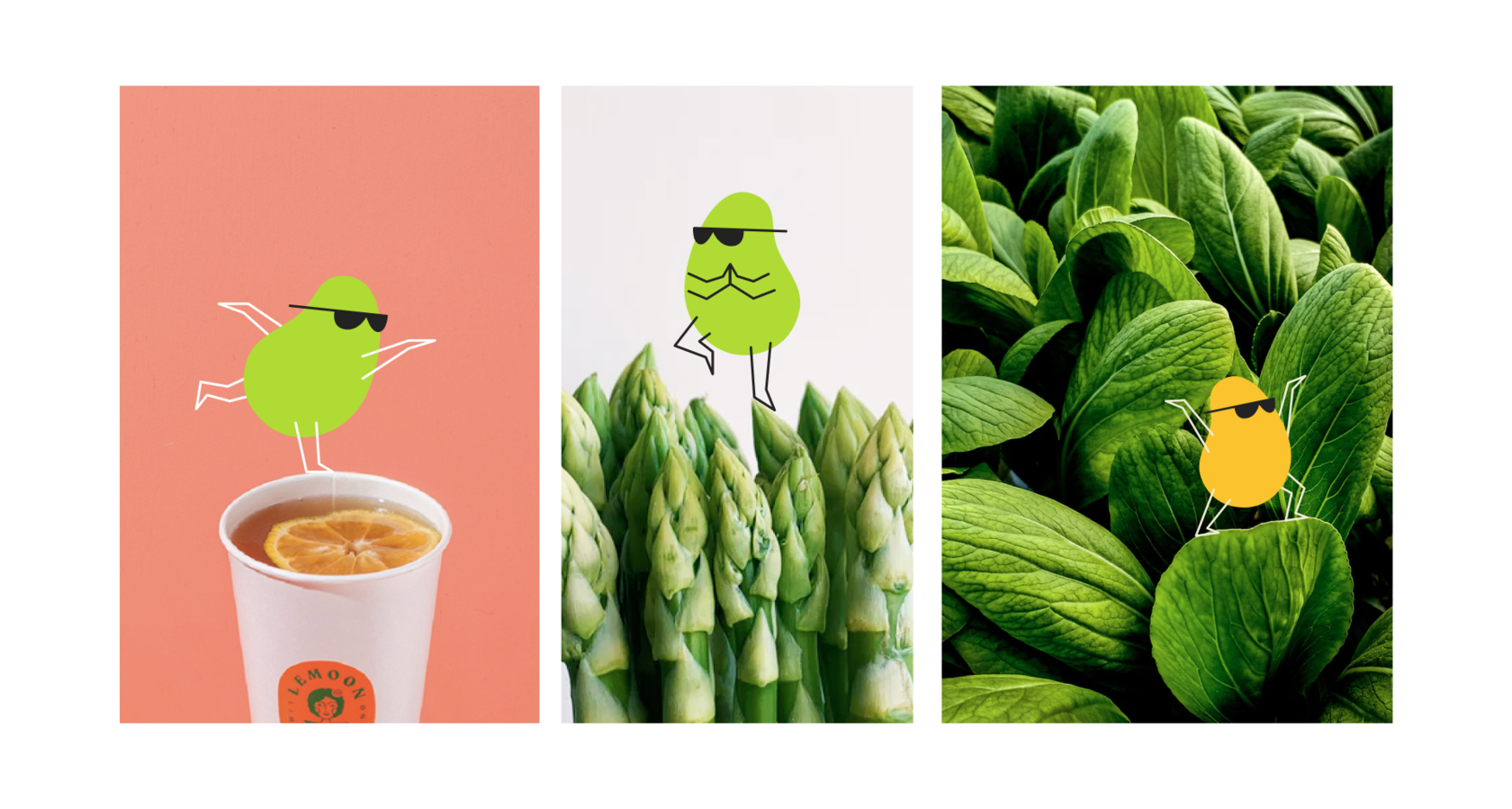
Core visual style elements
Color & flavor. The color palette is vibrant and “edible,” representing freshness, naturalness, and diversity. Green stands for health and plant-based ingredients, while orange, pink, and yellow evoke energy, appetite, and optimism.
Motion & energy. A dynamic, italicized logo paired with bold, modern typography visually reinforces the brand’s spirit of movement. Balabowl isn’t just a meal — it’s a fast-paced, flavorful lifestyle.
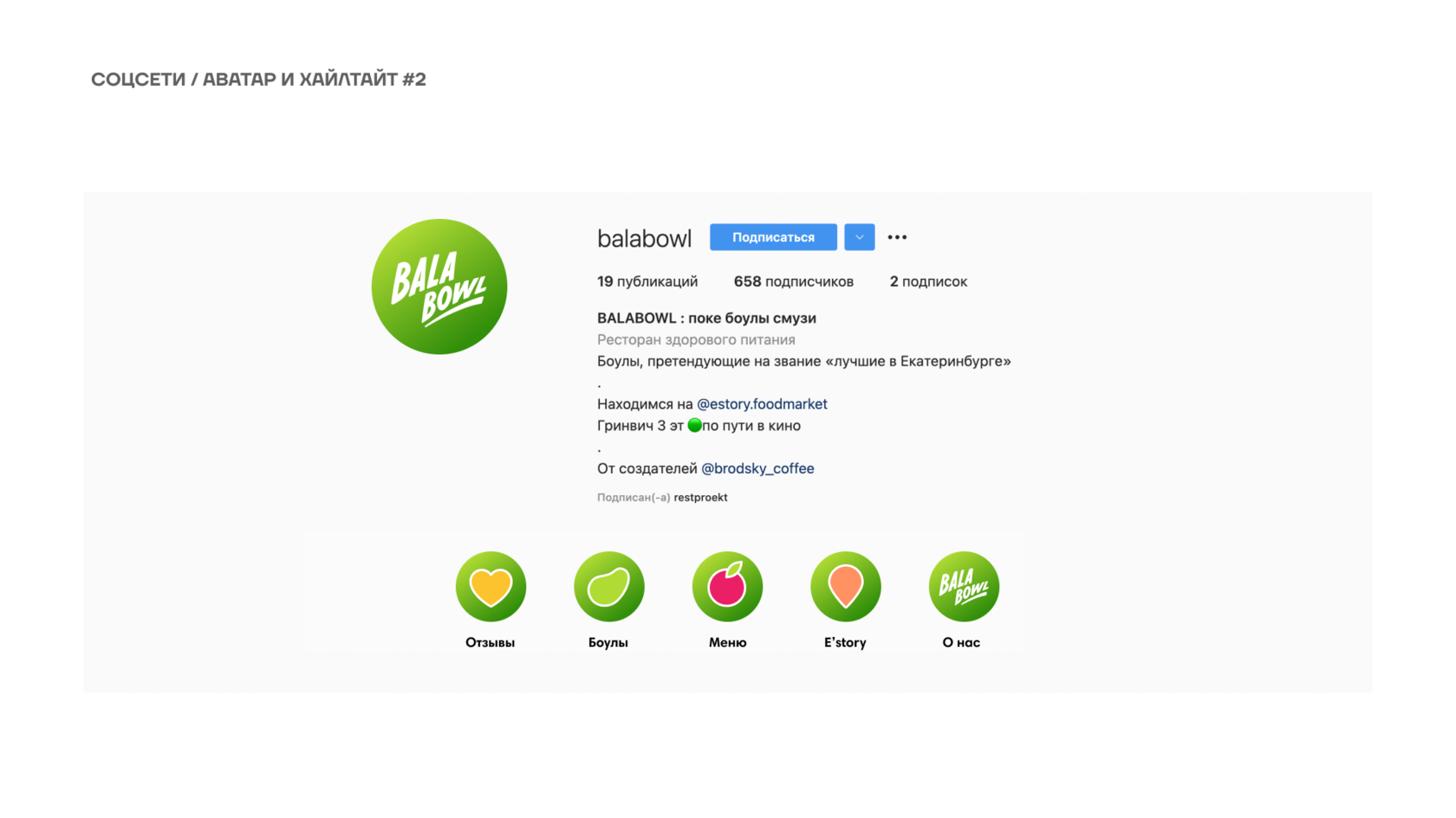
Edamame-shaped photo mask. A signature graphic device that anchors the identity system. Inspired by the recognizable shape of edamame — a symbol of health, wholesomeness, and plant-based eating — the form is used as a photo frame, background container, or decorative motif.
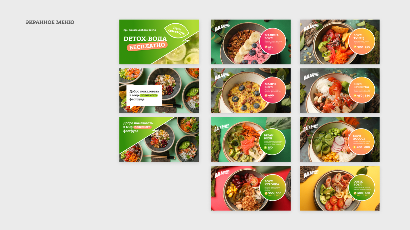
Stickers as brand language. The brand heavily uses sticker-style graphics — trendy, easily scalable, and highly expressive. These visual badges carry product names, ingredient highlights, and playful messages, adding a sense of liveliness to packaging and digital content.
Illustrations & icons. Clean, geometric, minimal forms that are easy to remember and work well across print and digital platforms.
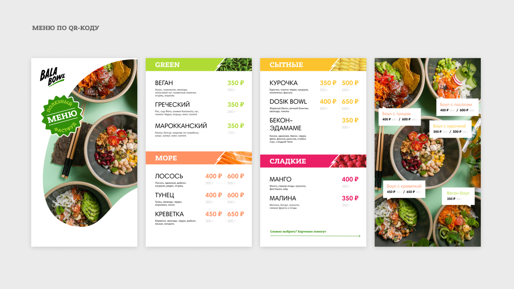
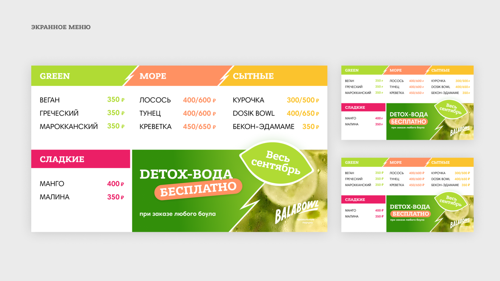
Packaging. Designed for takeout efficiency and scalability across different bowl formats, reinforcing both functionality and brand presence.
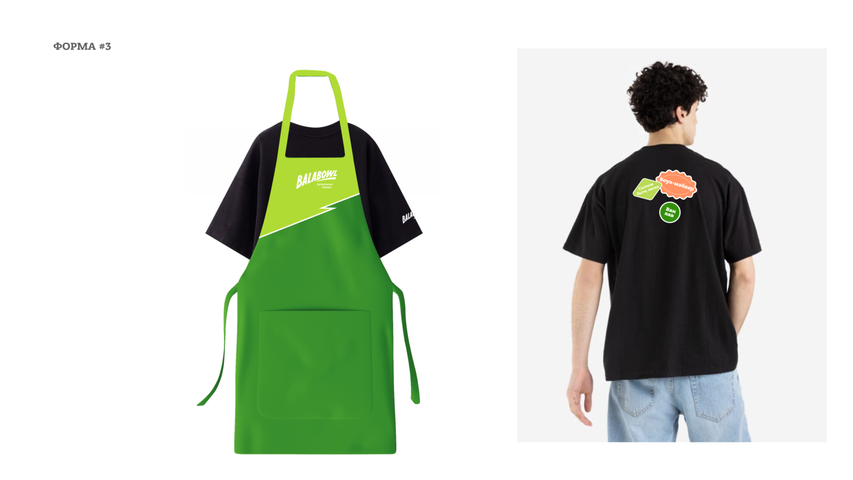
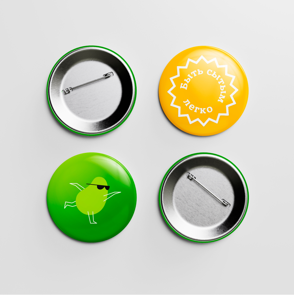
Merch & environment. Pins, signage, and interior graphics maintain a cohesive visual experience and reinforce the identity at every customer touchpoint.
Outcome
The resulting visual identity is highly adaptable for franchising and scalable across all communication channels. The brand stands out in the healthy food segment with its fresh, bold, and upbeat character.
Balabowl isn’t about restrictive wellness — it’s a celebration of flavor and nourishment. It’s a brand for people who care about themselves but still want to enjoy food. Its message: "The bowls are calling!" — and they’re hard to resist.
My role
Competitor analysis
Before starting the design process, we conducted a market analysis of key competitors such as Prime, Teremok (healthy line), Drinkit, Freshbox, and Salad Bar. Most of them rely on minimalist design, "sterile" colors, and neutral imagery, resulting in restrained and often indistinct branding.
Balabowl aimed to break free from the typical "healthy but boring" aesthetic, instead creating an emotional, lively, and character-driven identity. Through a bold color palette, expressive typography, and a strong personality, the brand stands out and forms a friendly, energetic, and highly recognizable presence in the health food sector.
Key objectives
- Logo and tagline development
- Creation of a brand color palette and typography system
- Packaging design (bowls, cups, lids)
- Design of branded elements (pins, signage, merchandise)
- Promotional materials and menu UI mockups
Concept: Tasty. Bright. Healthy.
The visual concept is rooted in the belief that healthy food shouldn’t be bland or boring. Balabowl is a bold and joyful brand that celebrates flavor, originality, and nutritional value.
Each bowl is a curated mix of nutritious, whole ingredients, brought together in unique and unexpected combinations. Grains, vegetables, proteins, and sauces are carefully paired to create meals that feel exciting and fulfilling — never just “another healthy option.”
Core visual style elements
Color & flavor. The color palette is vibrant and “edible,” representing freshness, naturalness, and diversity. Green stands for health and plant-based ingredients, while orange, pink, and yellow evoke energy, appetite, and optimism.
Motion & energy. A dynamic, italicized logo paired with bold, modern typography visually reinforces the brand’s spirit of movement. Balabowl isn’t just a meal — it’s a fast-paced, flavorful lifestyle.
Edamame-shaped photo mask. A signature graphic device that anchors the identity system. Inspired by the recognizable shape of edamame — a symbol of health, wholesomeness, and plant-based eating — the form is used as a photo frame, background container, or decorative motif.
Stickers as brand language. The brand heavily uses sticker-style graphics — trendy, easily scalable, and highly expressive. These visual badges carry product names, ingredient highlights, and playful messages, adding a sense of liveliness to packaging and digital content.
Illustrations & icons. Clean, geometric, minimal forms that are easy to remember and work well across print and digital platforms.
Packaging. Designed for takeout efficiency and scalability across different bowl formats, reinforcing both functionality and brand presence.
Merch & environment. Pins, signage, and interior graphics maintain a cohesive visual experience and reinforce the identity at every customer touchpoint.
Outcome
The resulting visual identity is highly adaptable for franchising and scalable across all communication channels. The brand stands out in the healthy food segment with its fresh, bold, and upbeat character.
Balabowl isn’t about restrictive wellness — it’s a celebration of flavor and nourishment. It’s a brand for people who care about themselves but still want to enjoy food. Its message: "The bowls are calling!" — and they’re hard to resist.
My role
- Art Direction
- Graphic Design
- Visual System Development
- Copywriting (Tagline, Brand Voice)


DPD · Merchbook
р.
р.
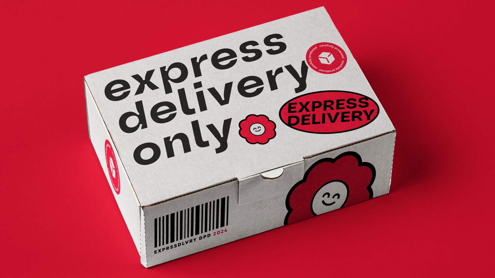
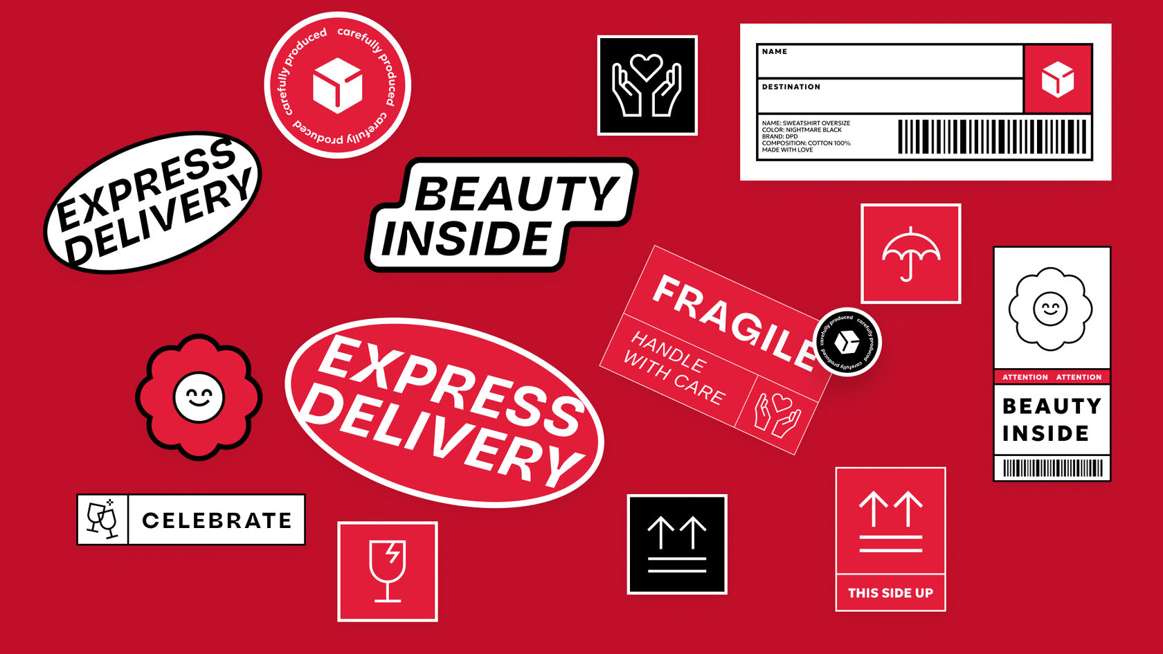
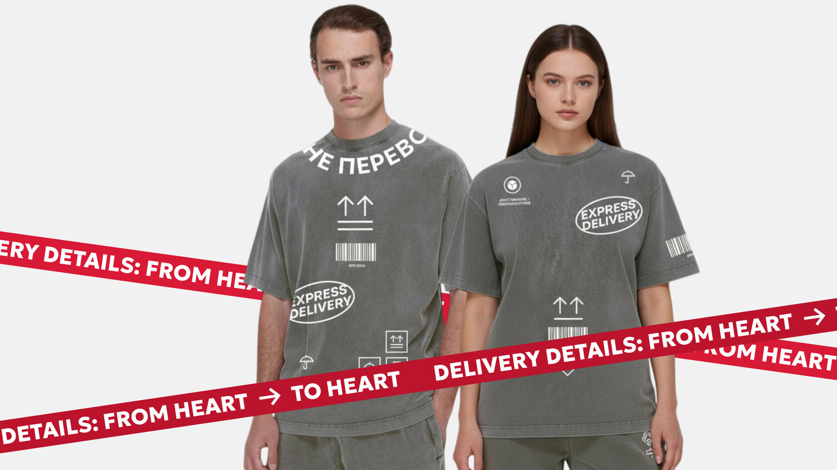
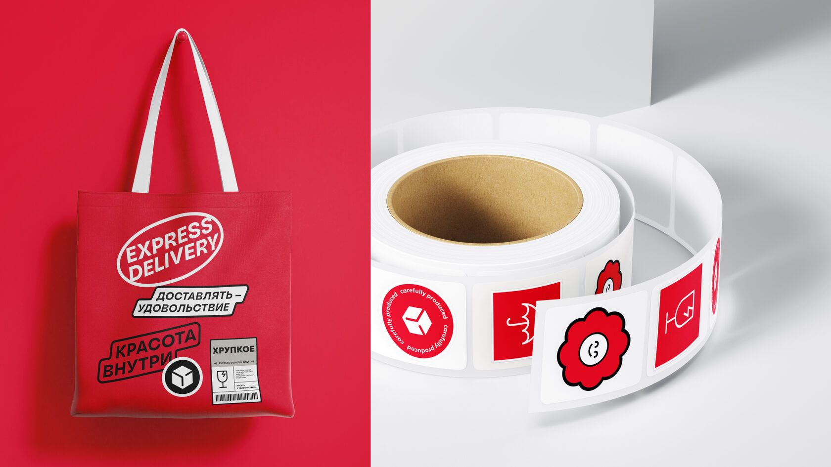
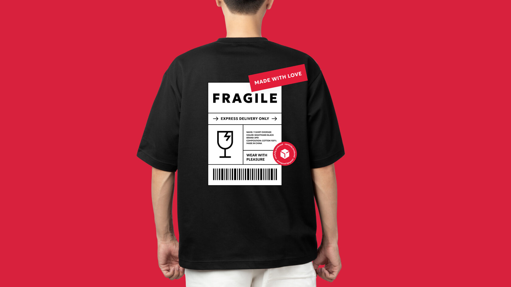
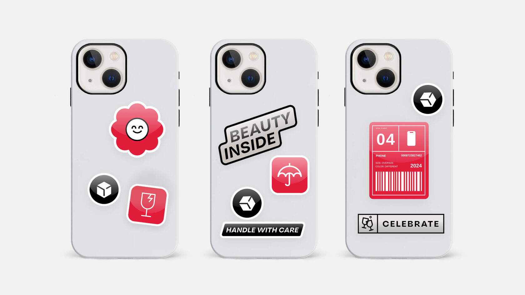
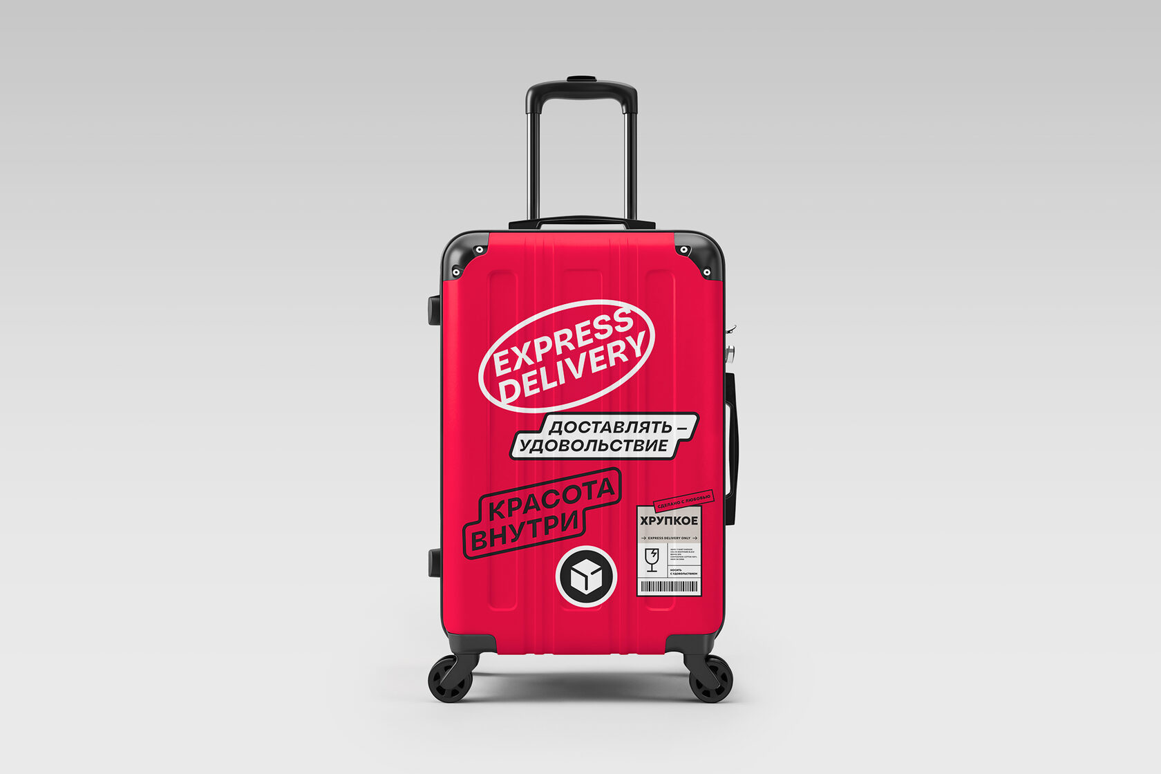
DPD is one of the largest logistics companies. In 2024, I was tasked with designing a bold, modern, and functional merchandise line for employees — one that goes beyond just clothing or souvenirs, and becomes a part of the company’s internal culture, a source of pride, team unity, and brand recognition.
Target audience
Key objectives
Concept: “Delivery speed. People first.”
The visual concept is built around the balance of fast delivery and valuing every employee. DPD is more than just logistics — it’s about people delivering trust, care, and commitment every day.
Speed is our drive. People are our priority. The brand speaks the language of speed, efficiency, and technology — expressed through dynamic typography, angled compositions, and bold red tones. But an equally important layer of the concept is thoughtful, human-centered care.
Every parcel at DPD comes with a label: “Fragile,” “This Side Up,” “Handle with Care.” Shouldn’t we treat people the same way?
Every team member is like a valuable package, each with:
What it brings to the brand
The philosophy behind the merch
DPD isn’t about “functions.” It’s about people. We don’t wear the brand as a uniform — we wear it as a statement. And that statement says: I’m part of this team. I’m valued. What I do matters. Merch becomes a tool of emotional identification — allowing people to feel like respected, empowered contributors, not cogs in a system.
Outcome
The final merchbook is:
My role
Target audience
- DPD employees — couriers, office staff, logisticians, managers
- HR and brand teams — as internal ambassadors and merch initiators
- Partners and contractors — as part of gift and promo sets
Key objectives
- Develop a visual concept for the merch line
- Create a design system for apparel and accessories
- Maintain brand consistency within DPD’s visual language
- Present the complete merchbook with high-quality mockups and designs
- Prepare designs for production (print specs, logo sizing, application methods)
Concept: “Delivery speed. People first.”
The visual concept is built around the balance of fast delivery and valuing every employee. DPD is more than just logistics — it’s about people delivering trust, care, and commitment every day.
Speed is our drive. People are our priority. The brand speaks the language of speed, efficiency, and technology — expressed through dynamic typography, angled compositions, and bold red tones. But an equally important layer of the concept is thoughtful, human-centered care.
Every parcel at DPD comes with a label: “Fragile,” “This Side Up,” “Handle with Care.” Shouldn’t we treat people the same way?
Every team member is like a valuable package, each with:
- their own “label” — personality, boundaries, goals, strengths, vulnerabilities
- a unique delivery route — personal growth, career path, contribution
- an internal value that deserves attention and respect
What it brings to the brand
- Fosters a culture of empathy and respect
- Increases emotional engagement and loyalty
- Builds stronger human connections within teams
- Makes the brand feel not just efficient, but genuinely warm and human
The philosophy behind the merch
DPD isn’t about “functions.” It’s about people. We don’t wear the brand as a uniform — we wear it as a statement. And that statement says: I’m part of this team. I’m valued. What I do matters. Merch becomes a tool of emotional identification — allowing people to feel like respected, empowered contributors, not cogs in a system.
Outcome
The final merchbook is:
- A practical tool for HR and brand teams
- A vivid expression of DPD’s internal culture
- A production-ready solution requiring no additional adjustments
- A branded “language” that resonates with every employee
My role
- Concept development
- Art direction and visual execution
- Creation of all mockups and final merchbook layout
- Copywriting for slogans and brand phrases
- Print preparation and production supervision


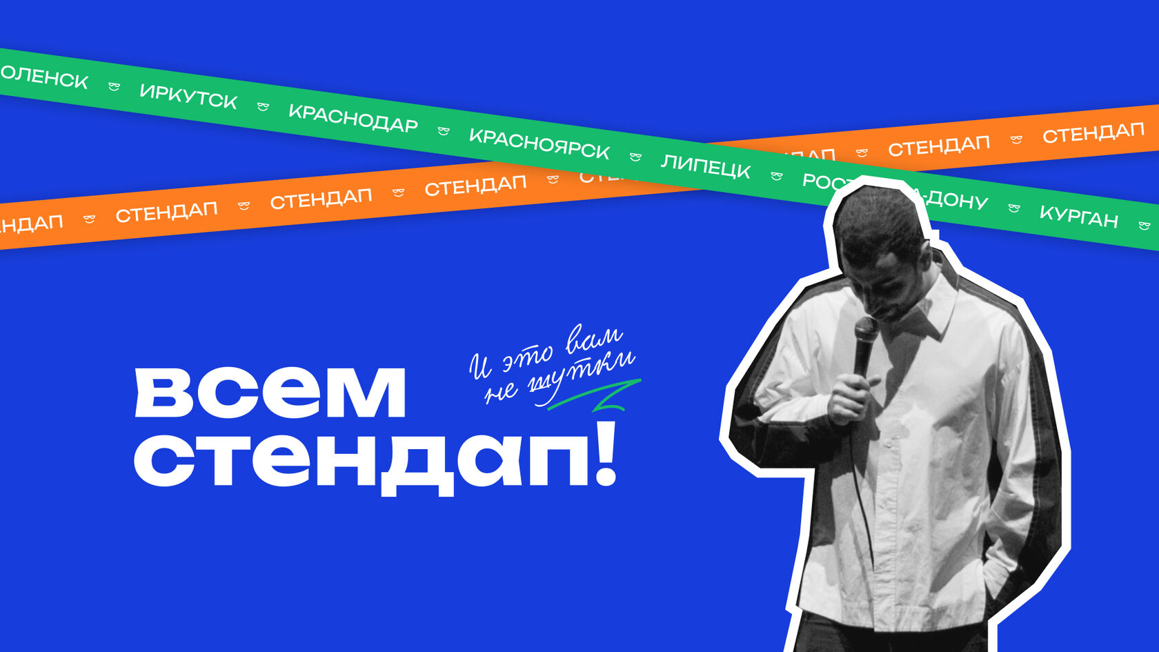
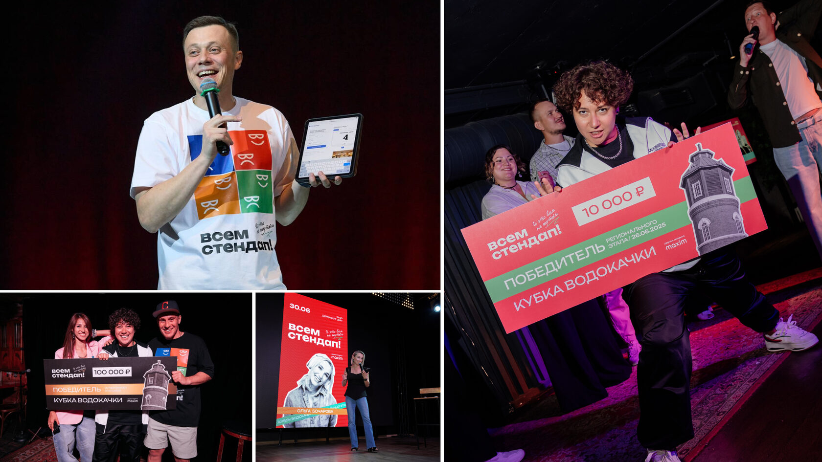
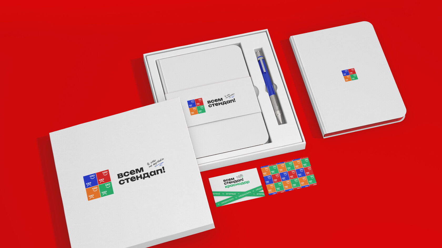
Vsem Stand-Up
р.
р.
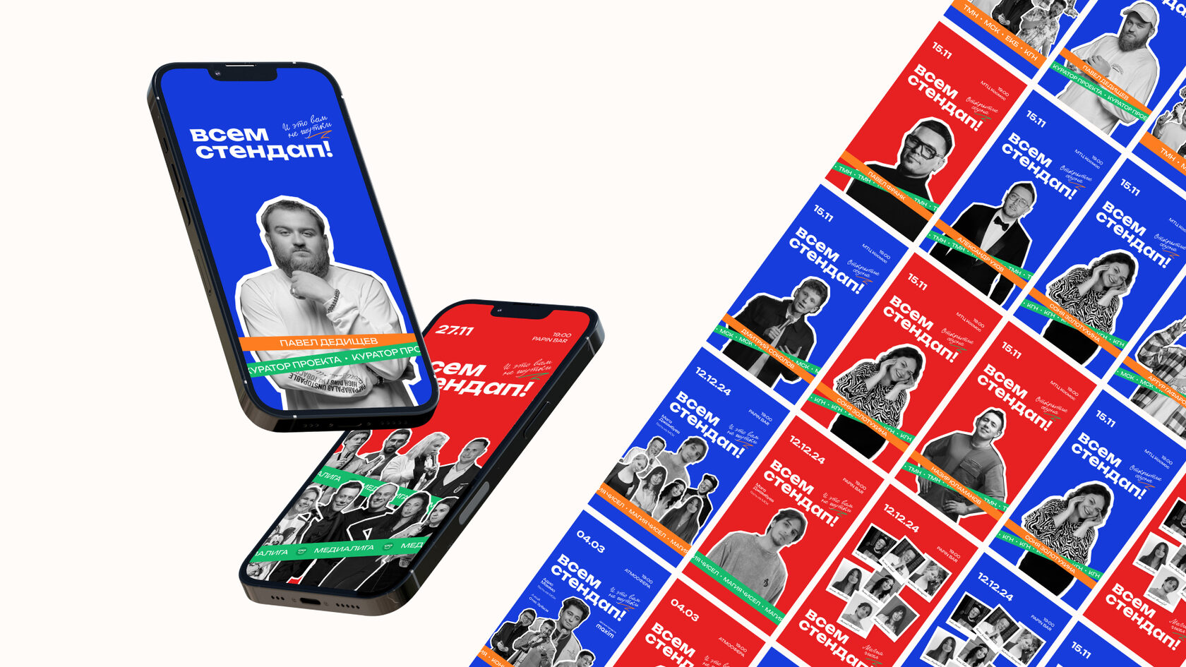
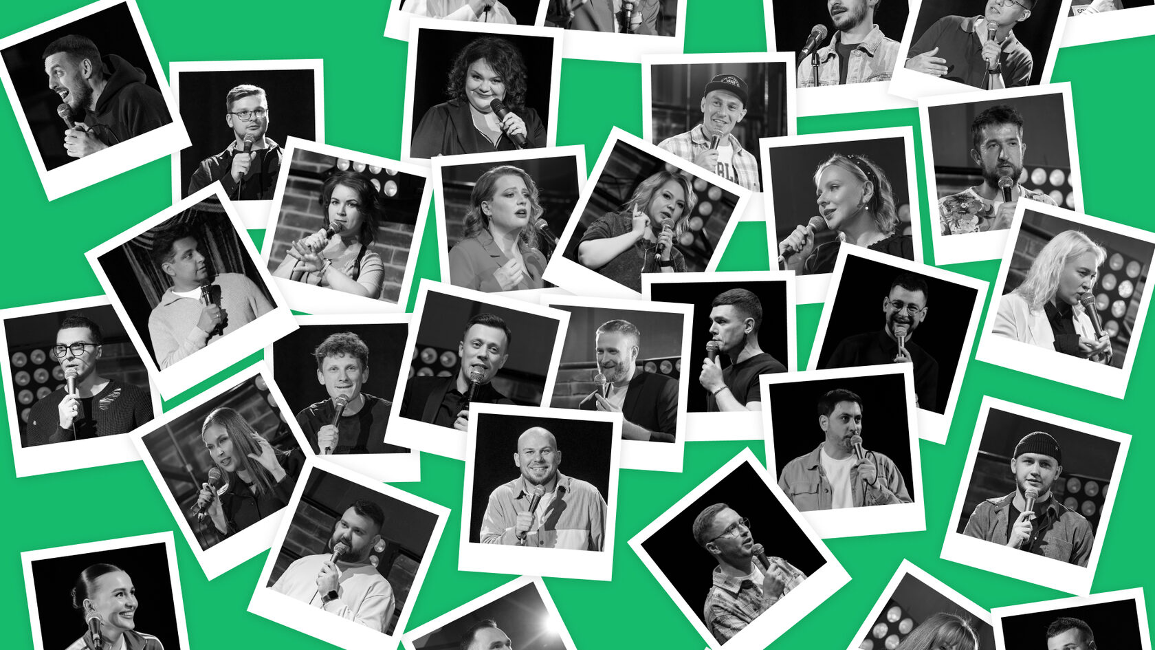
Vsem Stand-Up is a franchise of amateur stand-up events that brings together aspiring comedians, audiences, and local stand-up clubs in various cities. The goal is to create an open, vibrant, and informal space for humor and self-expression.
To develop a visual identity that reflects the project’s energy, democratic spirit, and freedom of self-expression:
People aged 18+, with a creative spark — not professional comedians. By day they work in offices, but by night they want to shine on stage and make others laugh. They don’t always know where to showcase their talent or may feel too shy to perform without support.
Visual style concept
The core idea is to visualize the energy, openness, and raw creativity of the community.
This isn’t a polished brand — it’s a welcoming, grassroots scene. Anyone can step up to the mic, crack a joke, and be heard.It’s a community-first identity, easy to relate to and built for people from all walks of life.
The solution
A bold, flexible identity system for a growing franchise:
Visual Identity
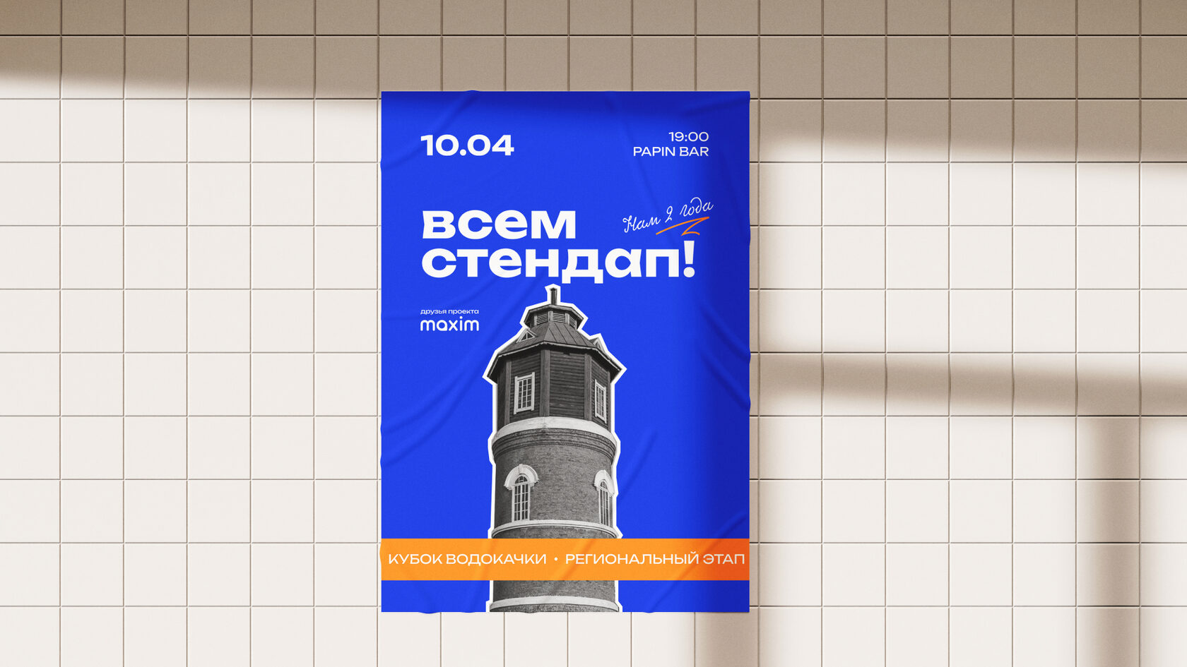
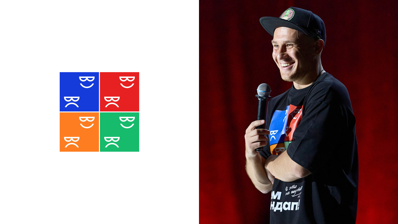
The logo is a four-block modular sign forming the abbreviation “ВС” (Vsem Stand-Up) with a bracket-shaped smile, referencing classic comedy & tragedy theater masks. It reflects the emotional ups and downs that define life — and stand-up.
A handwritten tagline — And that’s no joke — adds a human touch, as if someone scribbled it on a poster themselves.
Composition system
The result
The visual identity quickly became a recognizable symbol of the franchise:
To develop a visual identity that reflects the project’s energy, democratic spirit, and freedom of self-expression:
- Emphasize the amateur, unpolished nature of the project
- Make it easy to apply across posters, merch, and social media
- Keep it modern, but not corporate
People aged 18+, with a creative spark — not professional comedians. By day they work in offices, but by night they want to shine on stage and make others laugh. They don’t always know where to showcase their talent or may feel too shy to perform without support.
Visual style concept
The core idea is to visualize the energy, openness, and raw creativity of the community.
This isn’t a polished brand — it’s a welcoming, grassroots scene. Anyone can step up to the mic, crack a joke, and be heard.It’s a community-first identity, easy to relate to and built for people from all walks of life.
The solution
A bold, flexible identity system for a growing franchise:
- Instantly recognizable across cities
- Adaptable to a variety of formats
- Reflects the community’s tone: real, approachable, and with a smile
Visual Identity
The logo is a four-block modular sign forming the abbreviation “ВС” (Vsem Stand-Up) with a bracket-shaped smile, referencing classic comedy & tragedy theater masks. It reflects the emotional ups and downs that define life — and stand-up.
A handwritten tagline — And that’s no joke — adds a human touch, as if someone scribbled it on a poster themselves.
Composition system
- Cut-out black-and-white portraits over bright backgrounds evoke DIY poster aesthetics
- A tilted location strip acts as a brand signature — like stage tape or a visual cue that something exciting is happening
The result
The visual identity quickly became a recognizable symbol of the franchise:
- Posters were actively reshared by performers and audiences
- Local organizers easily adopted and reused the visual style
- The look stayed accessible and distinct — a style “for our own
- 24 live shows across different cities
- 70+ comedians performed
- 3,325 audience members laughed and clapped
- 80,000 people reached online
- Art Direction
- Graphic Design
- Visual System Development
- Copywriting (tagline, brand language)


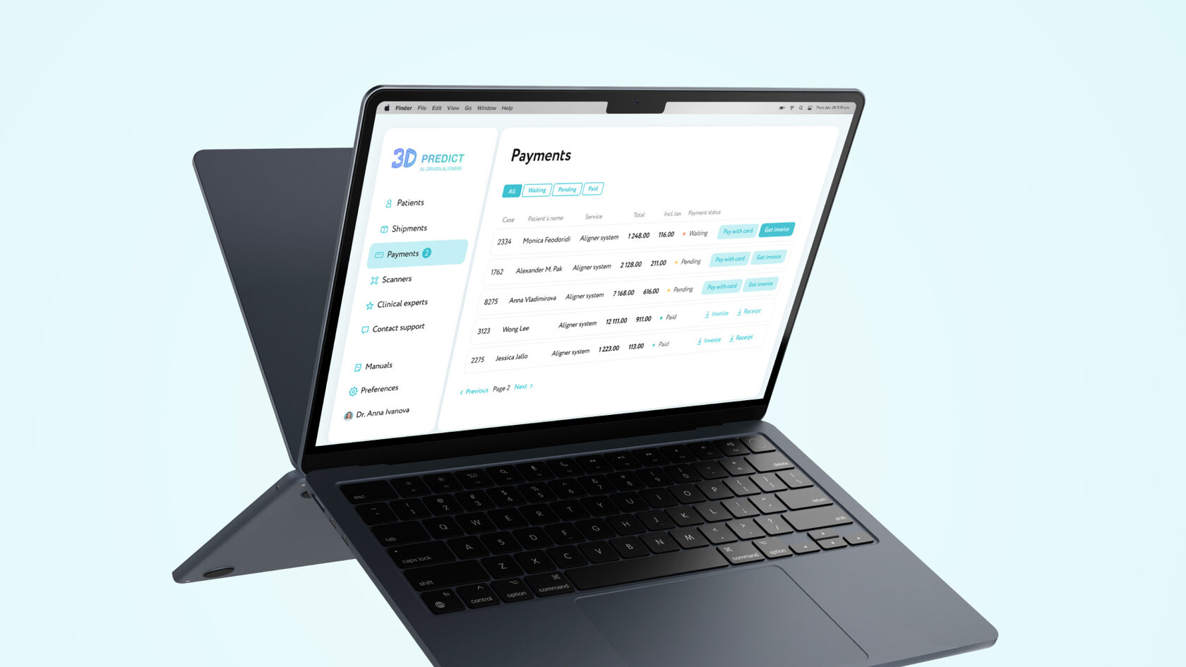
3D Predict · Payment Flow
р.
р.
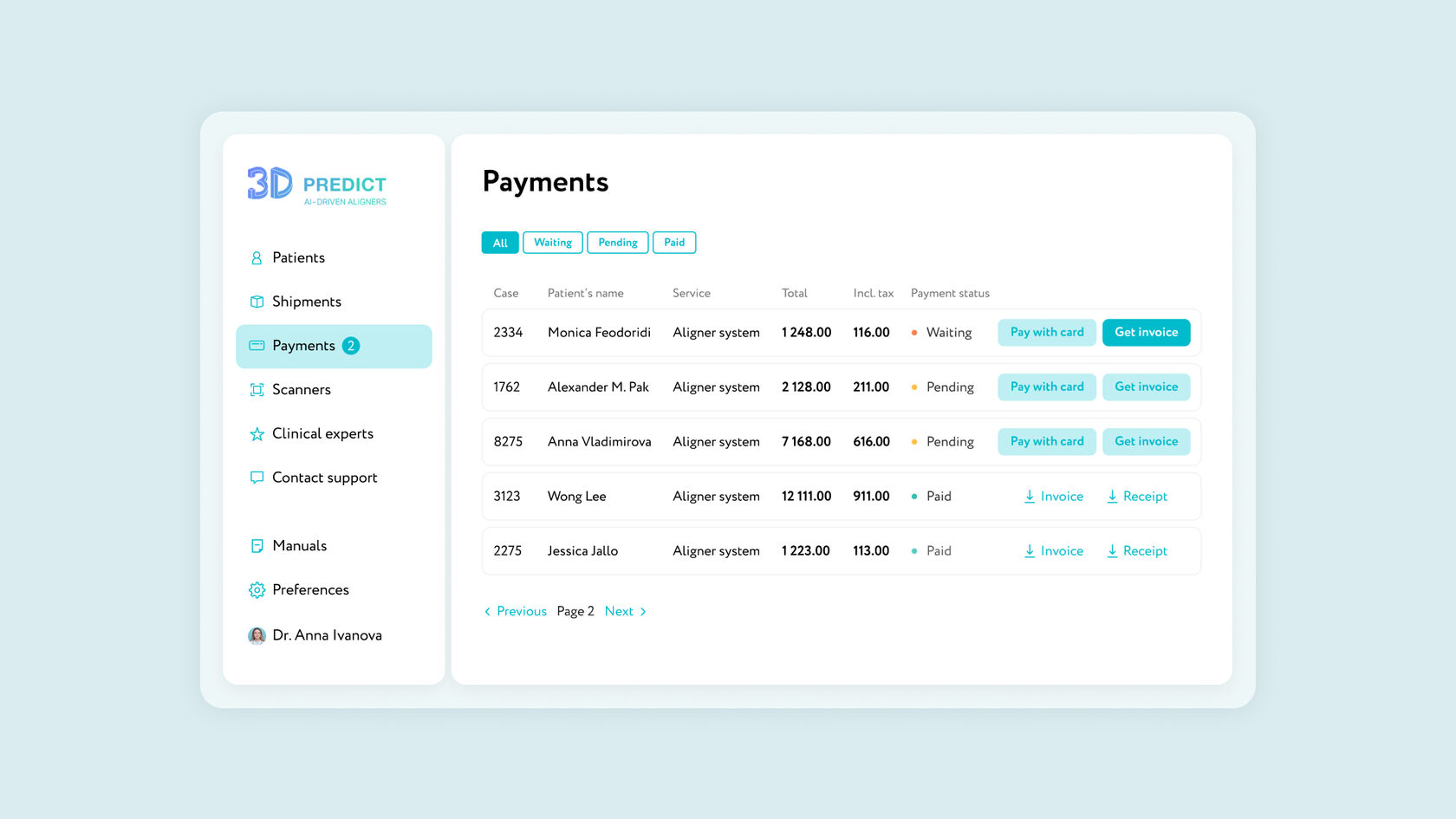
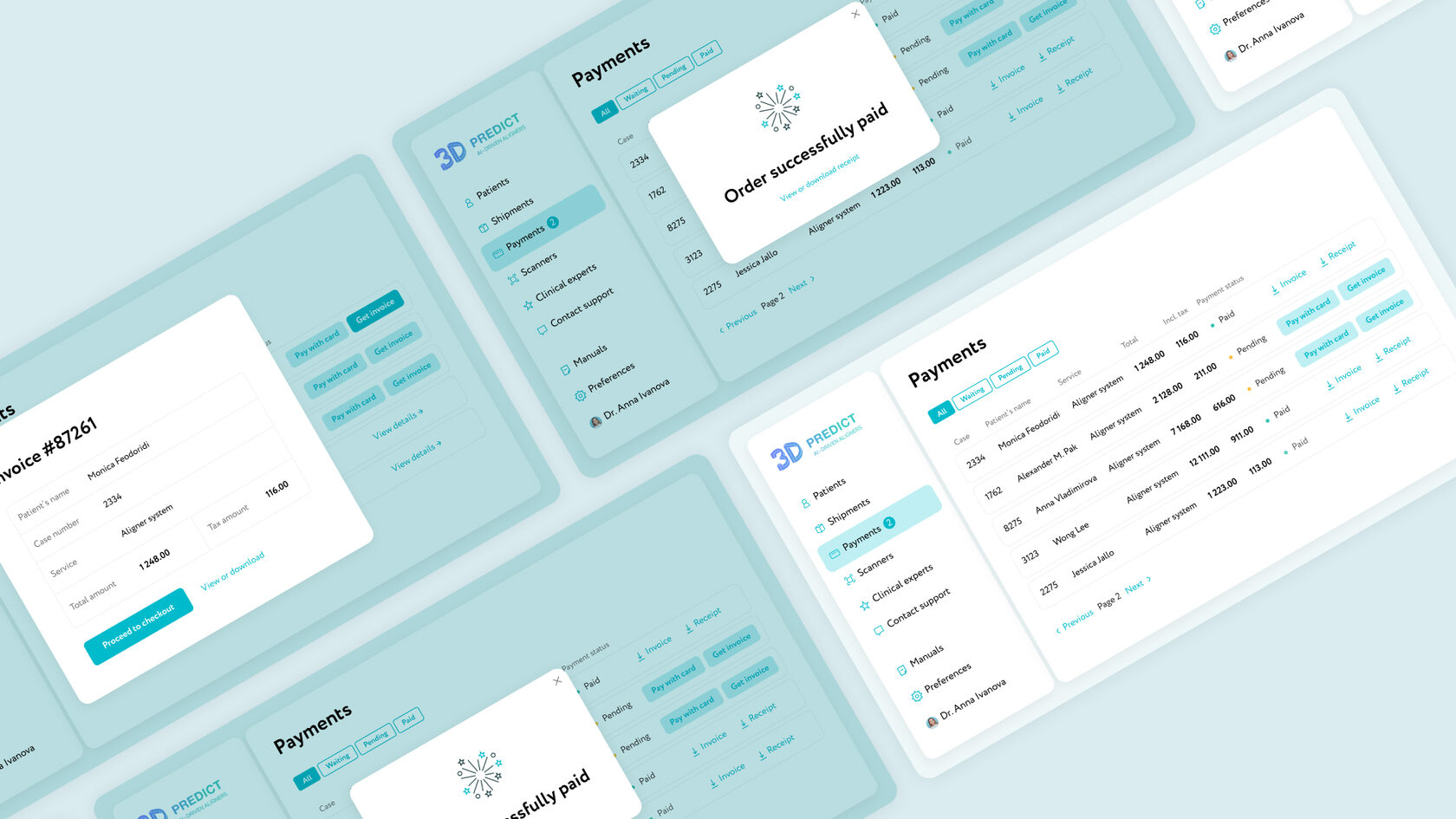
Redesign and Payment Flow Improvements for Doctors’ Portal
3D Predict is a US-based company that manufactures clear aligners for orthodontists and dentists. Through the online portal, doctors manage patient cases by uploading scans, reviewing treatment plans, and paying for aligners.
At the start of the project, the portal only supported card payments. However, many doctors—especially those from clinics—requested the ability to pay by invoice, a common practice in B2B workflows. This led to manual back-and-forth with support and delays in payment processing.
Project Goal
Design and implement an automated and user-friendly invoice payment flow to:
Approach
I analyzed the existing solution and identified the key pain points:
UX Solutions
Updated payment logic:
Redesigned “My Payments” page:
Results
3D Predict is a US-based company that manufactures clear aligners for orthodontists and dentists. Through the online portal, doctors manage patient cases by uploading scans, reviewing treatment plans, and paying for aligners.
At the start of the project, the portal only supported card payments. However, many doctors—especially those from clinics—requested the ability to pay by invoice, a common practice in B2B workflows. This led to manual back-and-forth with support and delays in payment processing.
Project Goal
Design and implement an automated and user-friendly invoice payment flow to:
- Reduce the workload on customer support
- Integrate with the accounting system (QuickBooks)
- Redesign the Payments page and improve user experience
- Increase transparency in payment statuses and document access
Approach
I analyzed the existing solution and identified the key pain points:
- Doctors couldn't pay by invoice without contacting support, which delayed case processing
- Payment statuses were unclear
- There was no way to view or download invoices from the portal
UX Solutions
Updated payment logic:
- After aligners are shipped, an invoice is automatically generated in QuickBooks.
- A notification appears in the portal, marking the case as Payment Pending.
- The doctor is guided to a secure payment gateway (Stripe or alternative) via a Continue to Payment button.
- Upon successful payment, the status is updated automatically, and a receipt is provided.
Redesigned “My Payments” page:
- Introduced tabbed or filterable views: All Invoices, Pending, and Paid
- Each entry includes: patient name, case ID, service details, total amount, tax (if applicable), payment status, invoice access, and action buttons
- Doctors can download or print invoices and receipts at any time
Results
- Delivered a modern, intuitive interface for invoice-based payments
- Automated critical steps, significantly reducing support team involvement
- Improved the overall doctor experience with greater clarity, control, and convenience


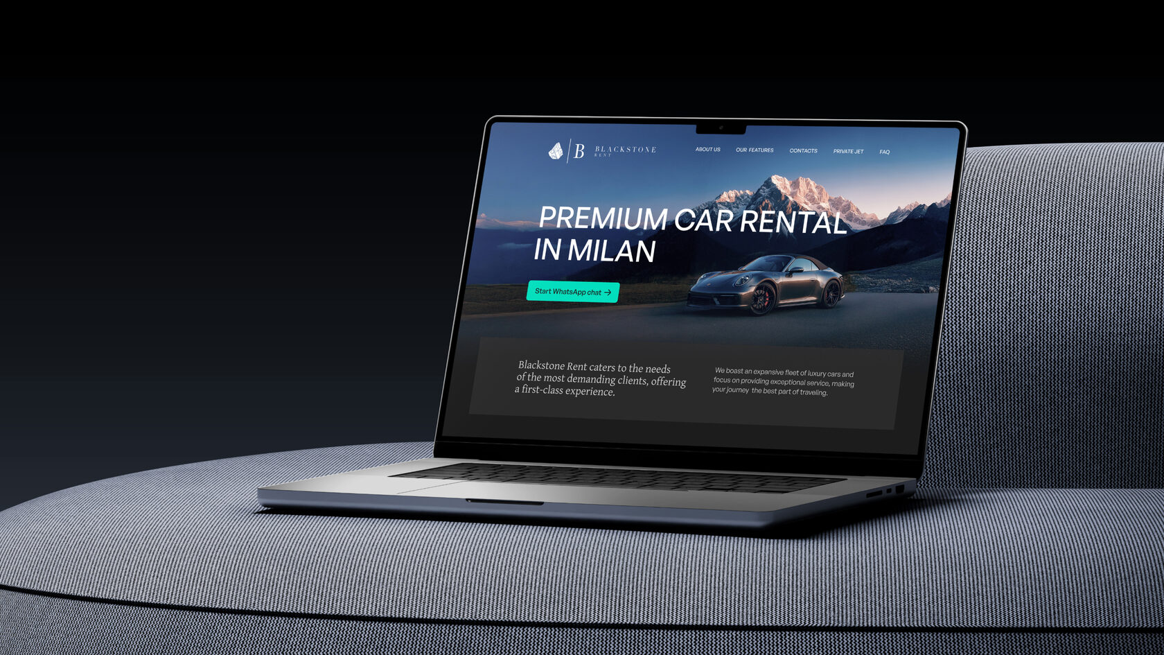

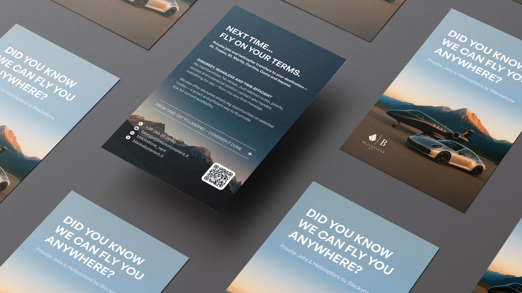
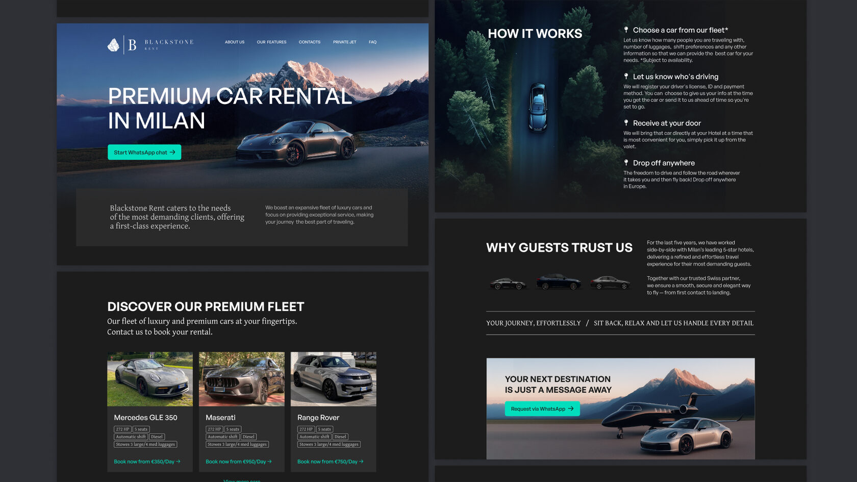
Car rental service | Milano
р.
р.
Blackstone Rent is a large company specializing in the rental of premium cars and aircraft in Milan.
Task
Redesign the landing page and marketing materials. Improve the brand identity so the materials look premium and align with the business segment and target audience. The main challenge was the lack of professional car photography.
Solution
To achieve the desired visual quality, we used neural networks to generate images based on real car photos in suitable environments. A minimalist and refined visual style emphasizes the premium positioning.
Consistent design principles applied across both the marketing materials and the landing page helped create a cohesive and unified brand experience.
My Role in the Project
Art direction
Visual concept development
Leading designers and contractors


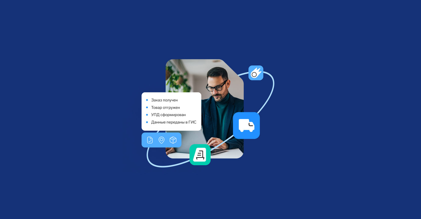
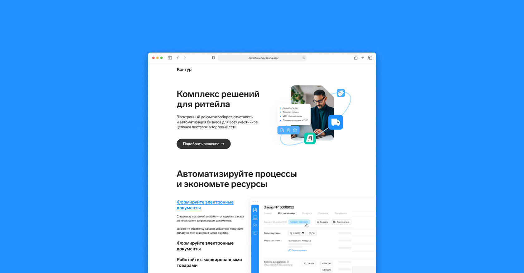
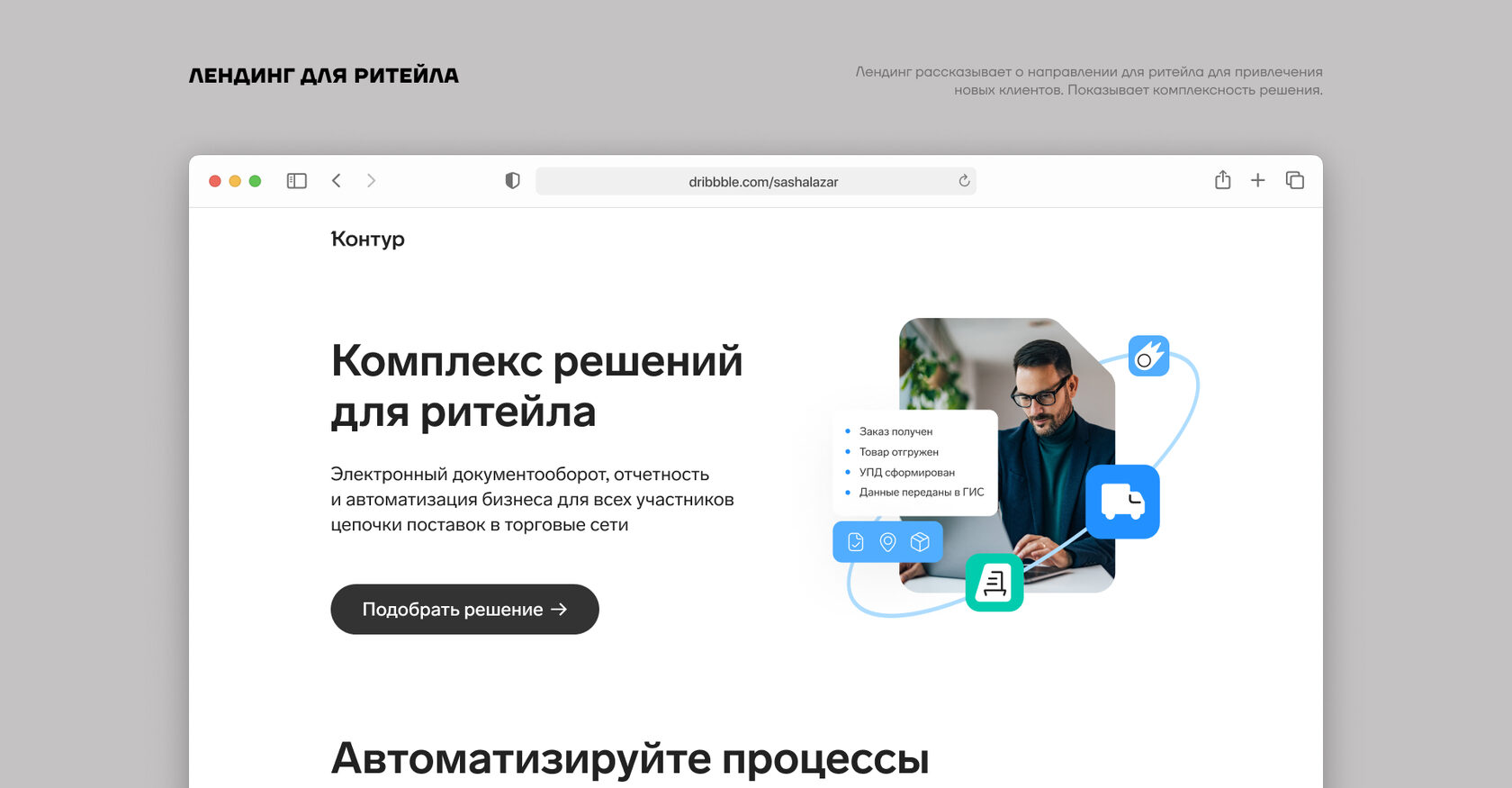
Landing pages
р.
р.
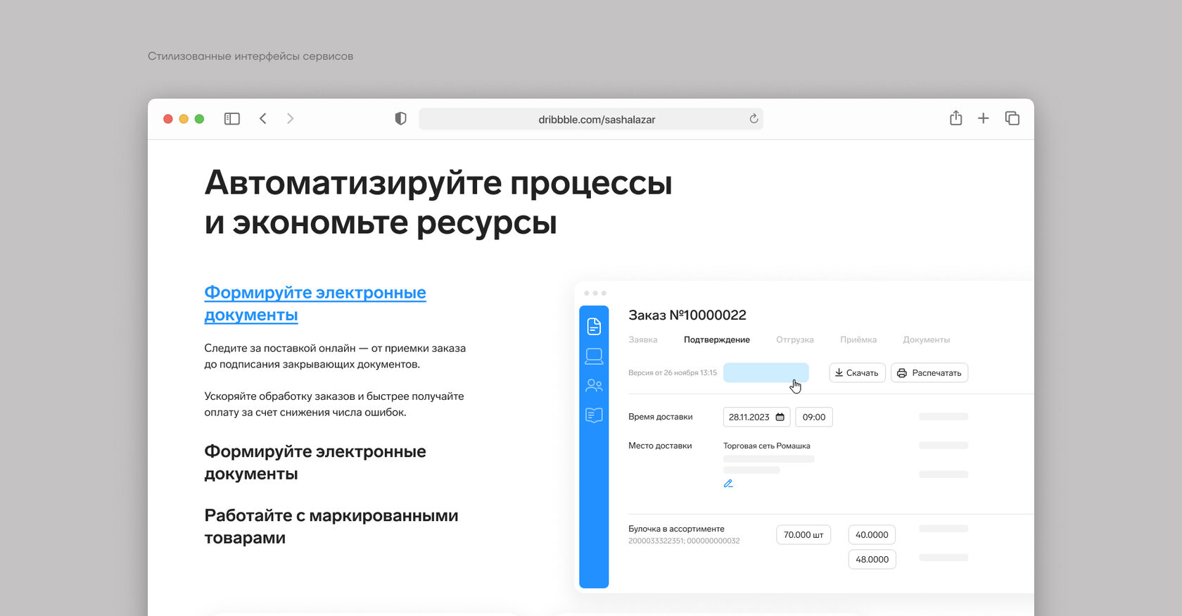
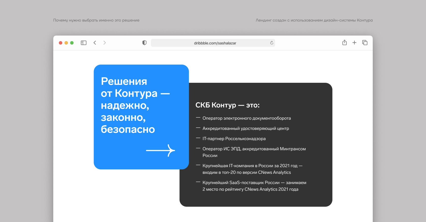
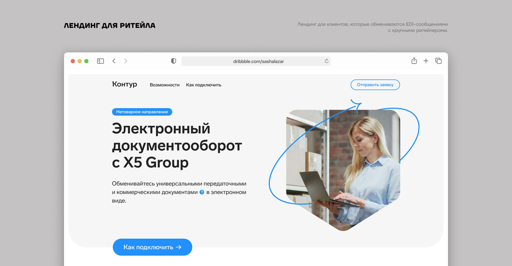
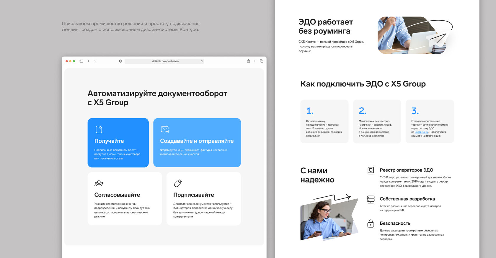
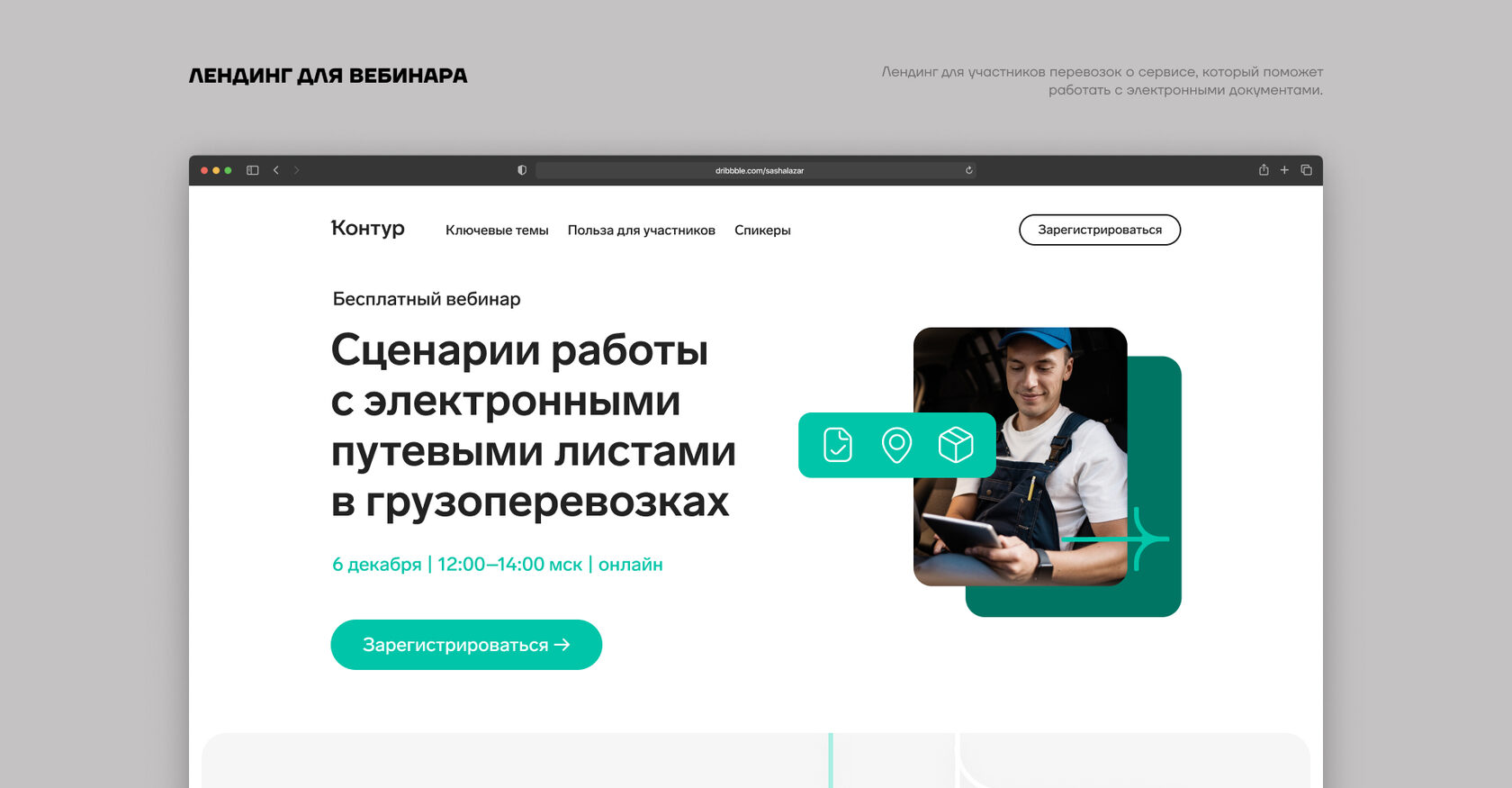
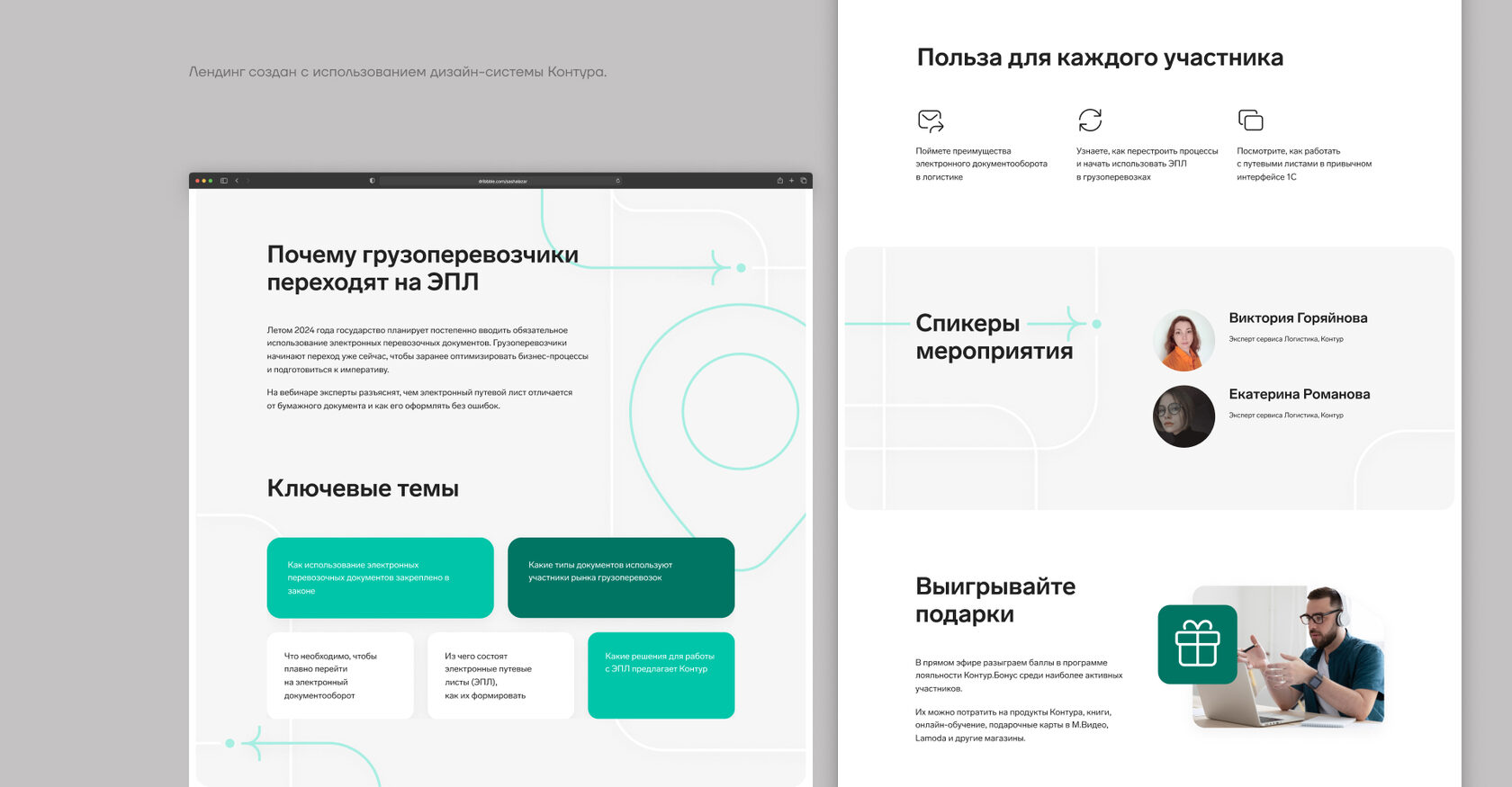
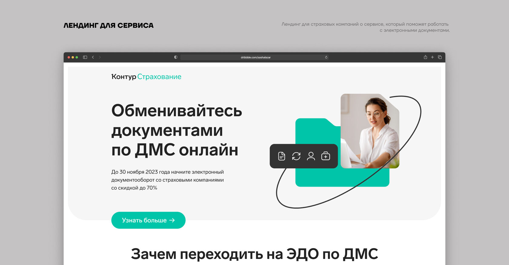
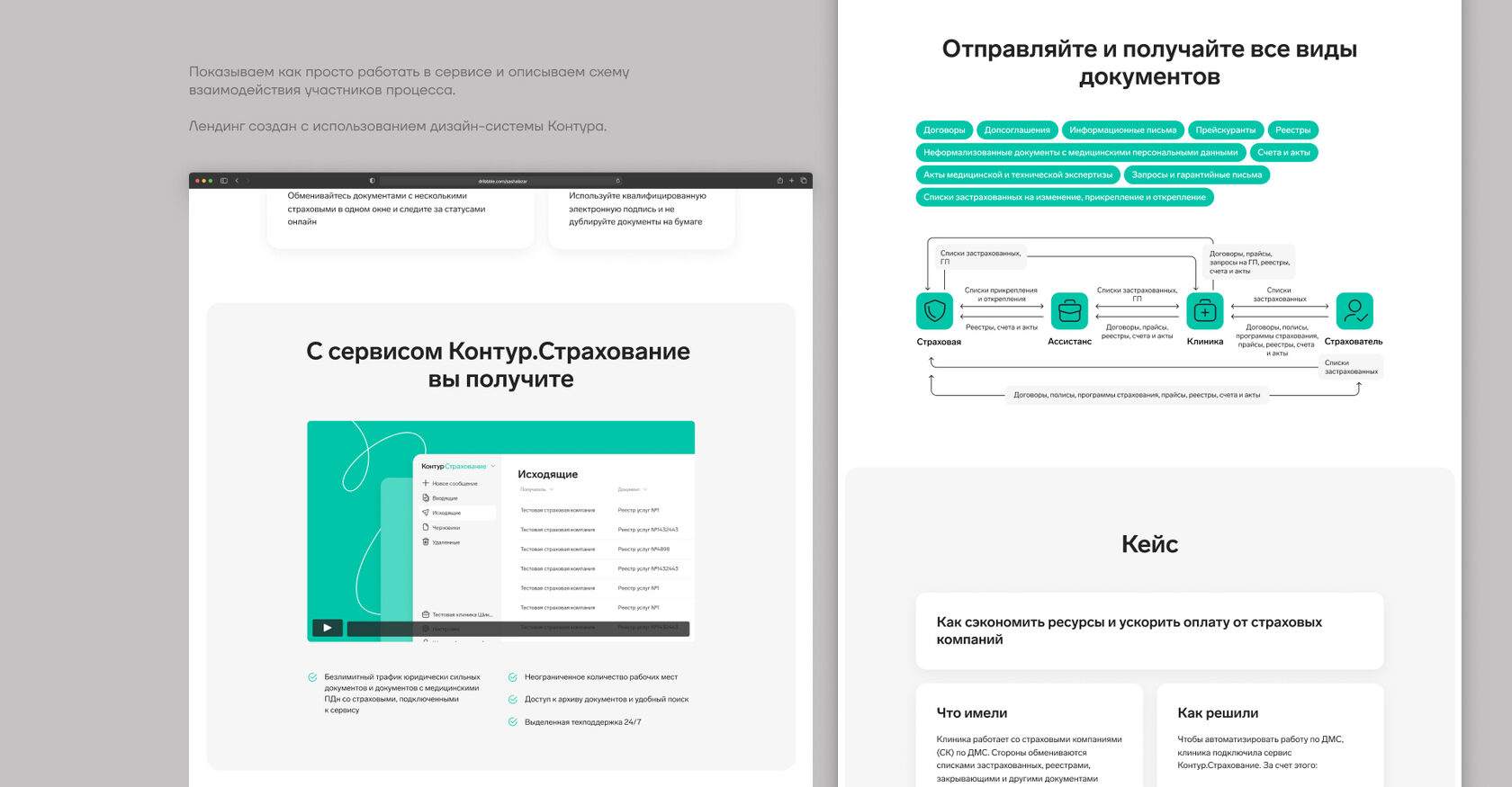
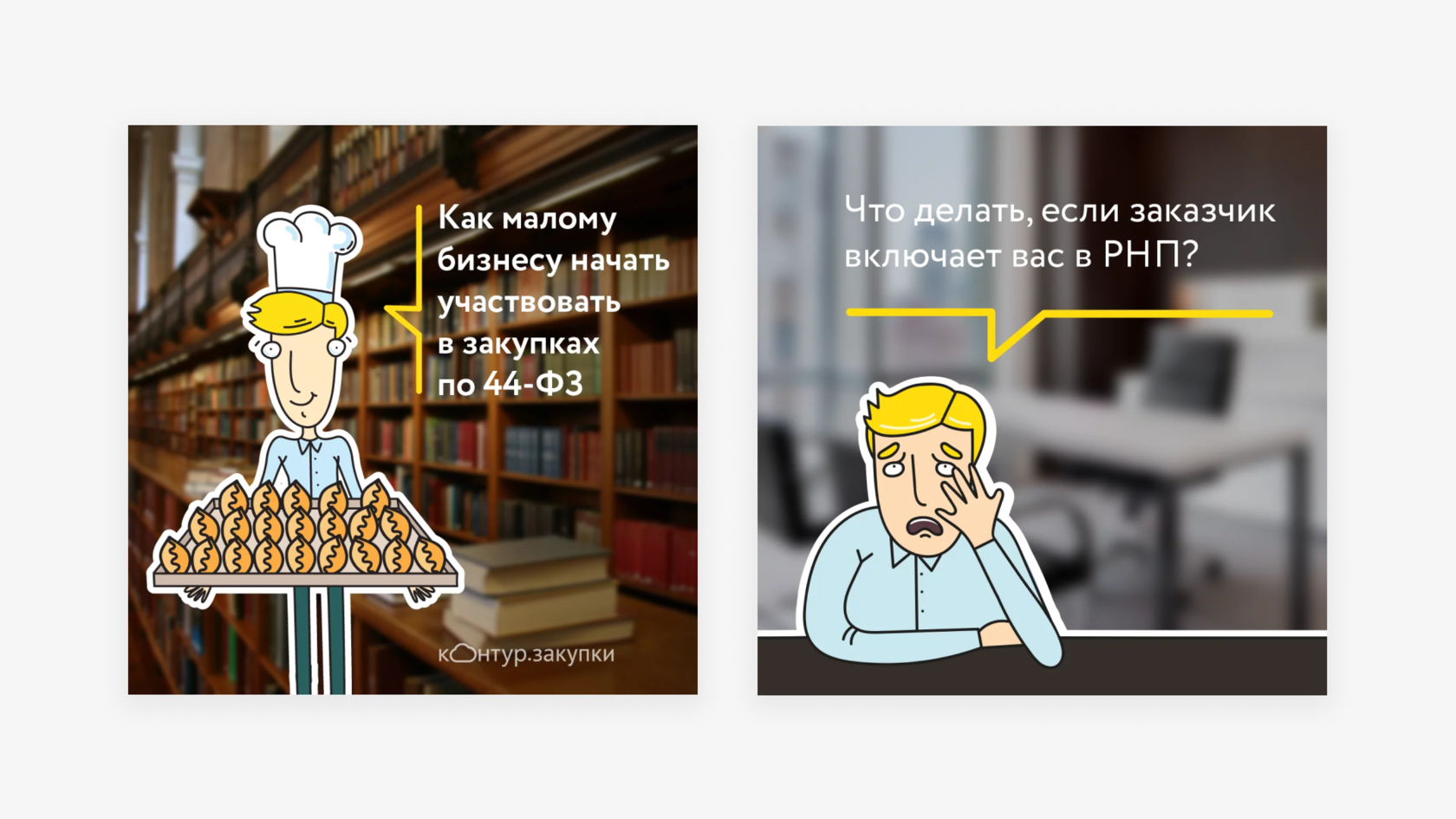
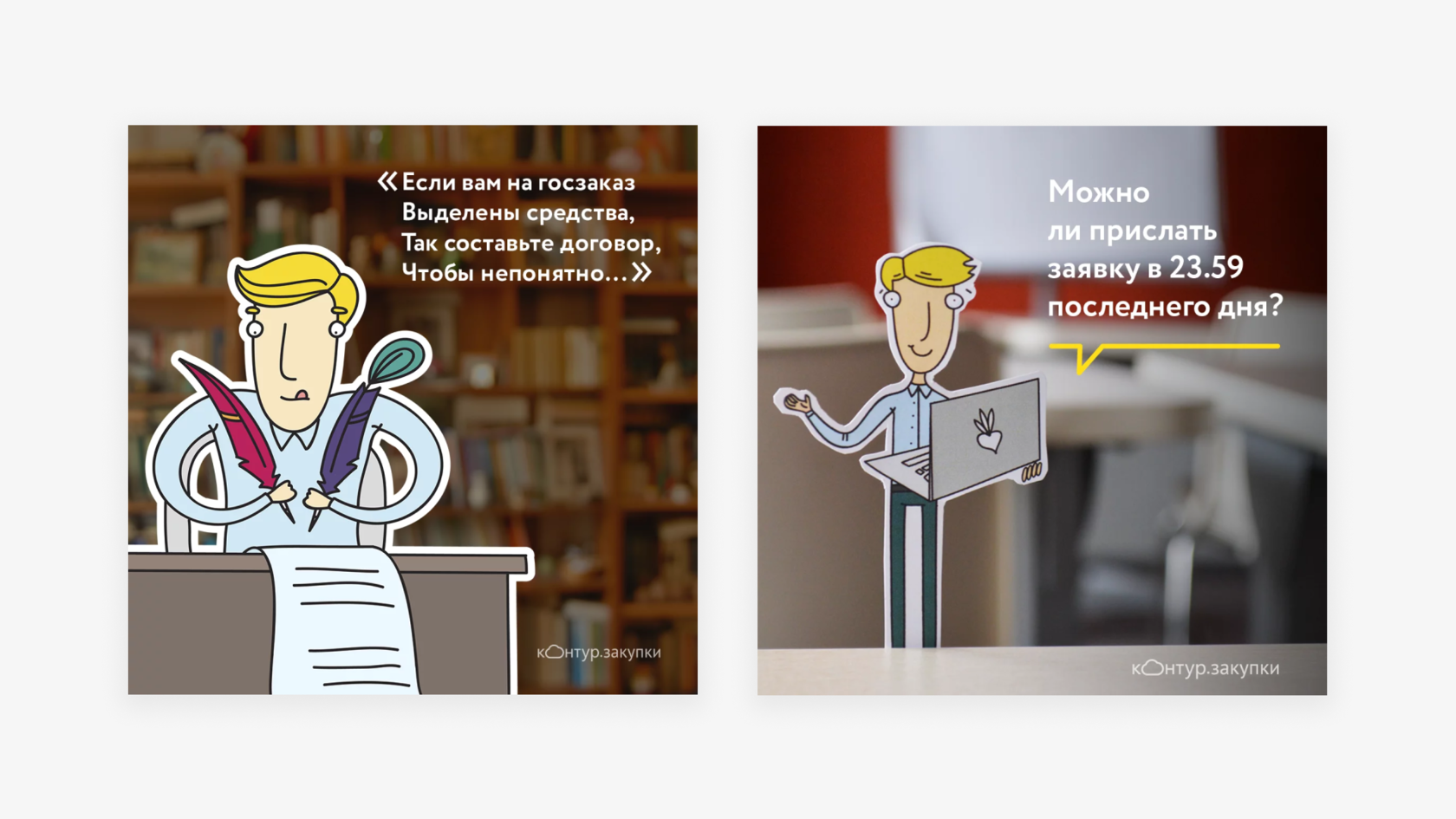
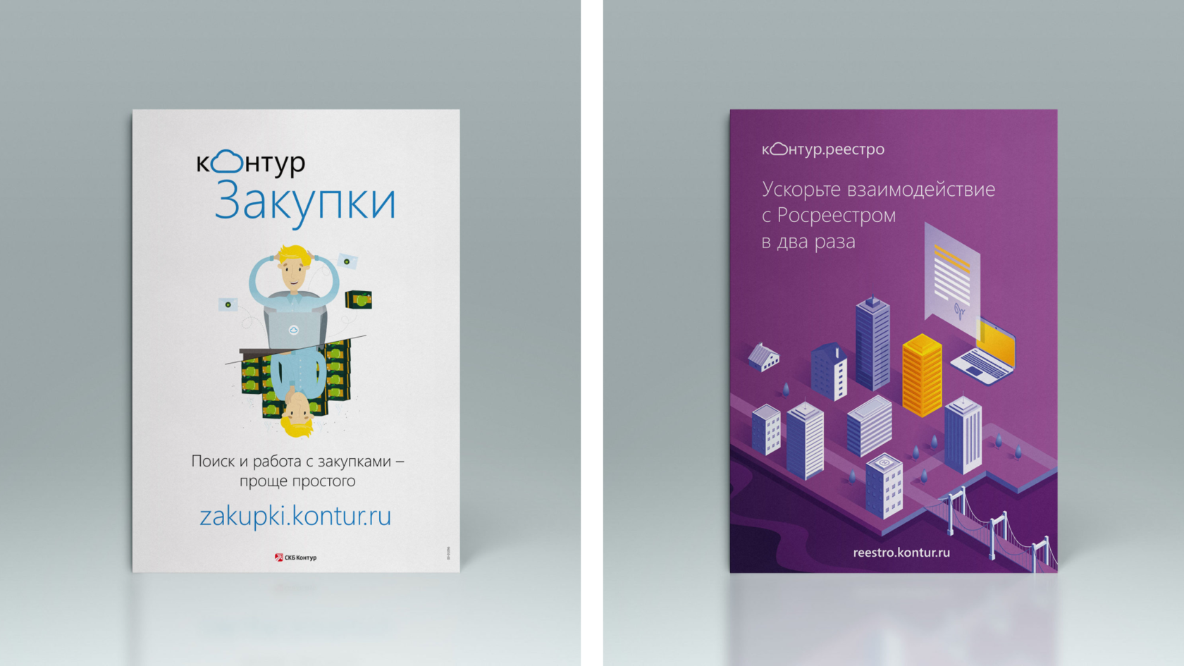
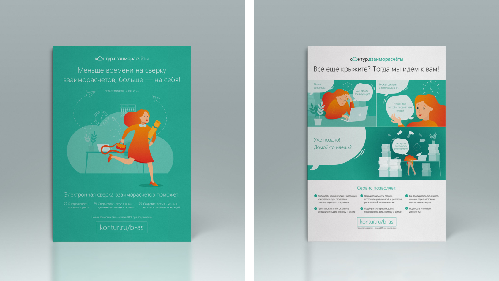
Development of landing pages for Kontur products. The goal is to showcase the advantages and ease of use of the services in line with the company’s brand guidelines.
The layouts were created using Kontur’s design system.
The layouts were created using Kontur’s design system.


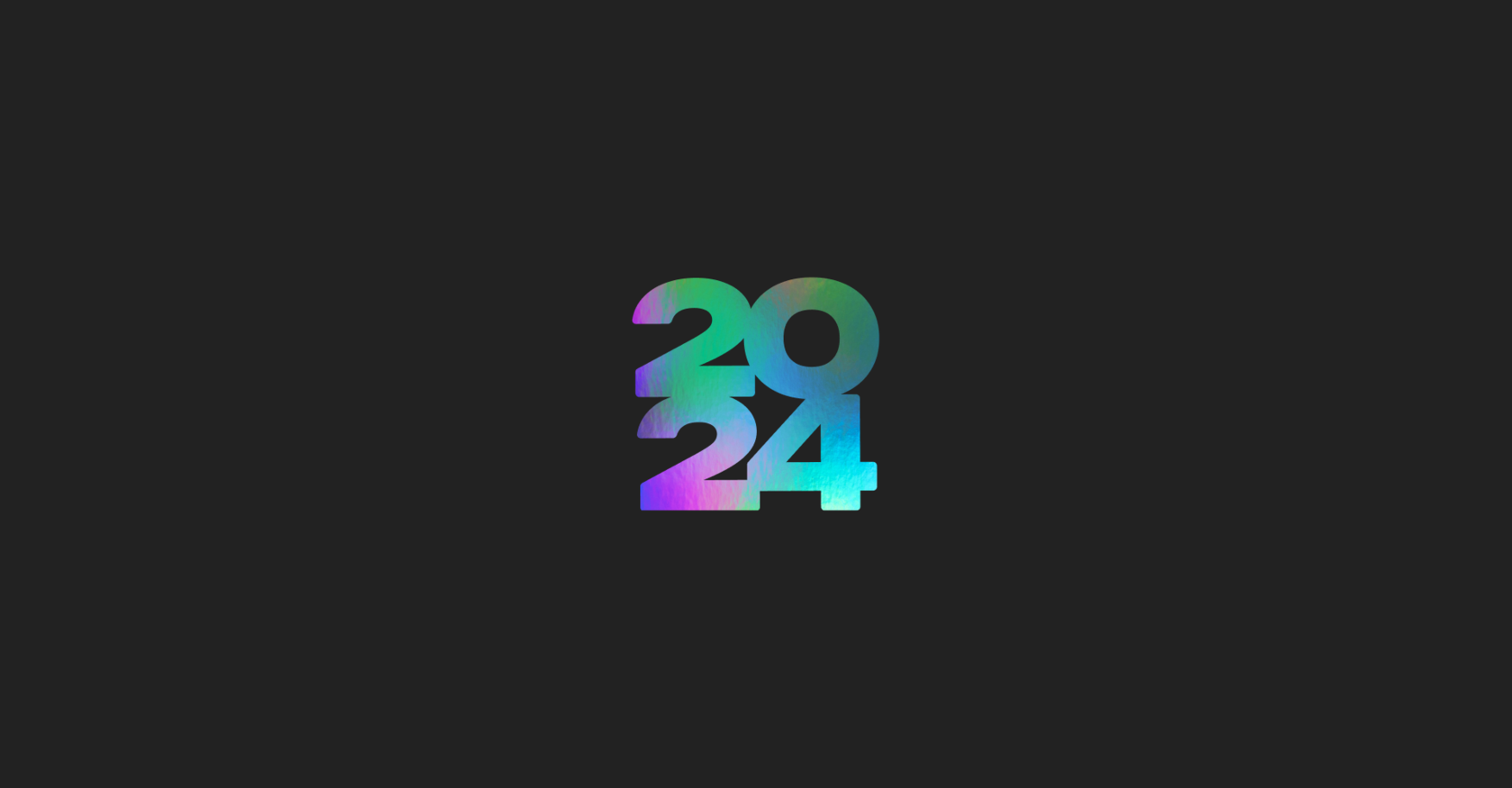
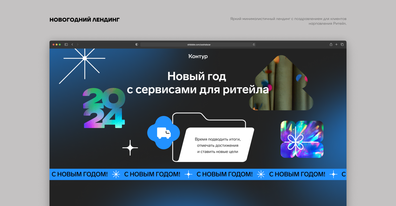
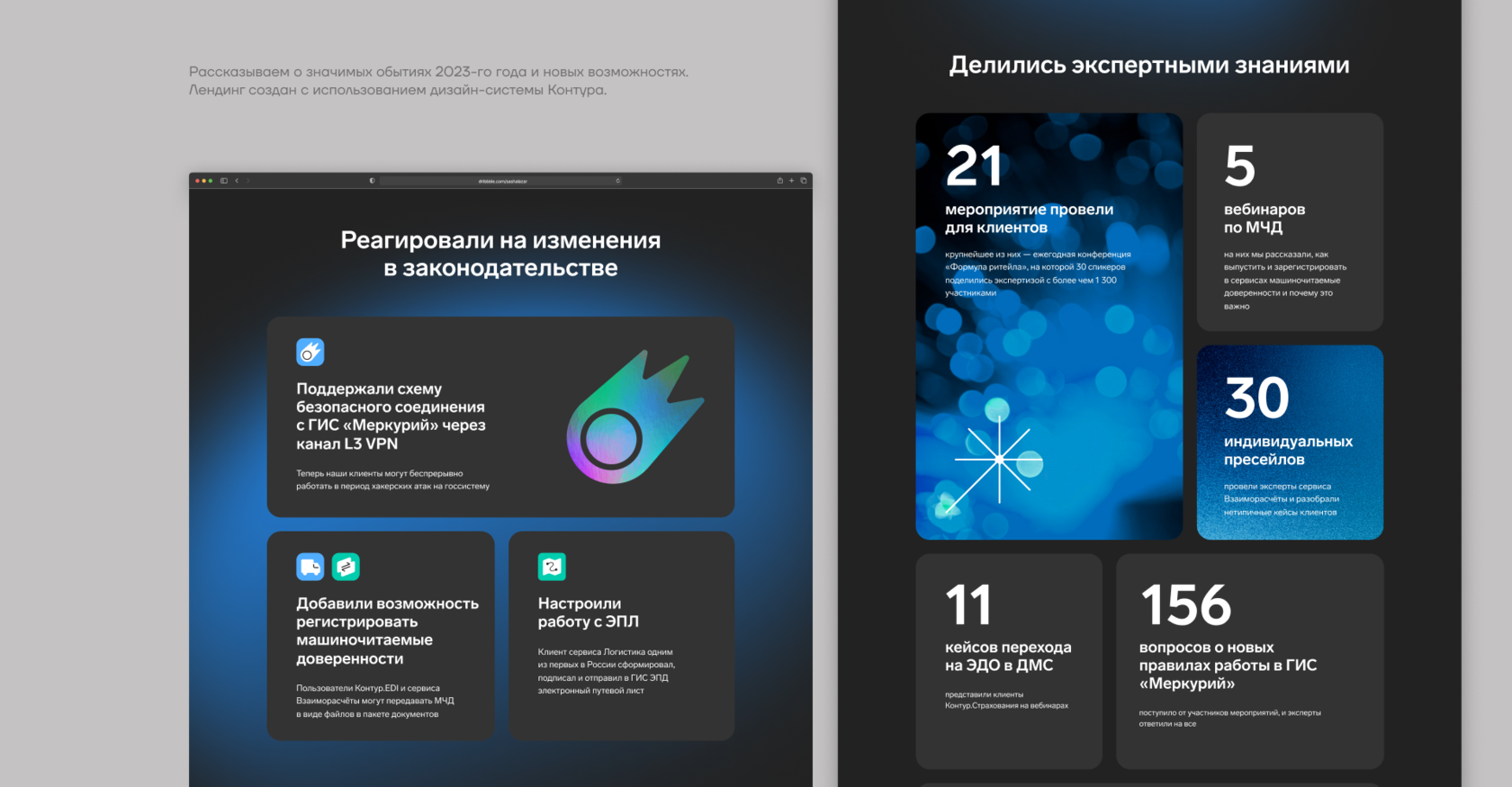
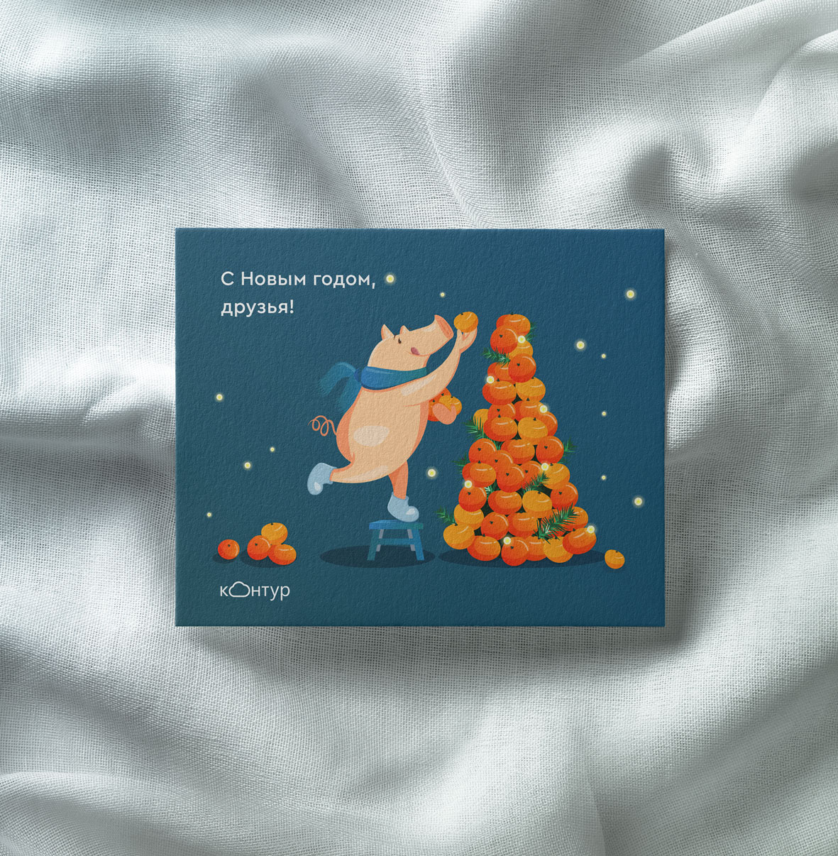
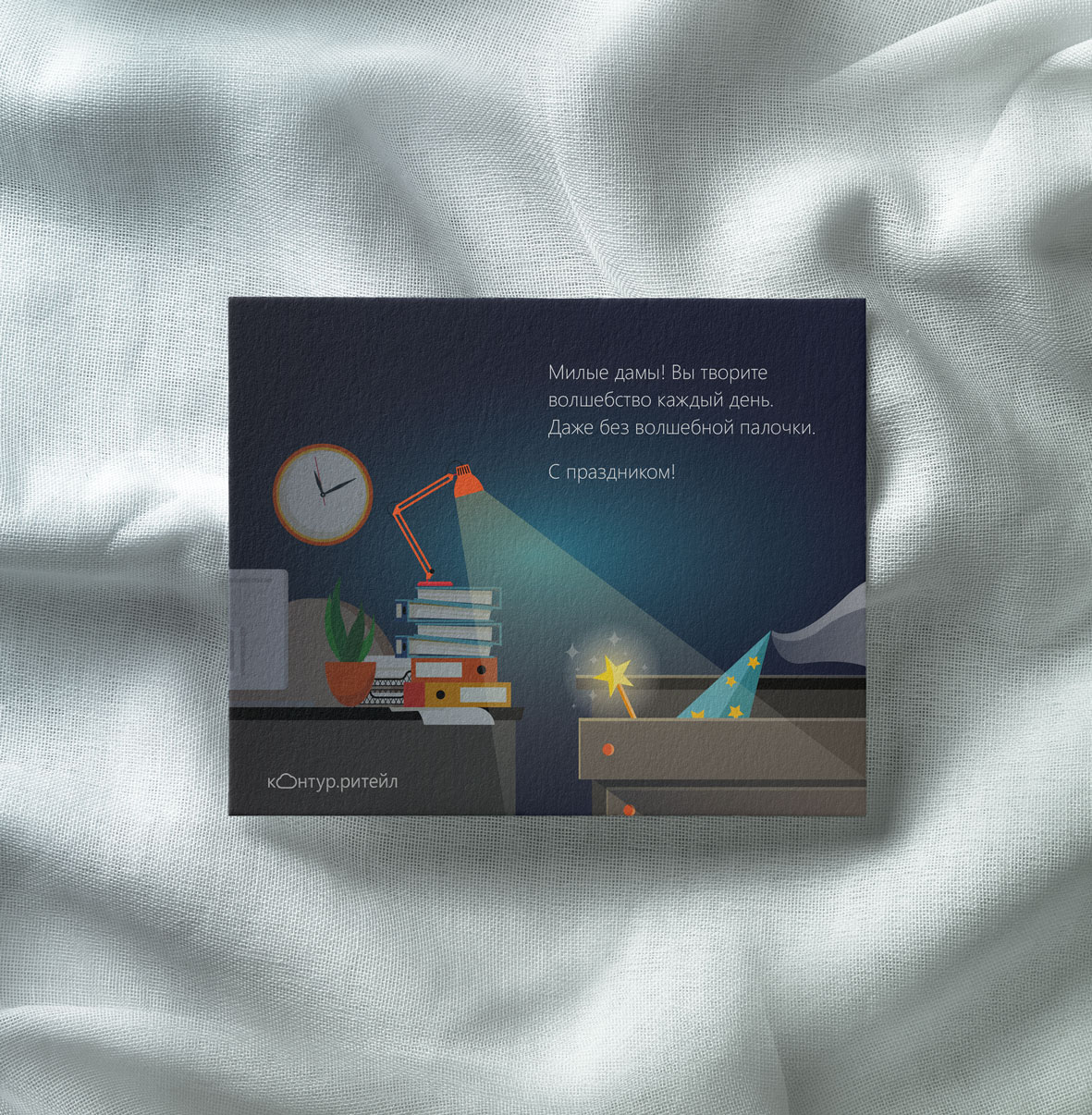
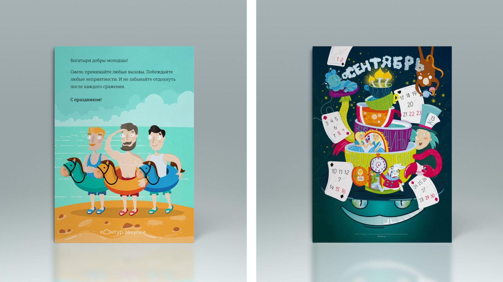
New Year landing page
р.
р.
Development of a New Year’s landing page for the Retail vertical. We shared interesting facts from 2023 and поздравили клиентов.
The layouts were created using Kontur’s design system.
The layouts were created using Kontur’s design system.


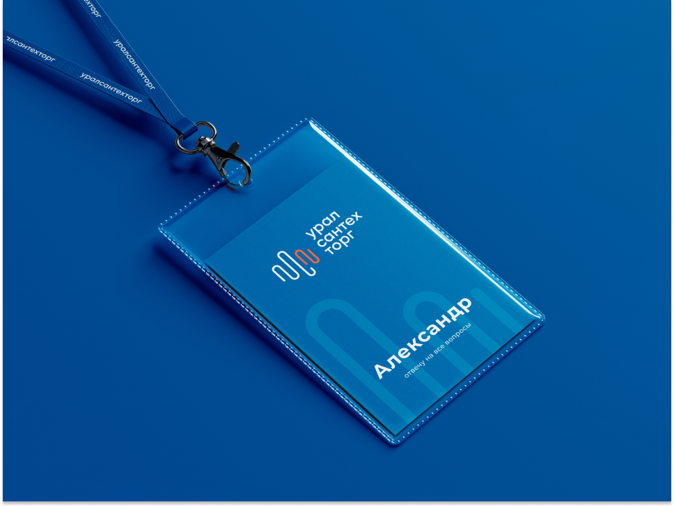
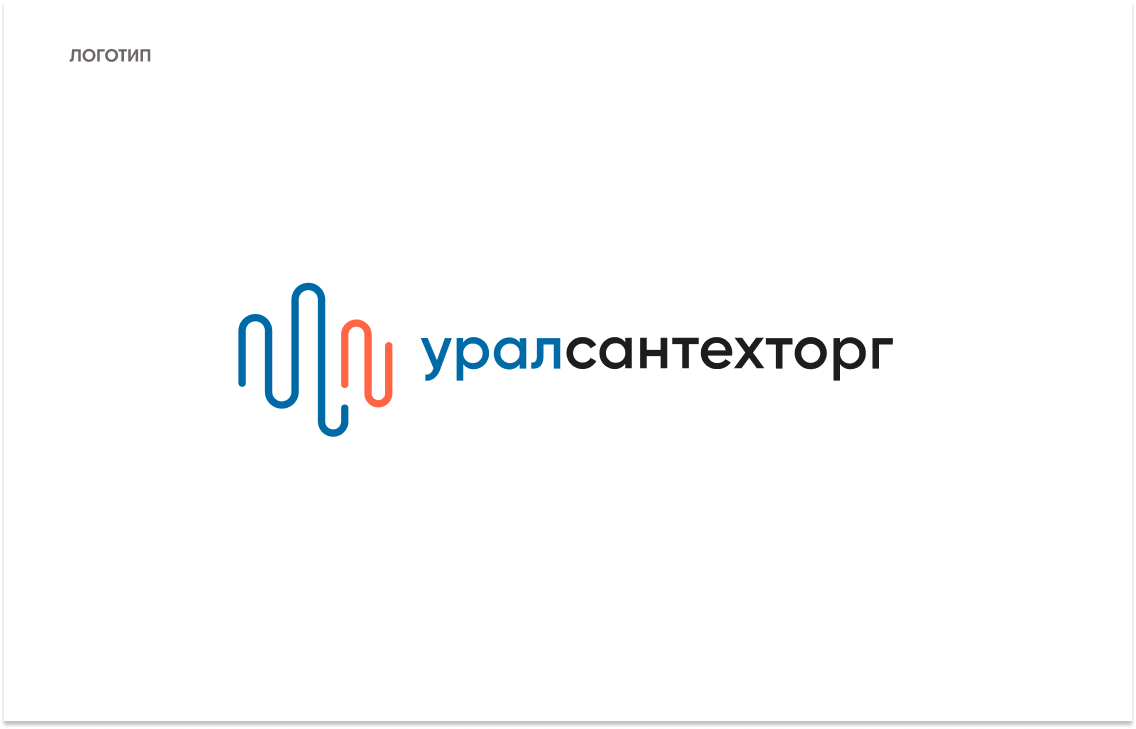
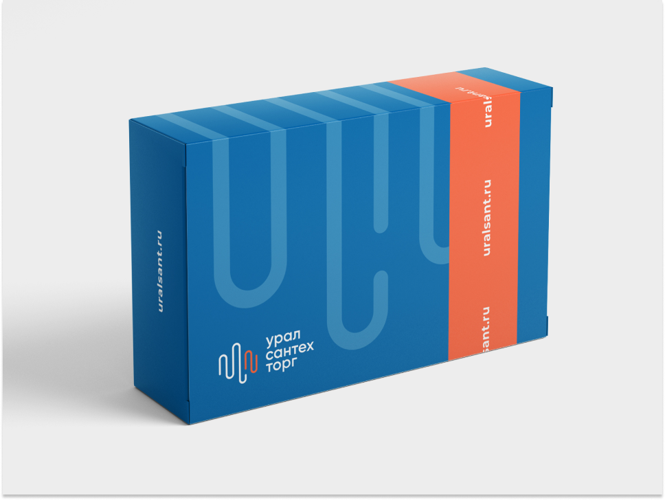
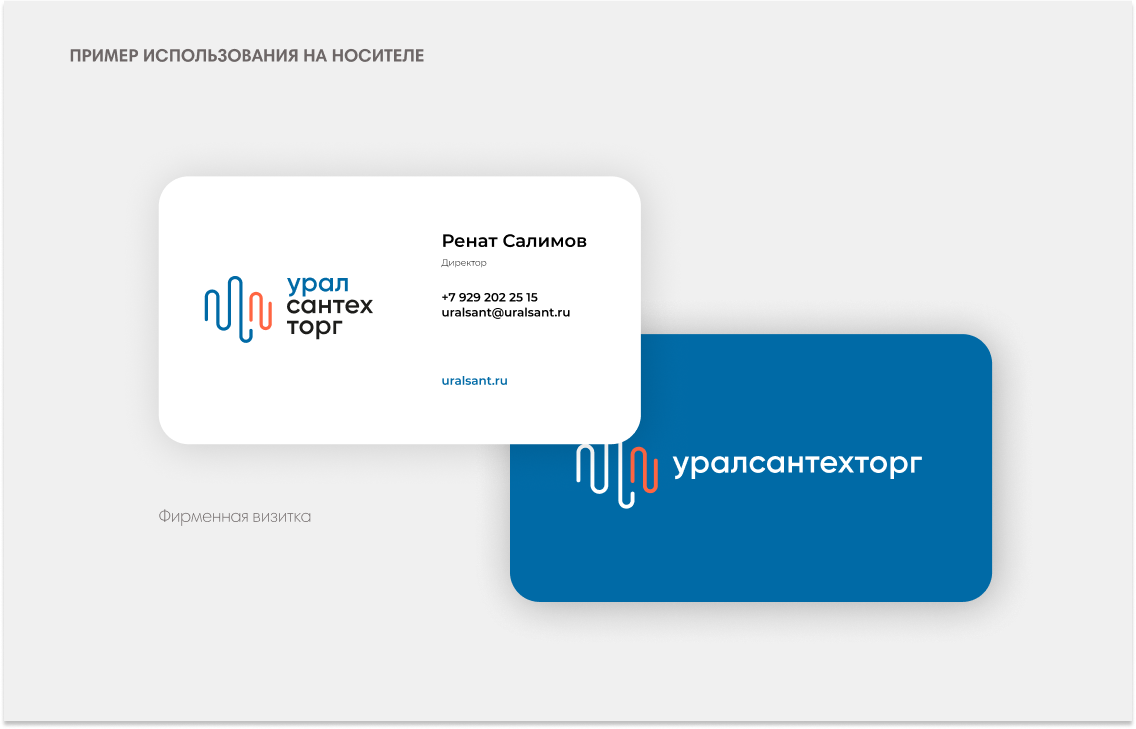
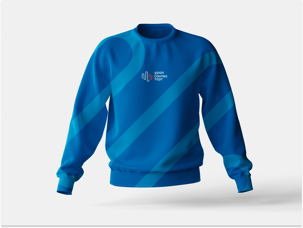
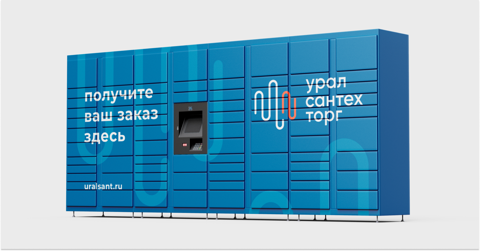
Santechtorg · Plumbing goods shop
р.
р.
Branding & identity


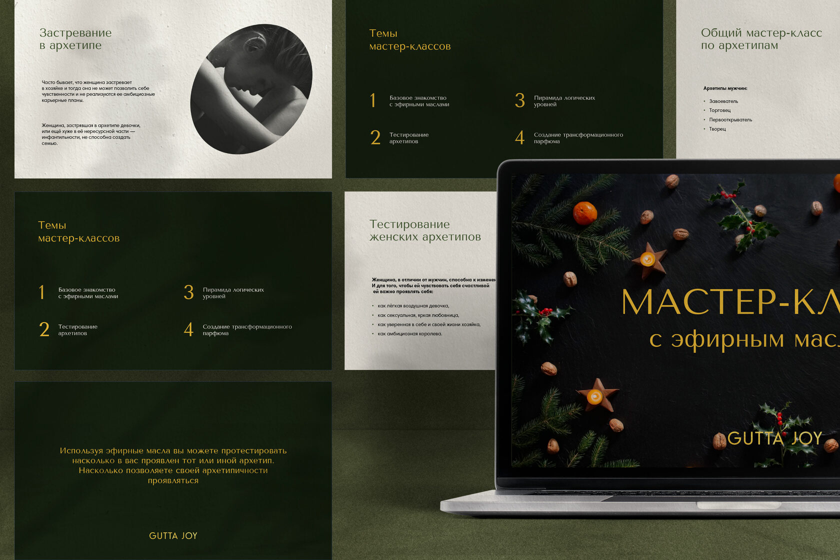
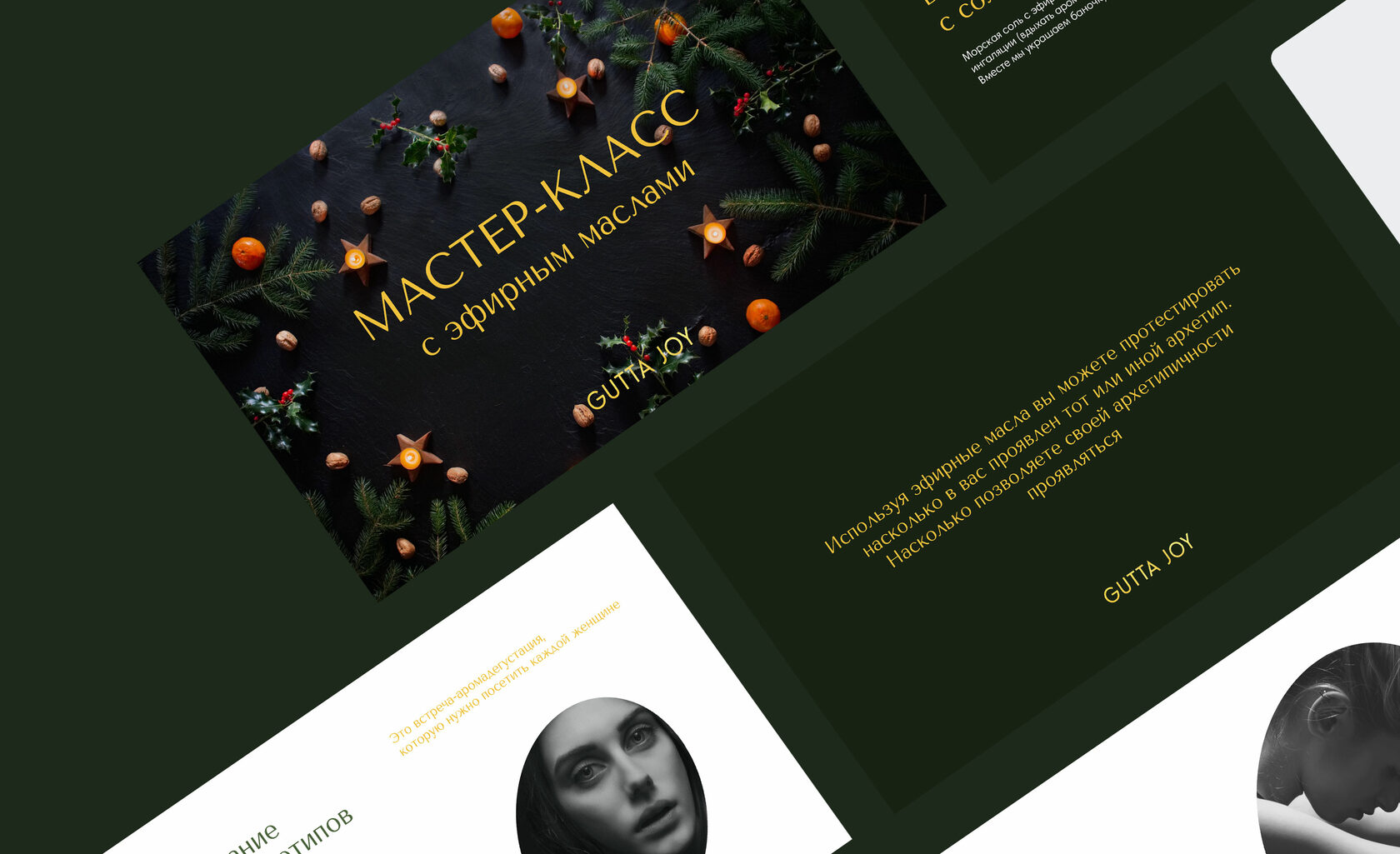
GUTTA JOY · Essential oil class
р.
р.
Presentation design


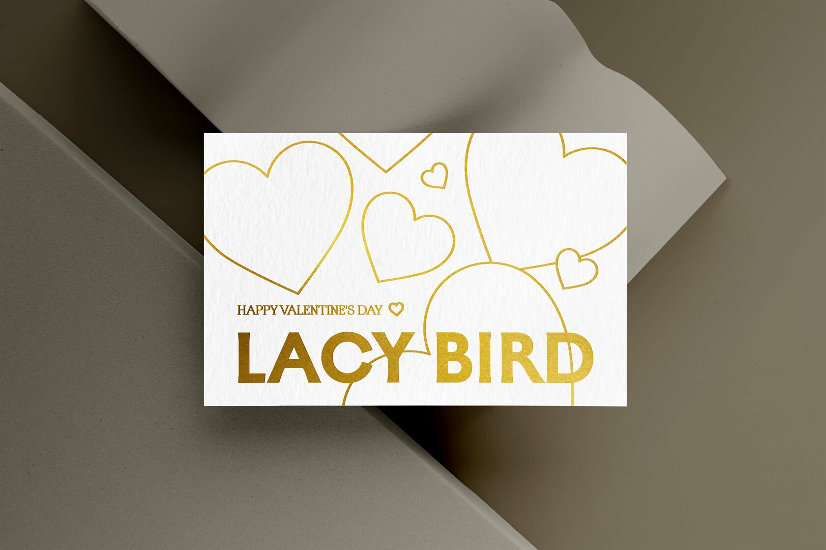
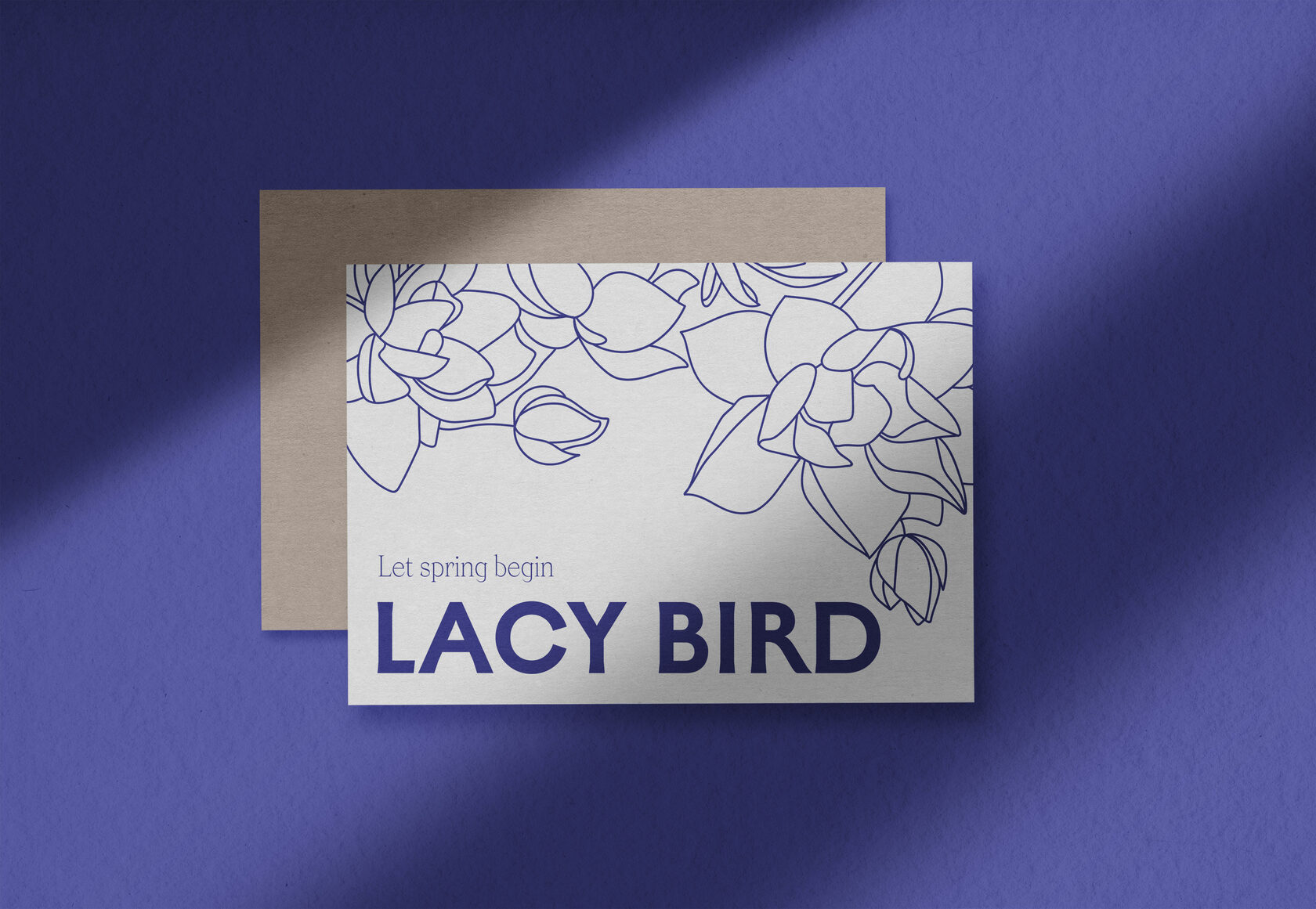
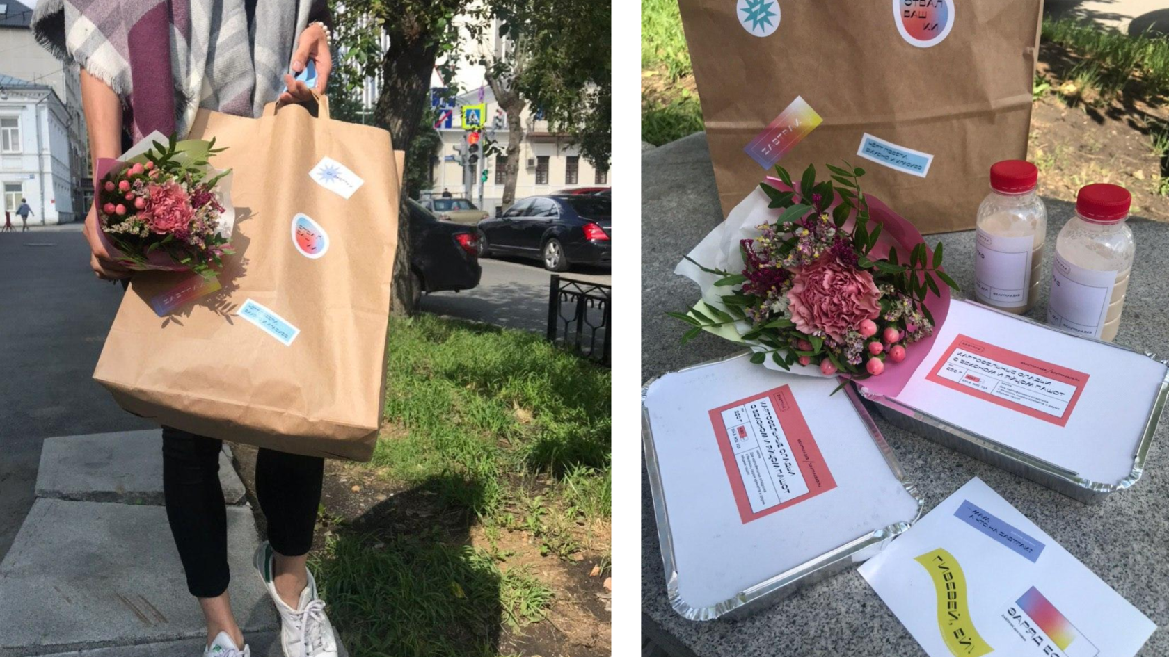
LACY BIRD · Floristic studio
р.
р.
Cards


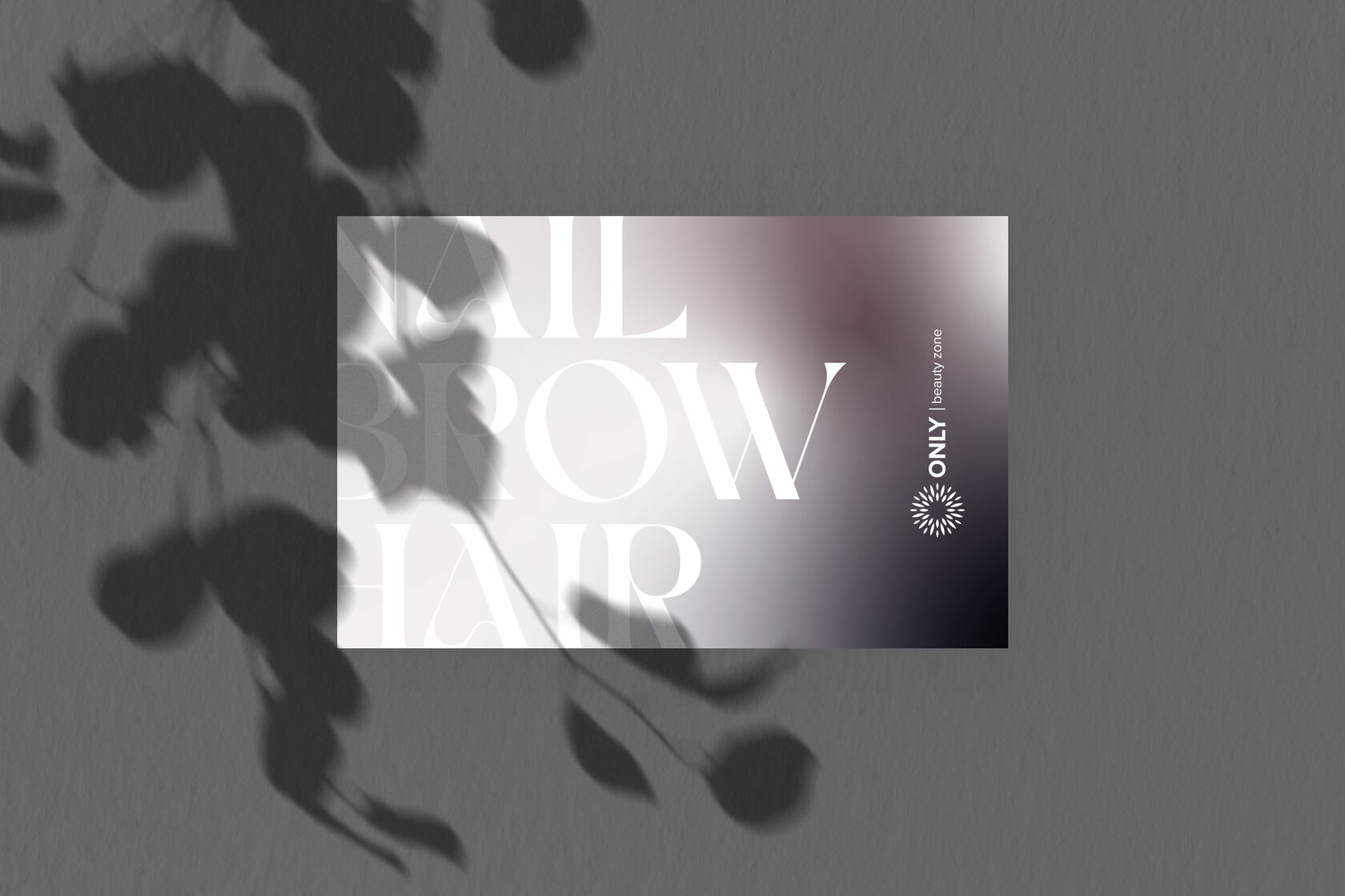
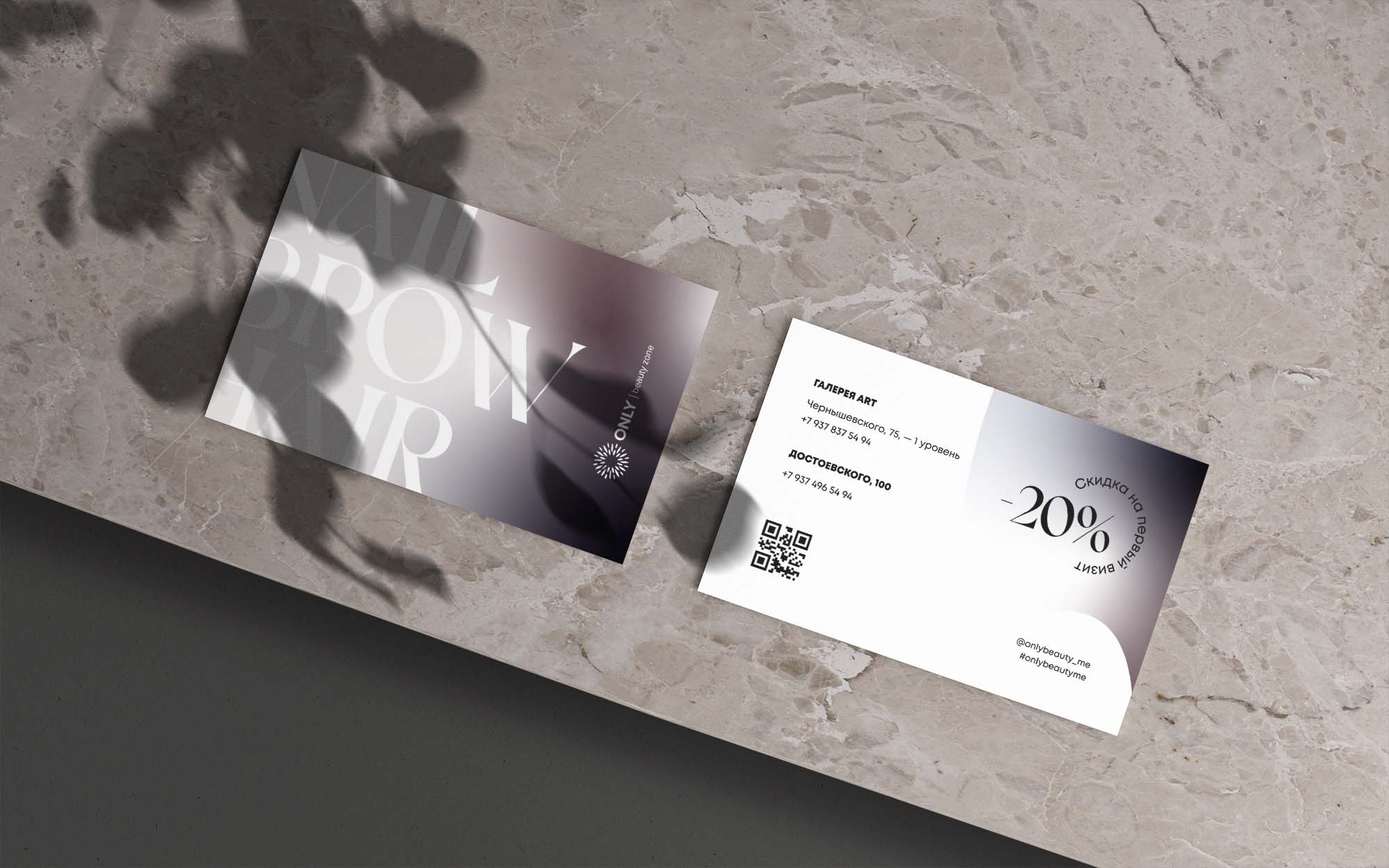
ONLY · Beauty studio
р.
р.
Cards


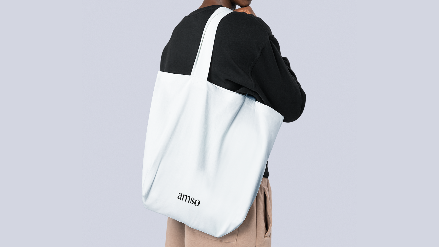
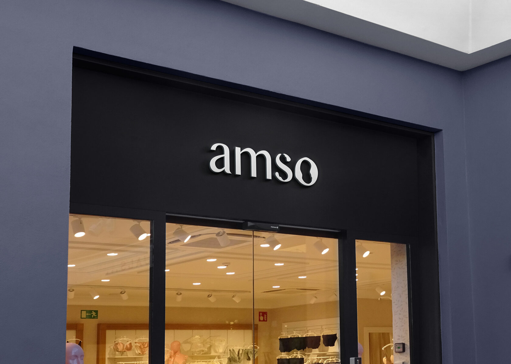
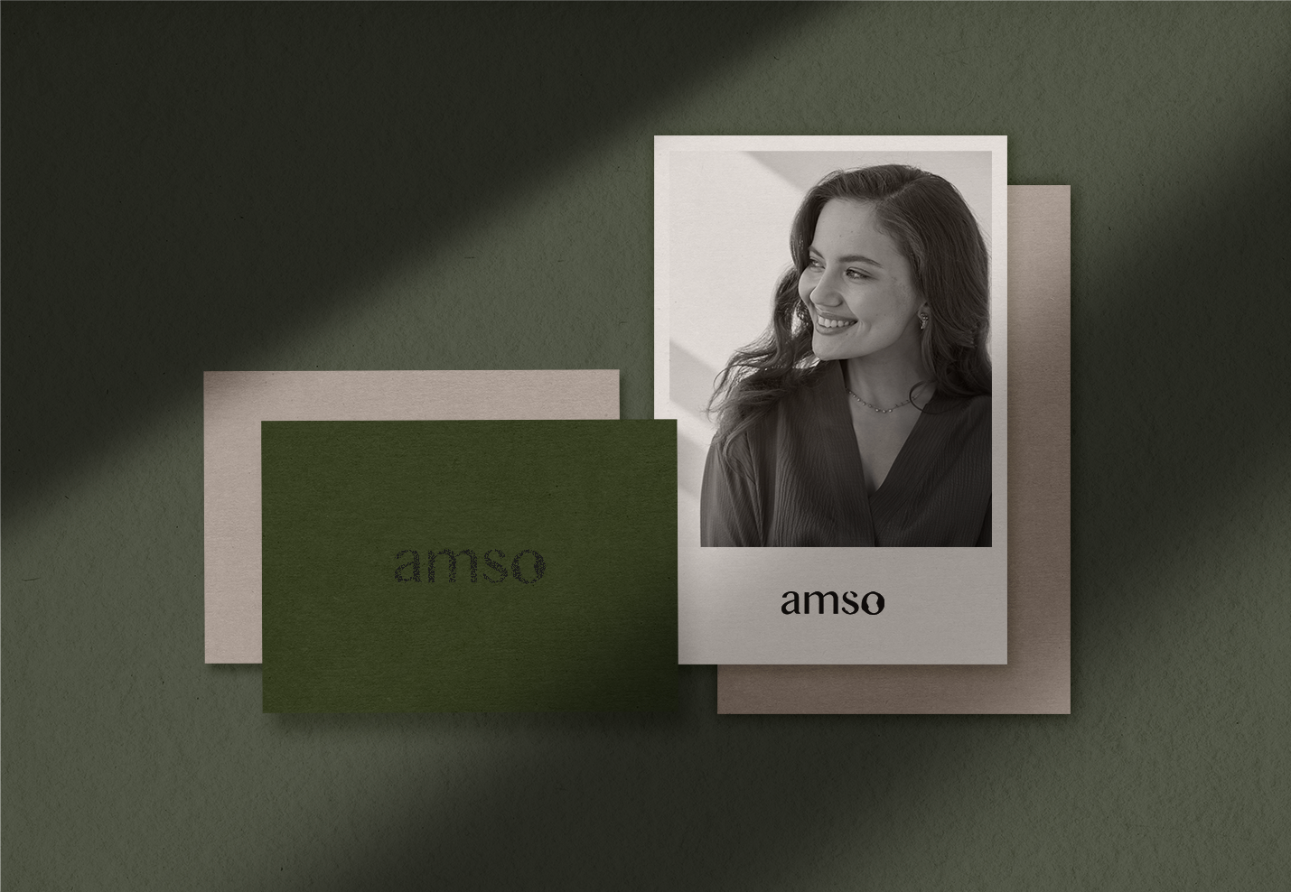
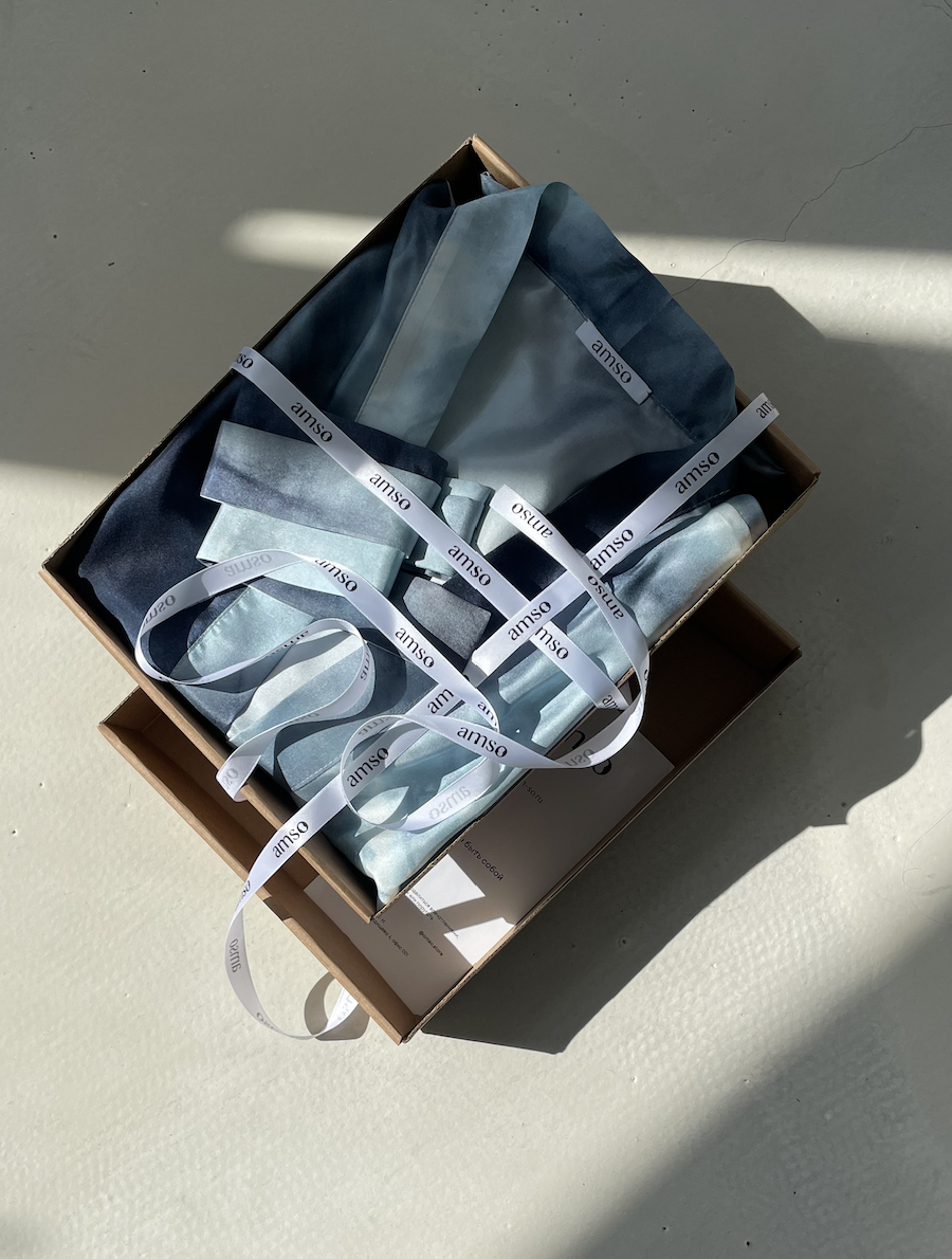
Amso · Silk and cashmere brand
р.
р.
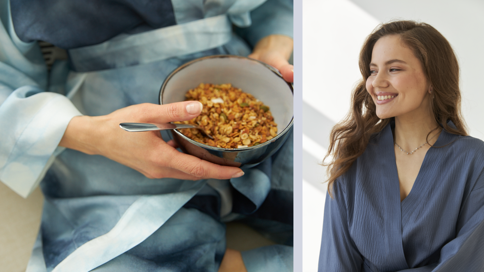
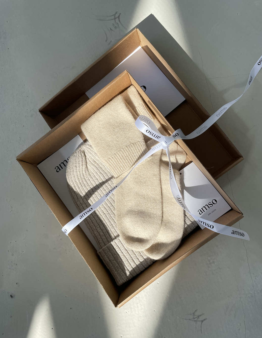
Российский бренд женской одежды с собственным производством.
Изделия из 100% шёлка, вискозы и кашемира. База и дизайн, который будет актуален долгое время.
Какая вы сегодня? Amso поможет передать ваше настроение или поменять его,
если захотите. Вы прекрасны в любых своих проявлениях.
A Russian brand of women's clothing with its own production.
Products made of silk 100%, viscose and cashmere. A base and a design that will be relevant for a long time.
What are you like today? Amso will help to convey your mood or change it
if you want. You are beautiful in any of your manifestations.


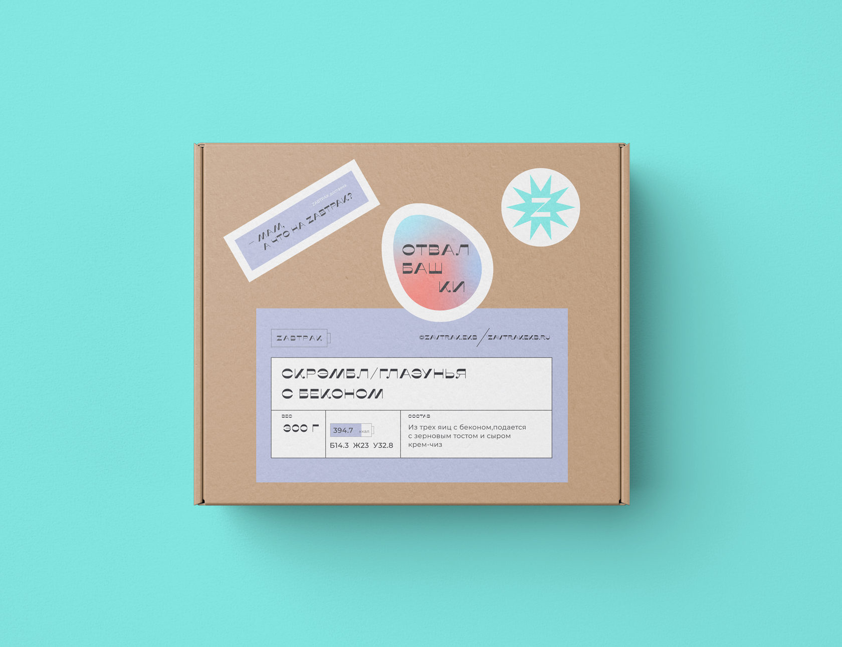
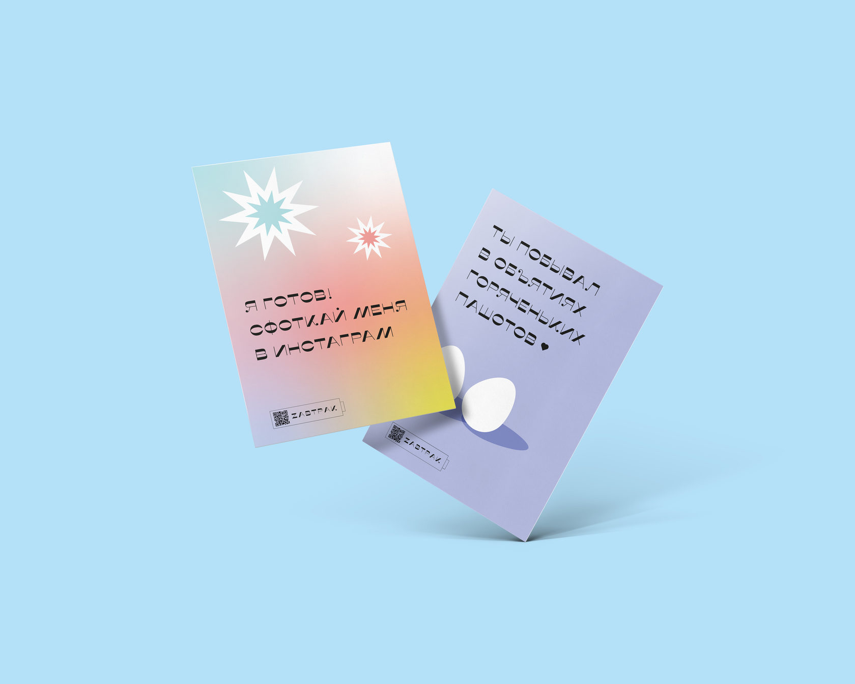
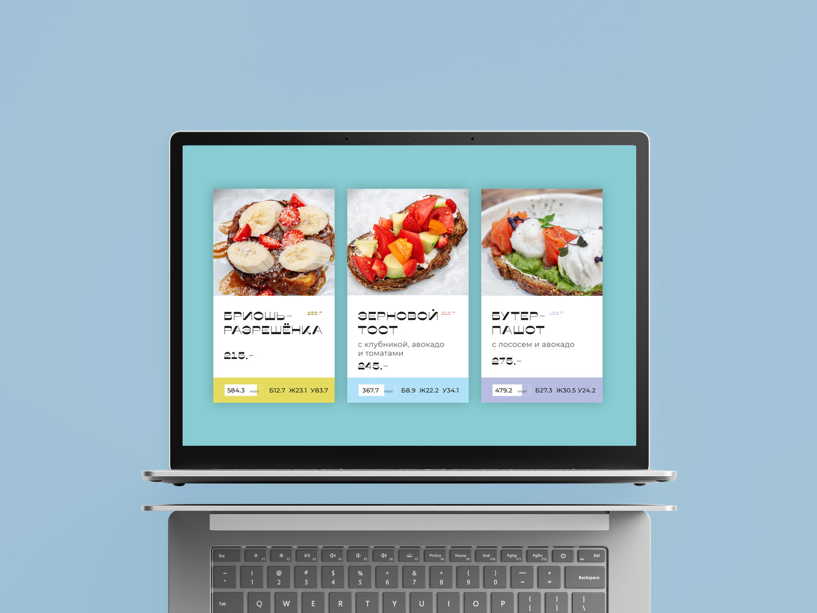
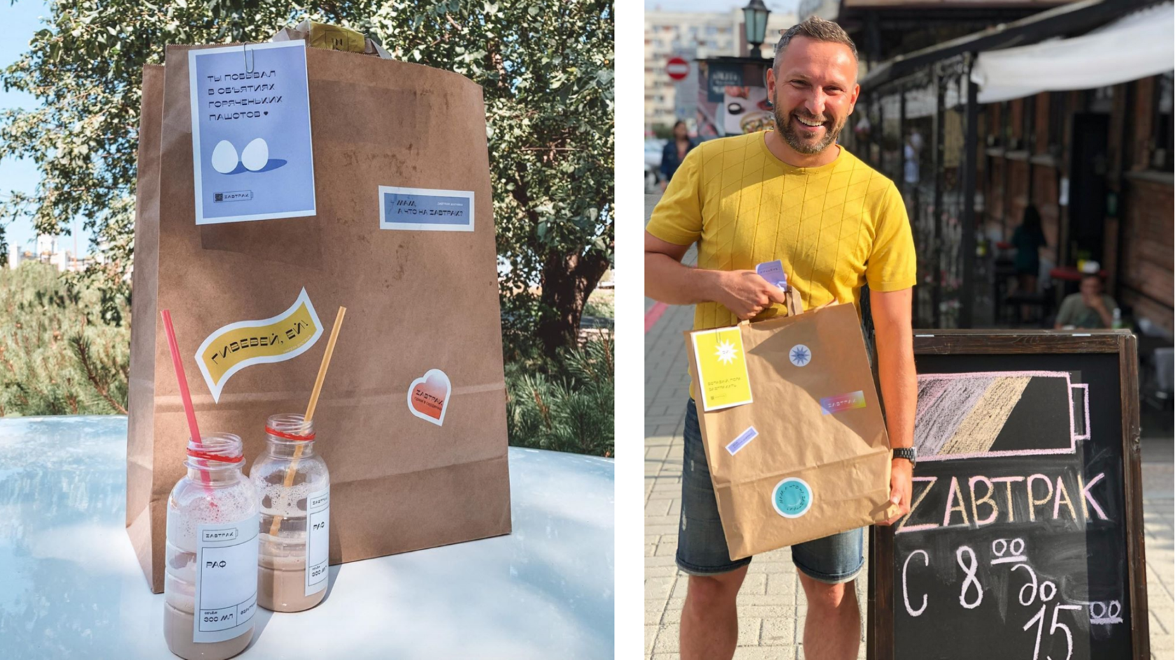
Zavtrak · Beautiful breakfast delivery
р.
р.
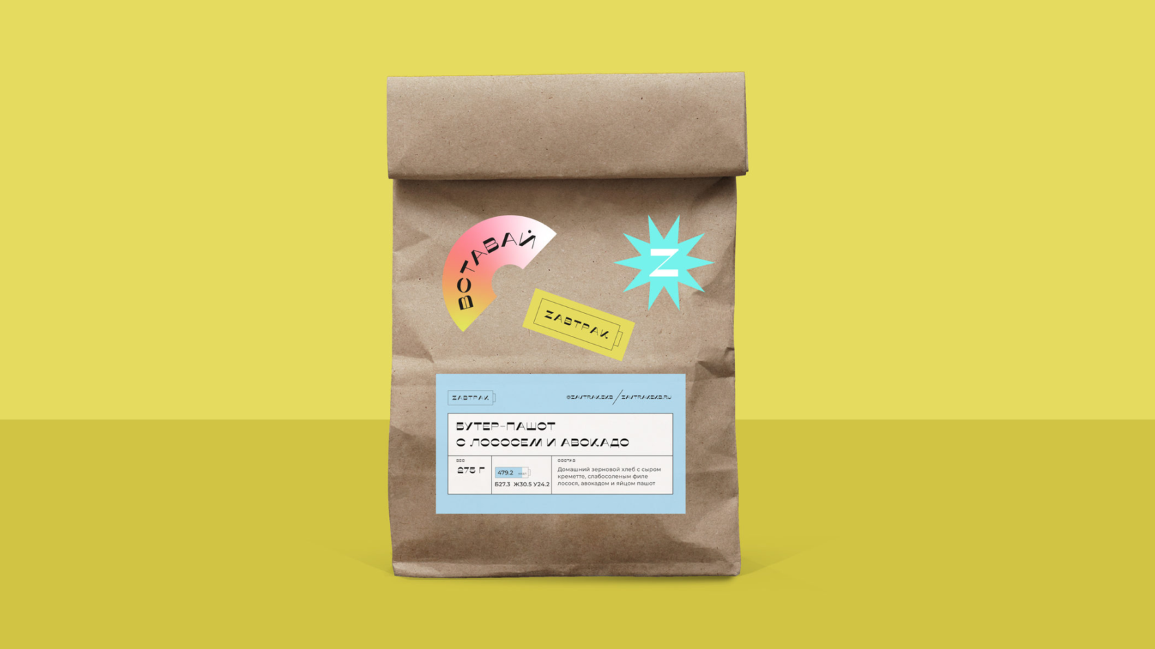
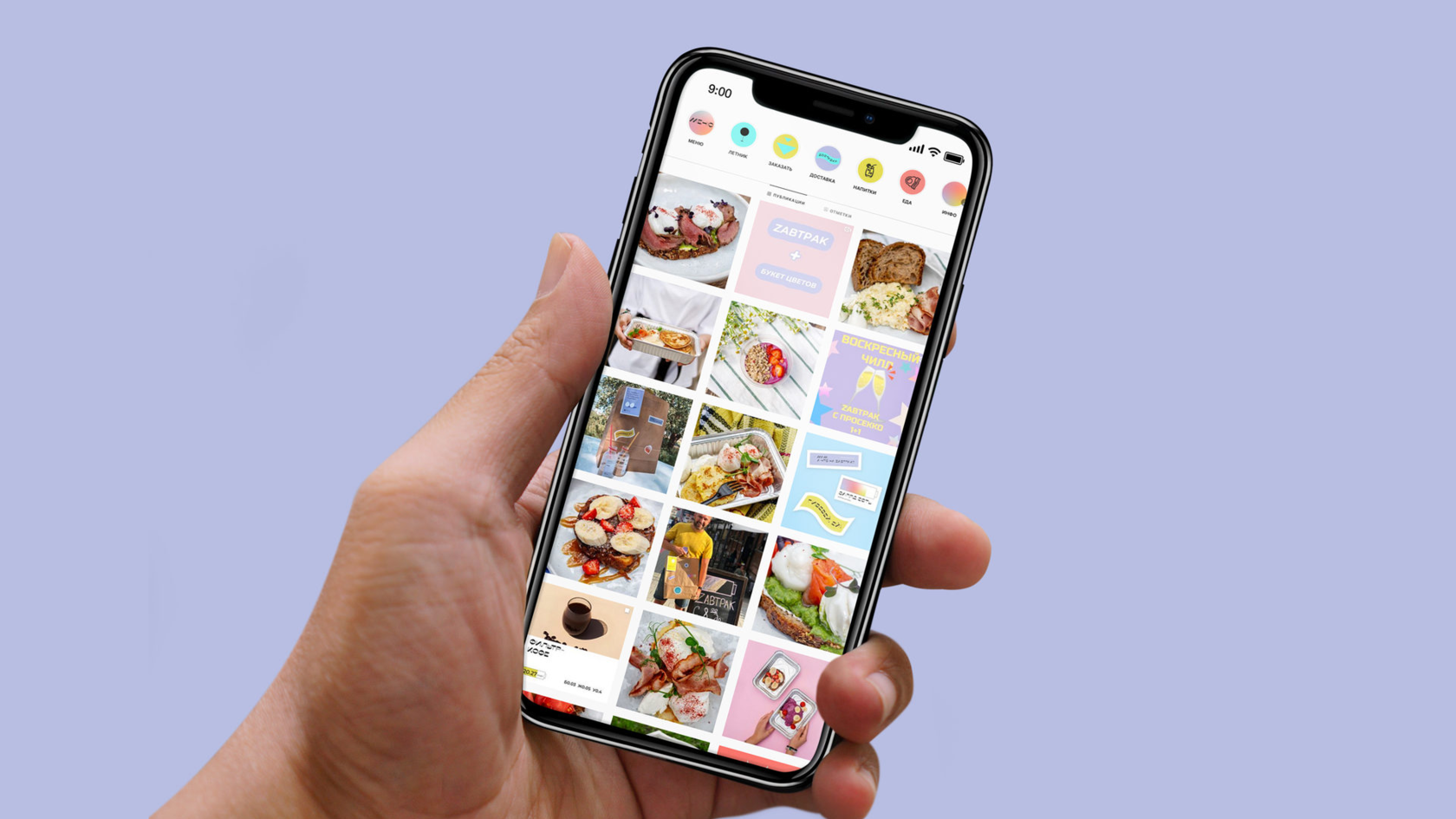
Яркие, красивые, свежие завтраки врываются в твое утро и не оставляют равнодушными!
Bright, beautiful, fresh breakfasts break into your morning and do not leave you indifferent!
Bright, beautiful, fresh breakfasts break into your morning and do not leave you indifferent!


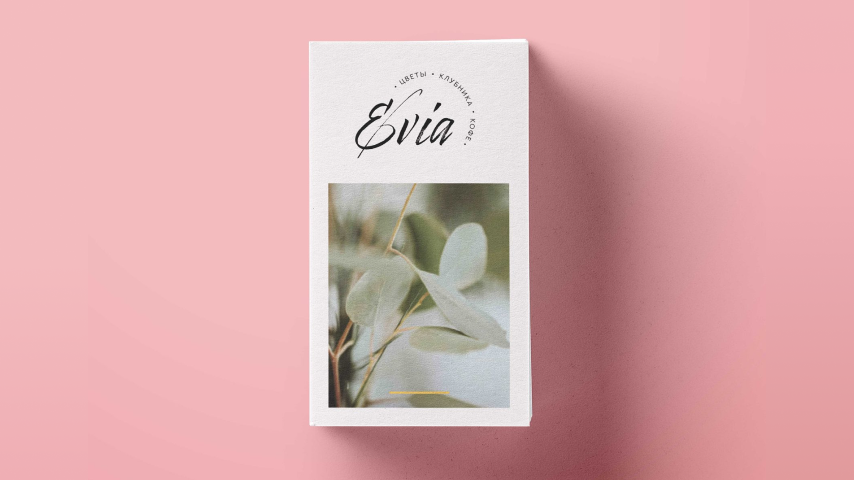
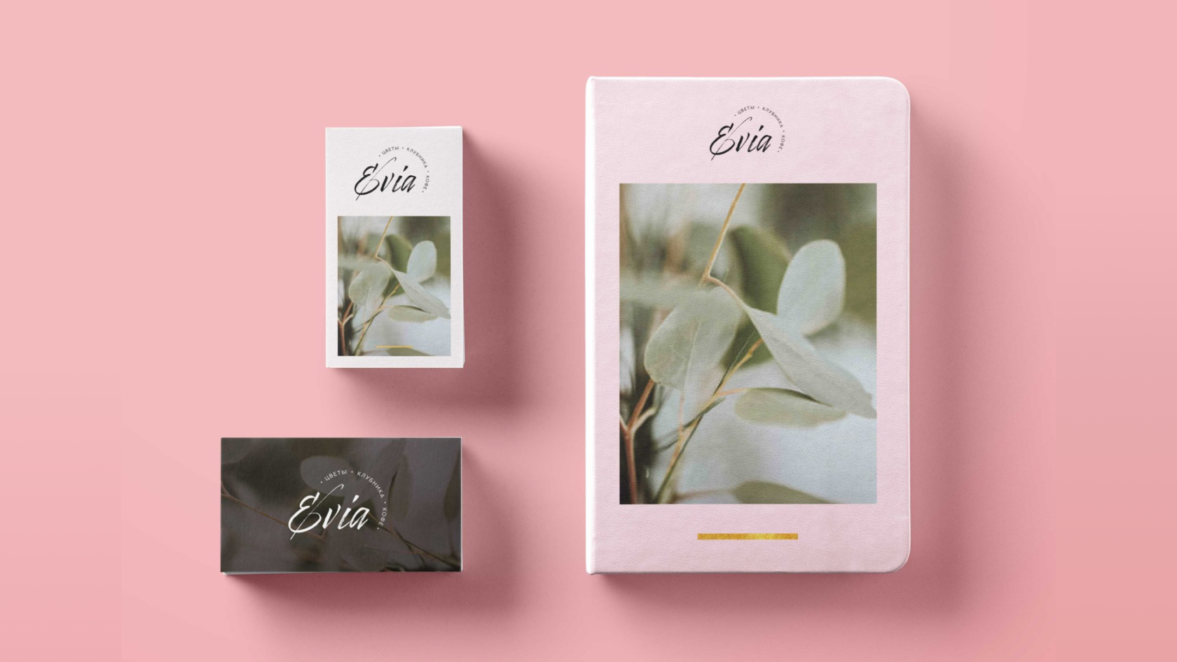
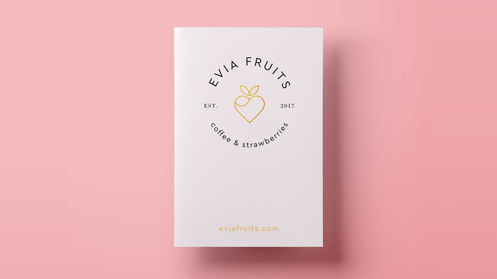
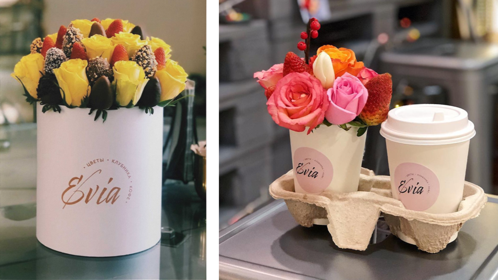
Evia · Coffee & flowers shop
р.
р.
Нежной «девочковой» кофейне — нежный логотип и пастельные цвета.
For delicate "girly" coffee shop — delicate logo and pastel colors.
For delicate "girly" coffee shop — delicate logo and pastel colors.


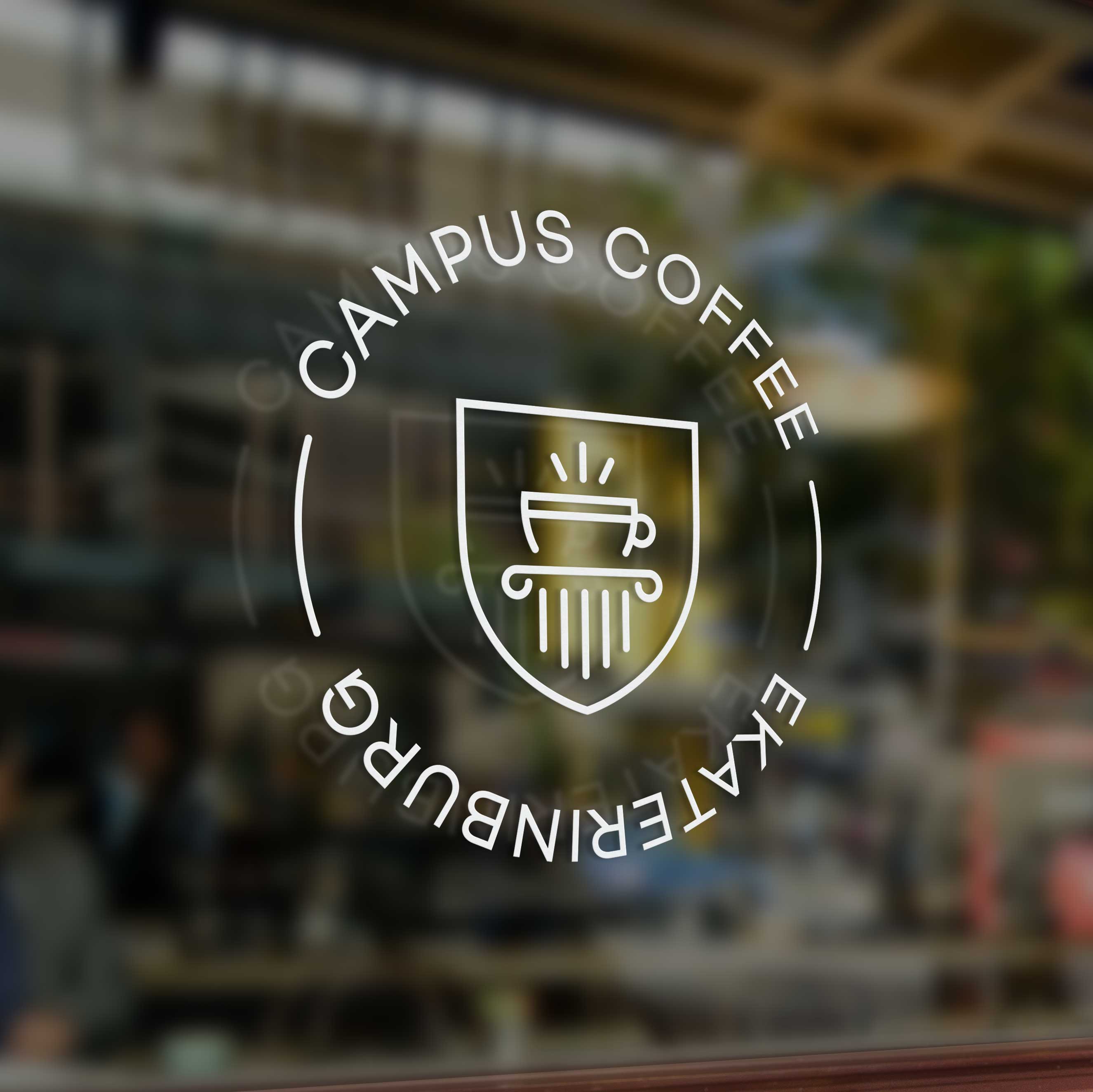
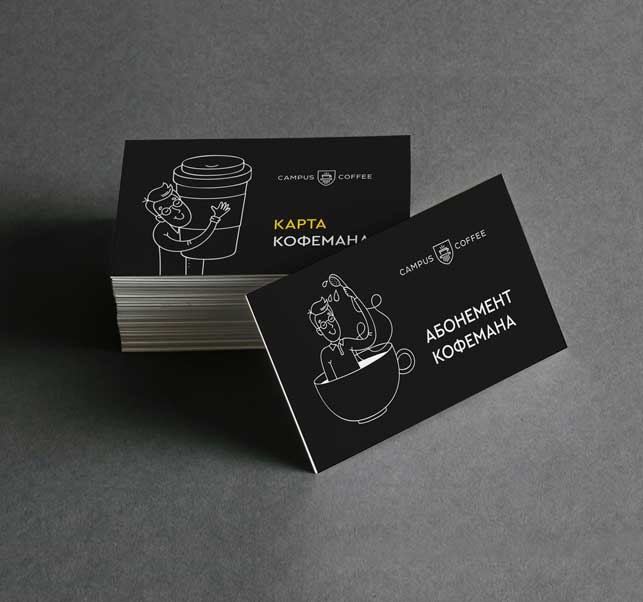
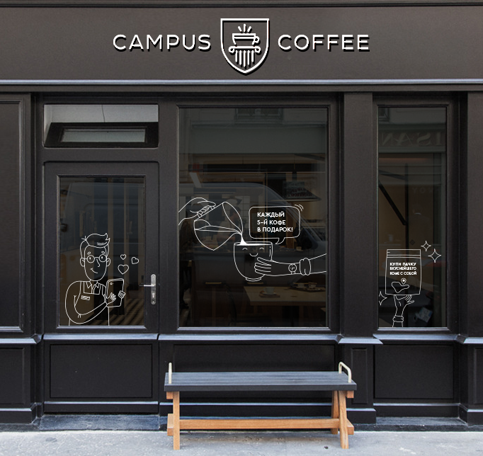
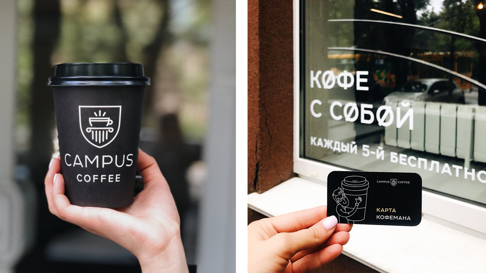
Campus · Coffee shop
р.
р.
Кофейня расположена рядом с Университетом и логотип поддерживает
эту тематику. Простой, лаконичный, ненавязчивый стиль иллюстраций
помогает отвлечься от мыслей об учёбе тем, кто хочет отдохнуть,
и не мешает тем, кто хочет поучиться или поработать.
The coffee shop is located next to the University and the logo supports this topic. Simple, concise, unobtrusive style of illustrations helps to distract from the thoughts of studying for those who want to relax, and it does not interfere with those who want to learn or work.


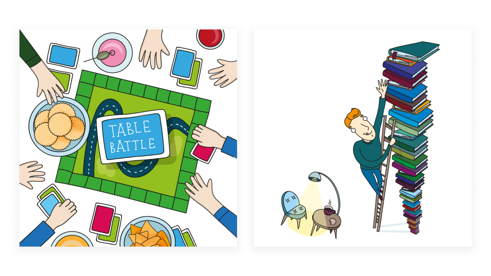
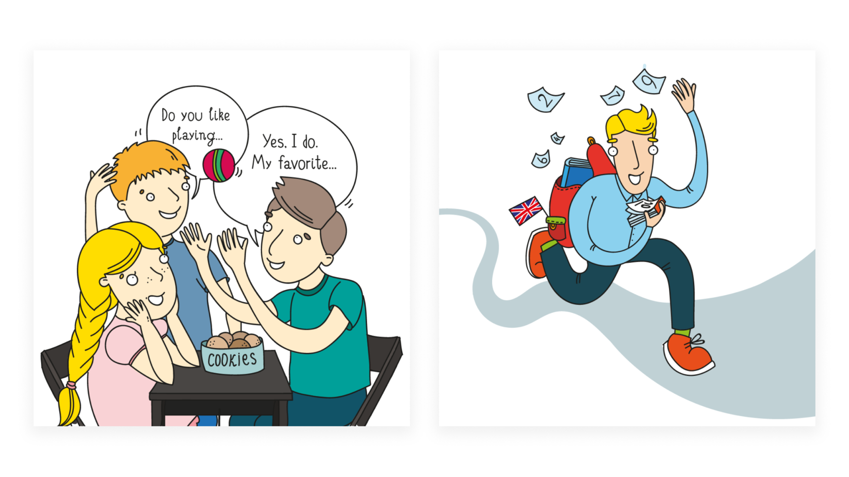
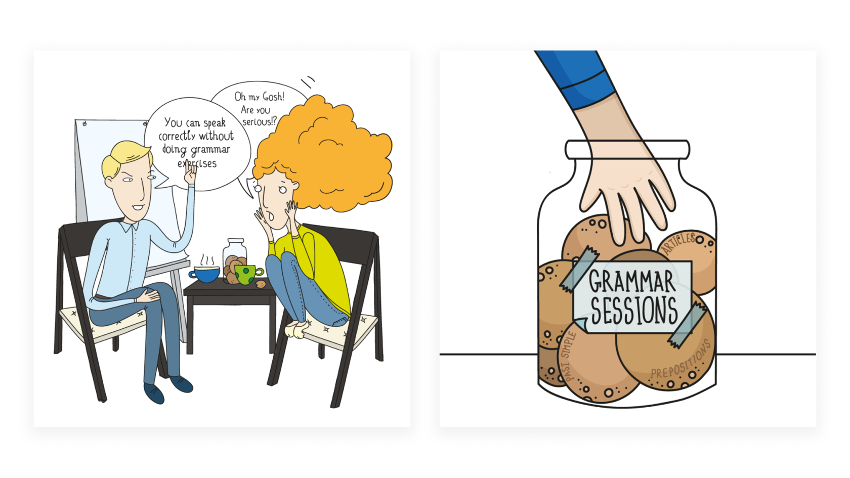
Homy Chat · English speaking club
р.
р.
Основная идея клуба — разговорить людей, избавить их от зажимов
и раскрепостить. Поэтому мы решили взять неформальную графику,
весёлых персонажей, ситуации из жизни и забавные диалоги.
Логотип в этой же стилистике — баббл — призывает вливаться и начинать
общаться, создавая впечатление изучения английского «без боли».
The main idea of the club is to make people talk and get rid of the clamps and liberate. So we decided to take an informal schedule, funny characters, life situations and funny dialogues. The logo in the same style — bubble-encourages you to join and start communicate, giving the impression of learning English "without pain".


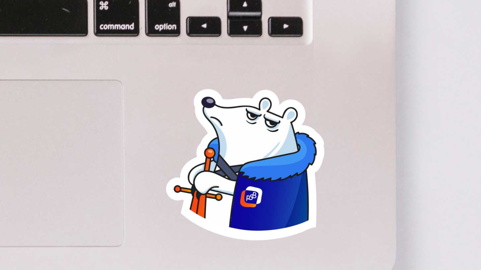
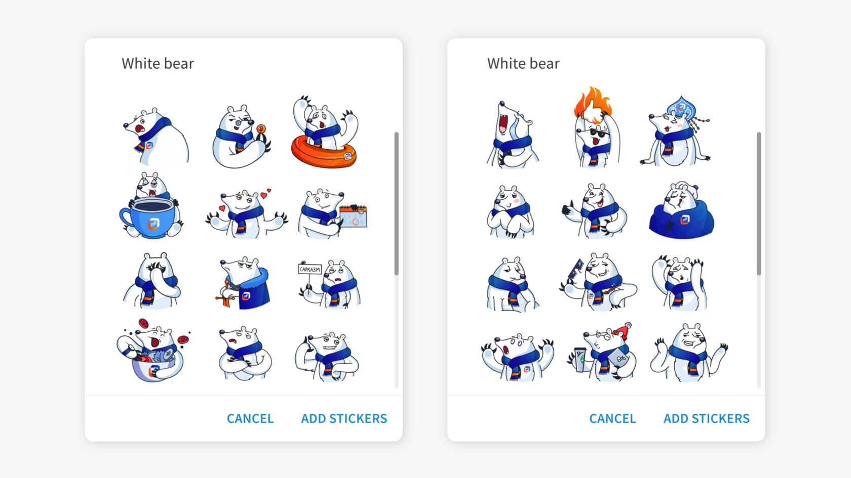
PSB Bank · Telegram stickers Bears
р.
р.
Stickerpack for Telegram


SKB Kontur · Love is...
р.
р.
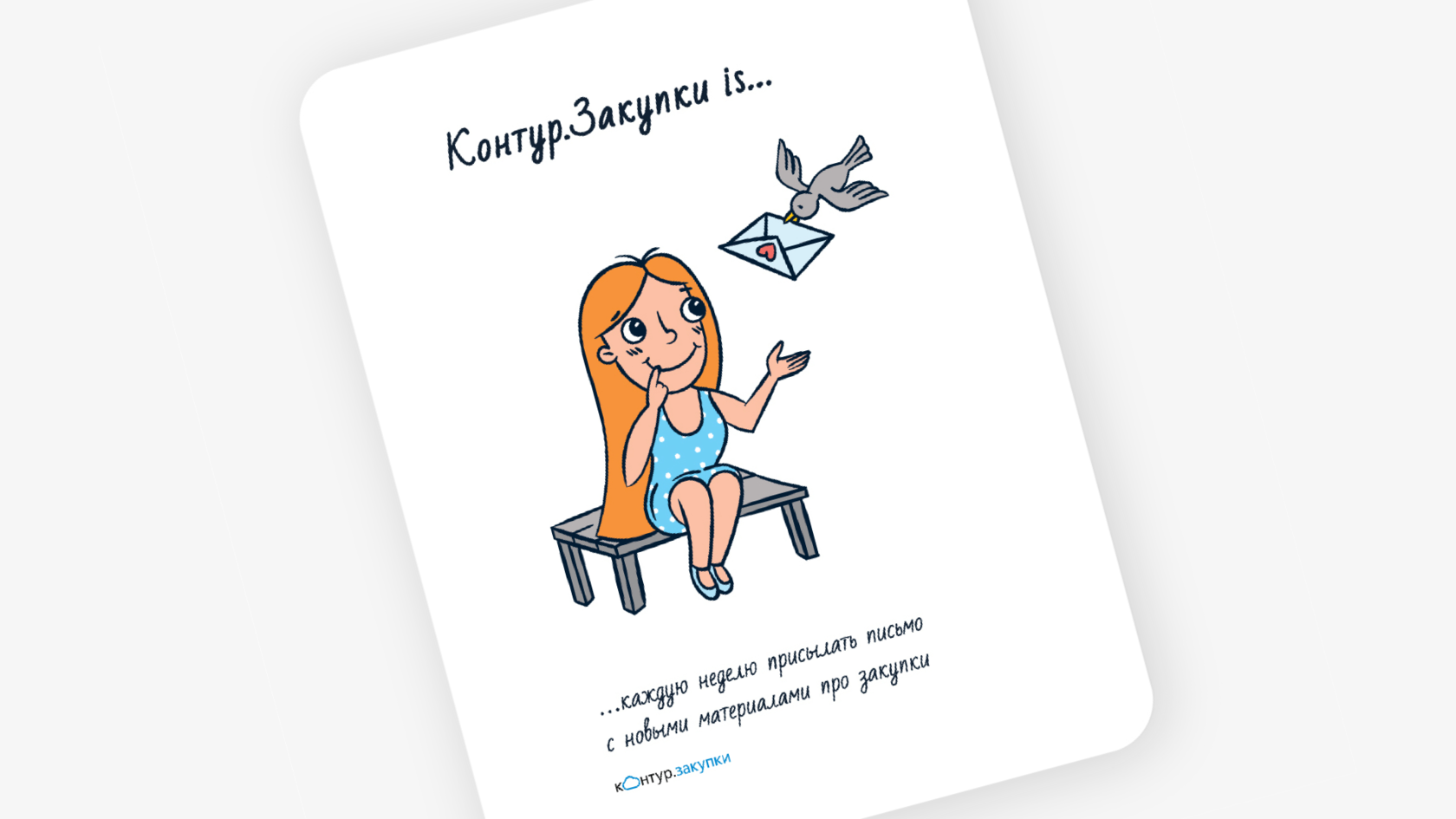
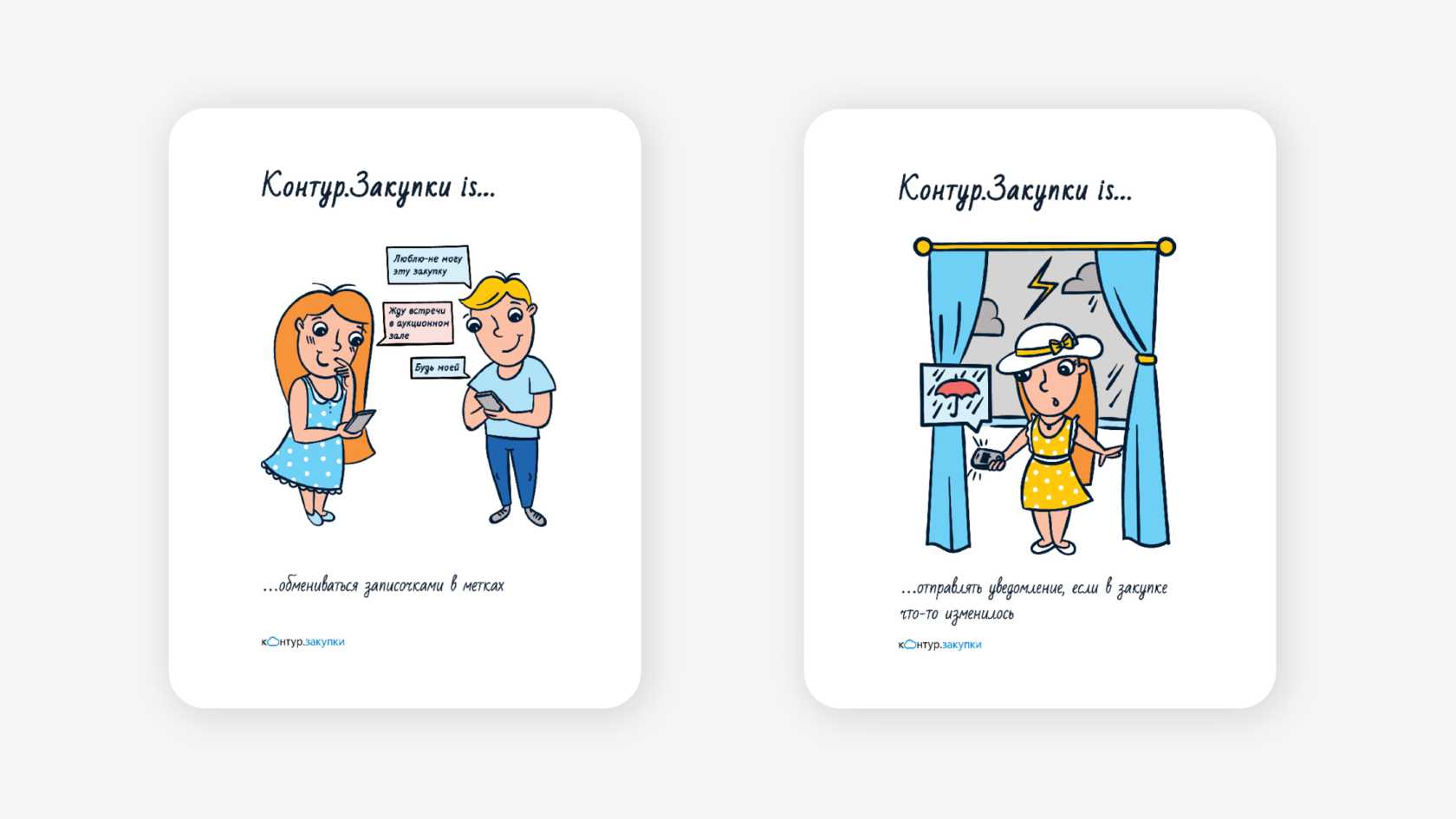
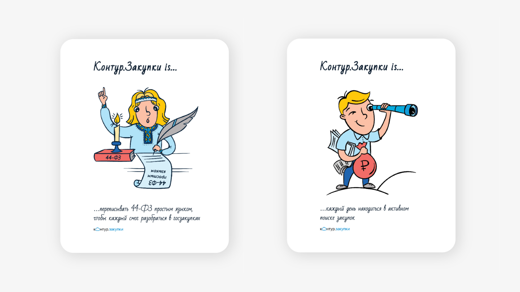
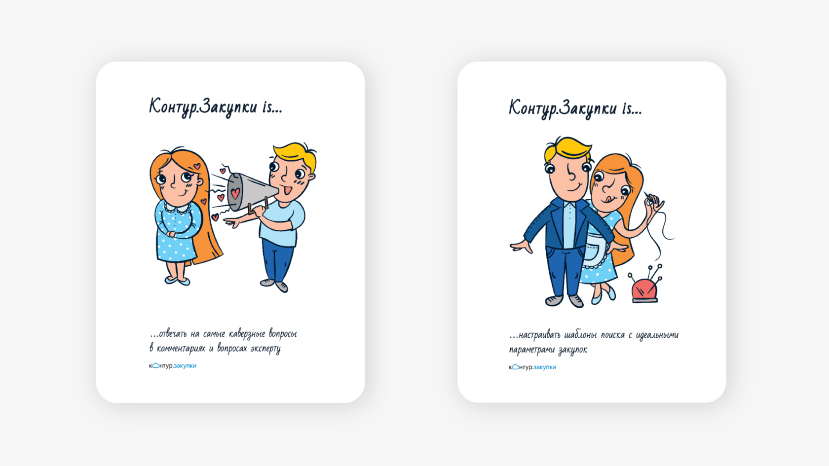
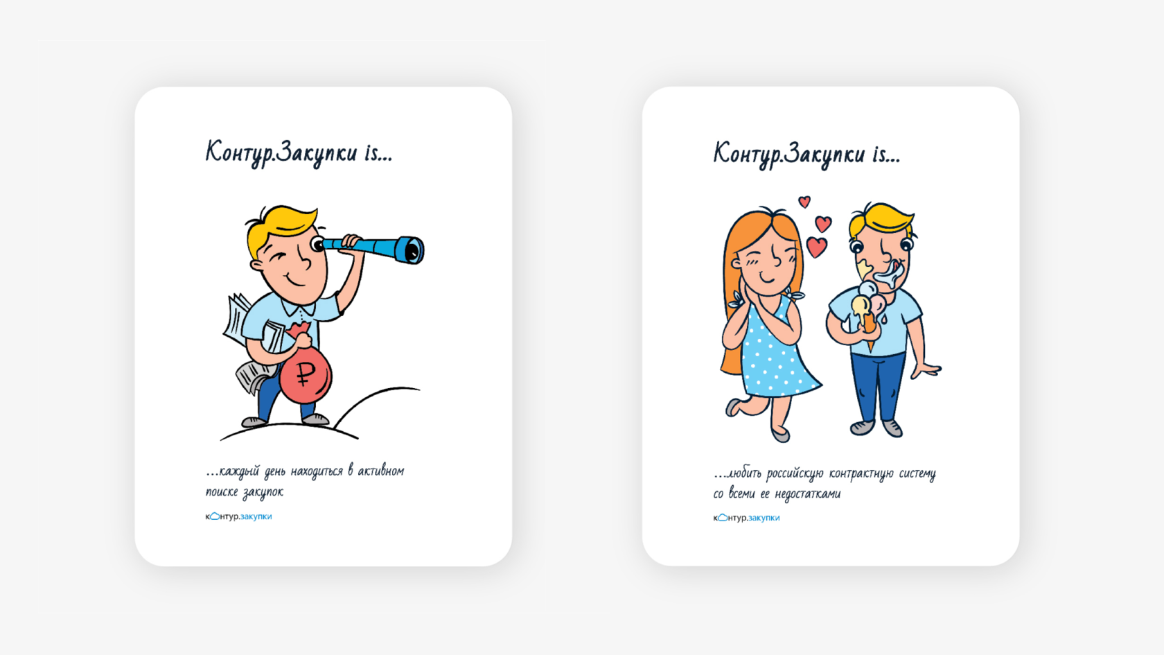
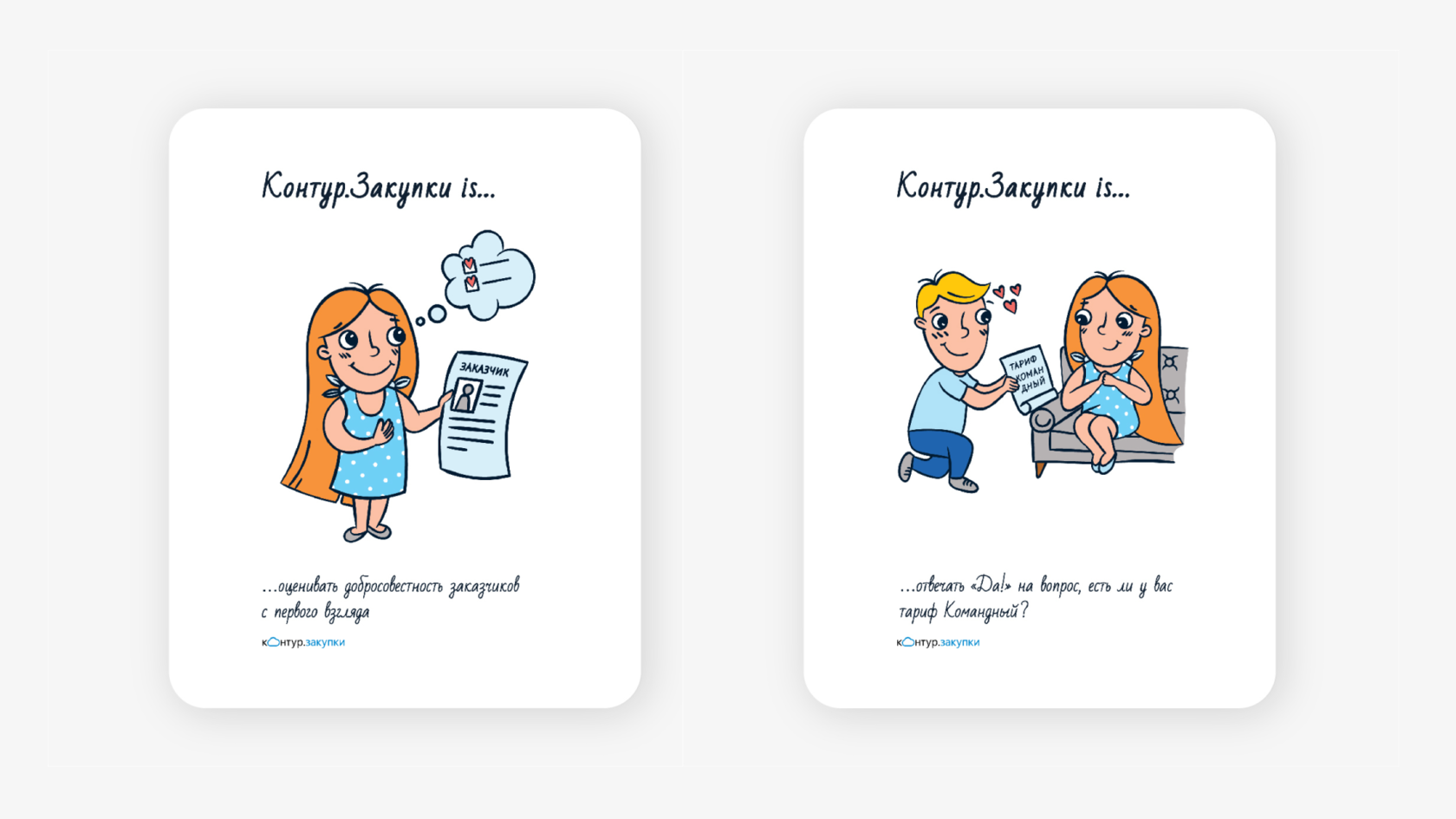
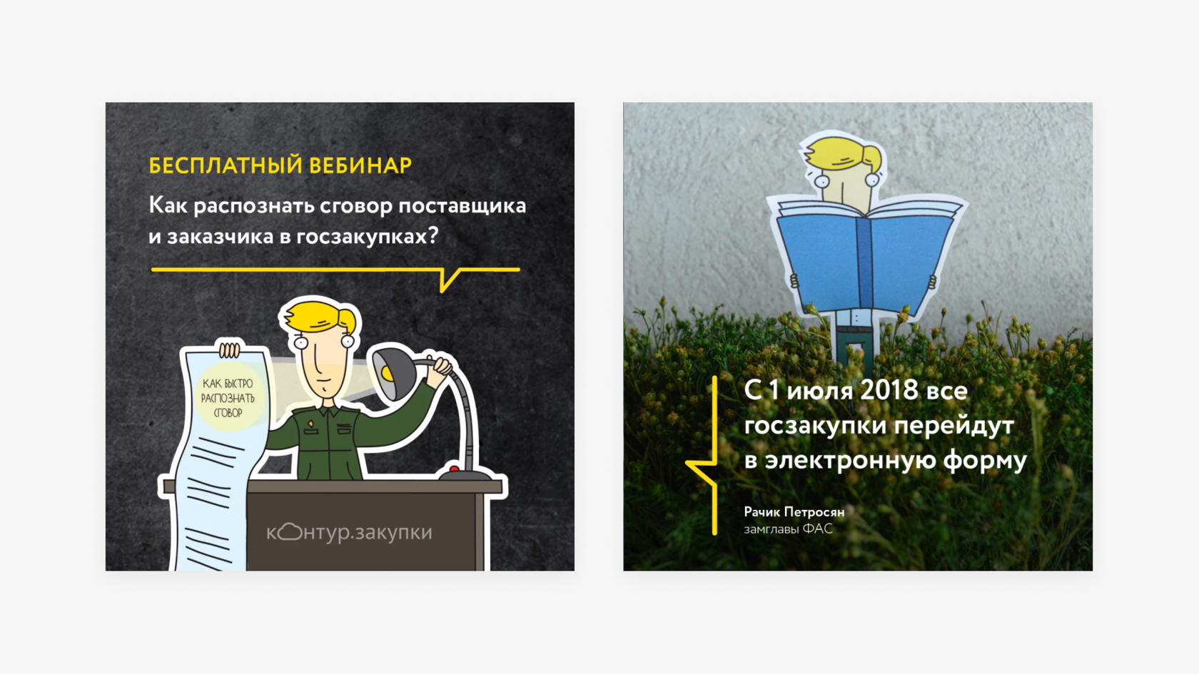
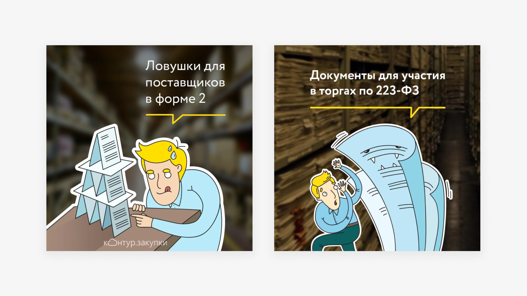
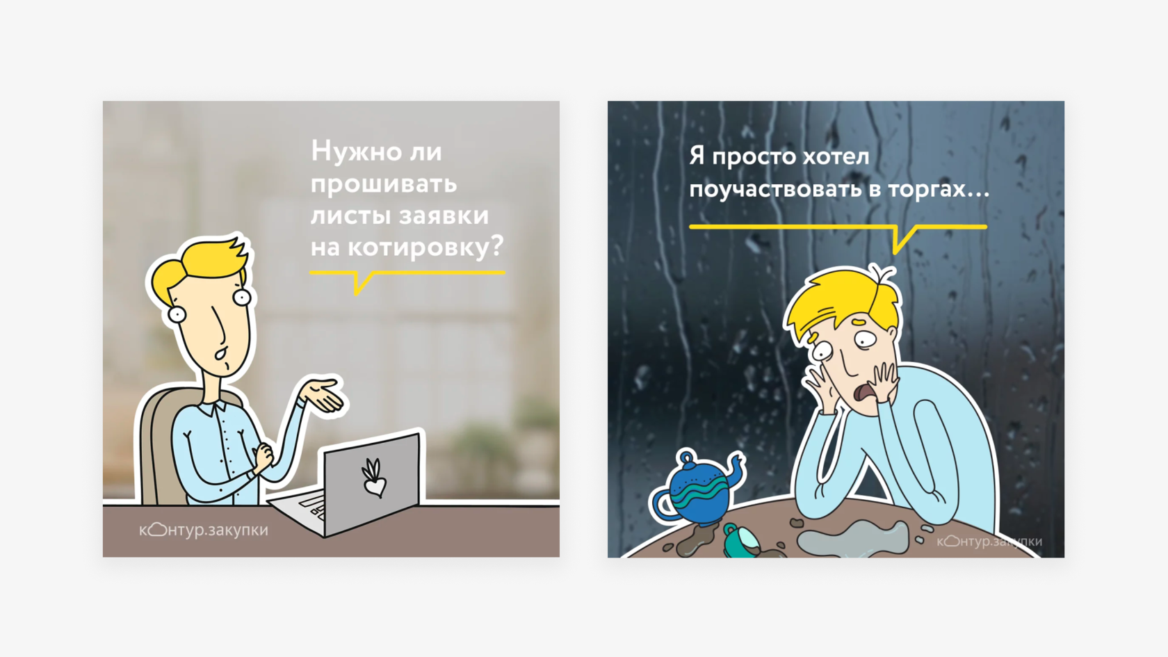
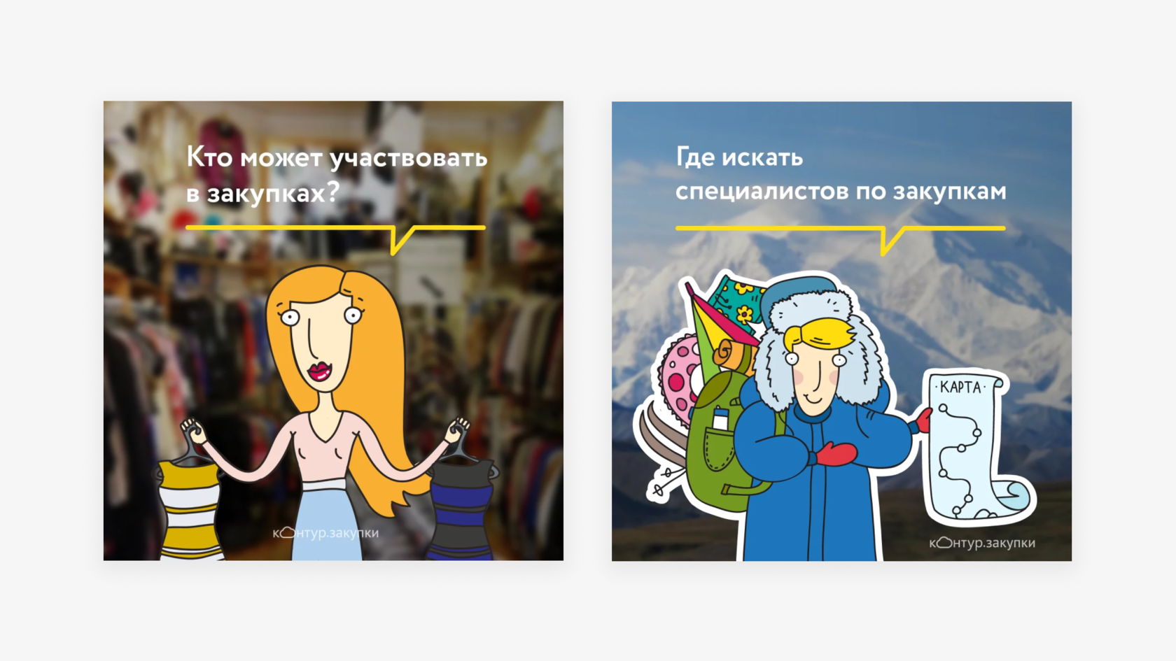
Каждый год в день рождения Контур.Закупок мы готовим в статью-развлечение.
В этот раз проекту исполнилось 5 лет и мы решили сделать особенное признание
в любви ко всему, что связано с сервисом в стиле Love is…
Соавтор — Маргарита Федосеева
Every year on the birthday of the Kontur.Zakupki we are preparing an article-entertainment. This time the project was 5 years old and we decided to make a special recognition in love with everything related to the service in the style of Love is…


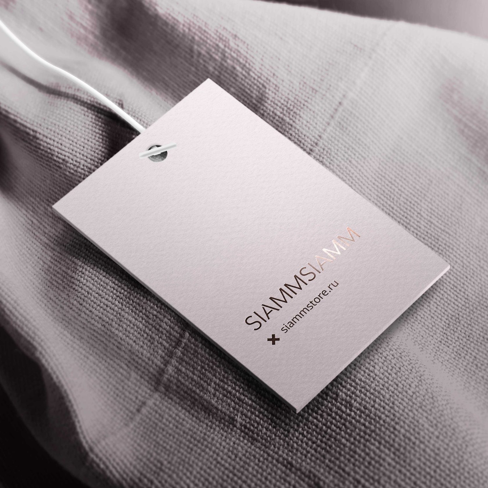
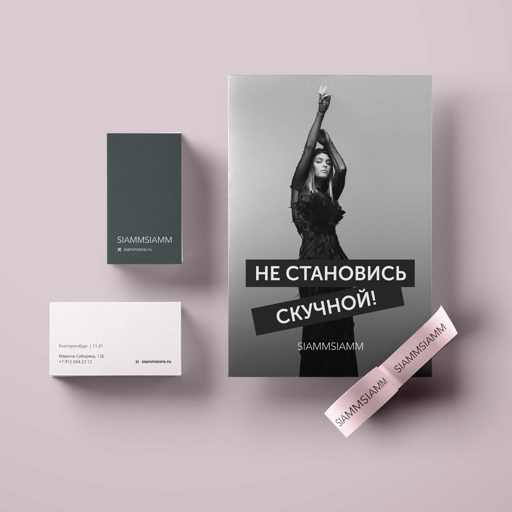
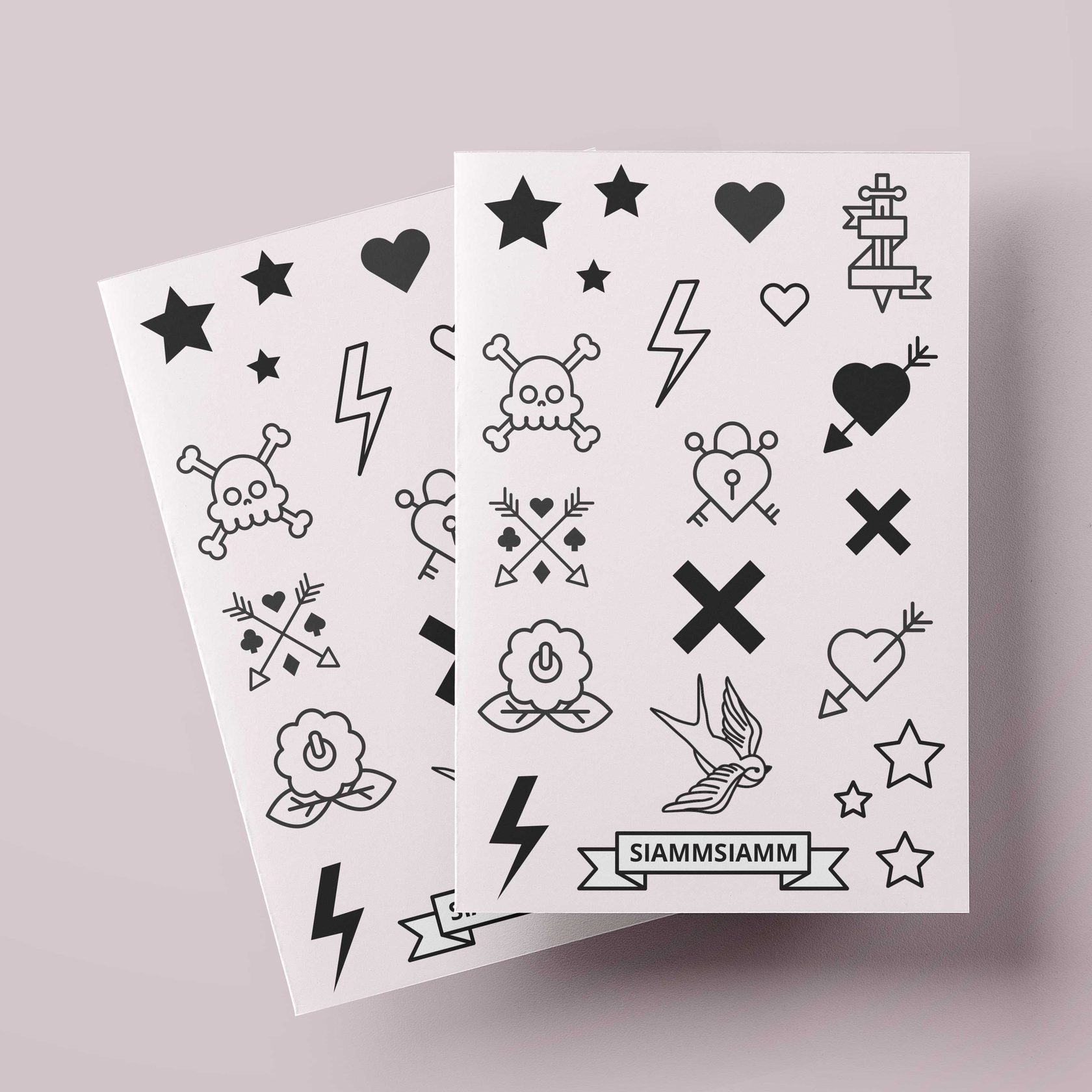
Siammsiamm · Fashion brand
р.
р.
Branding & identity


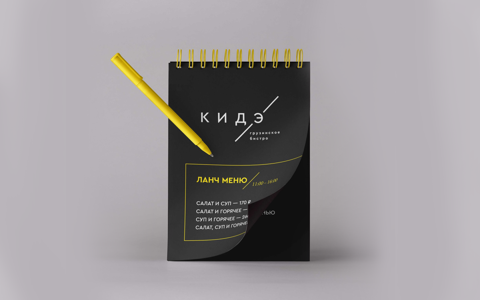
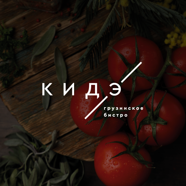
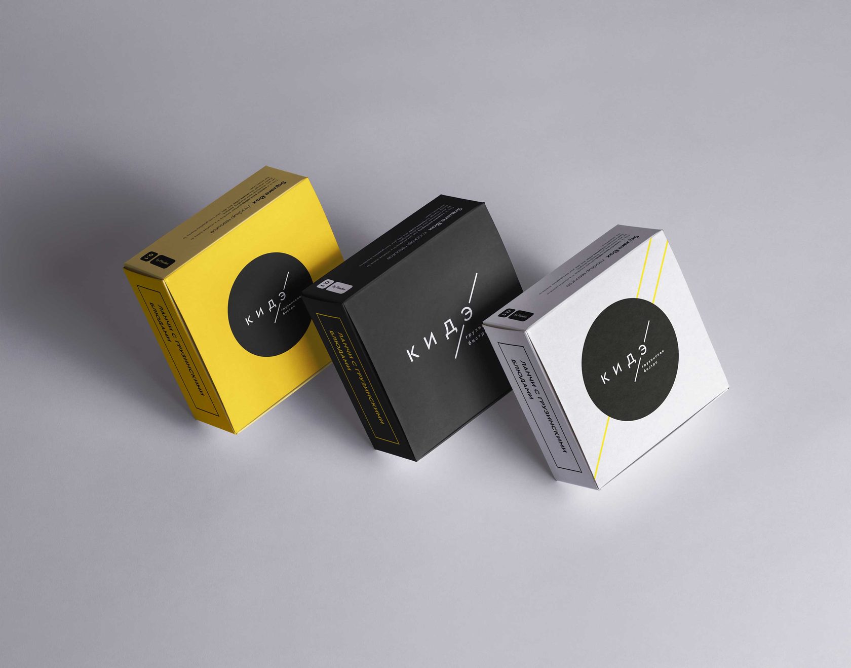
KIDE · Georgian bistro
р.
р.
Branding & identity


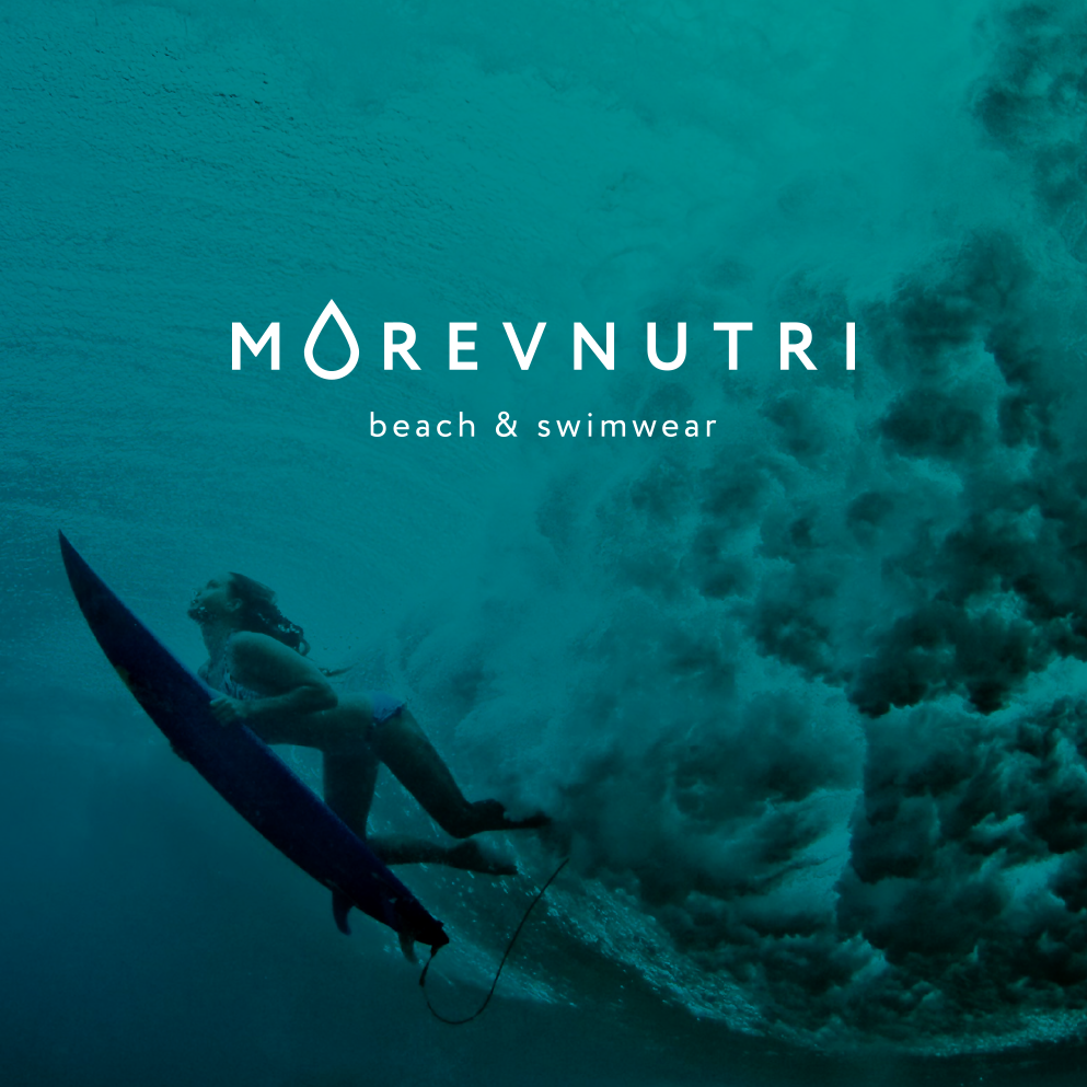
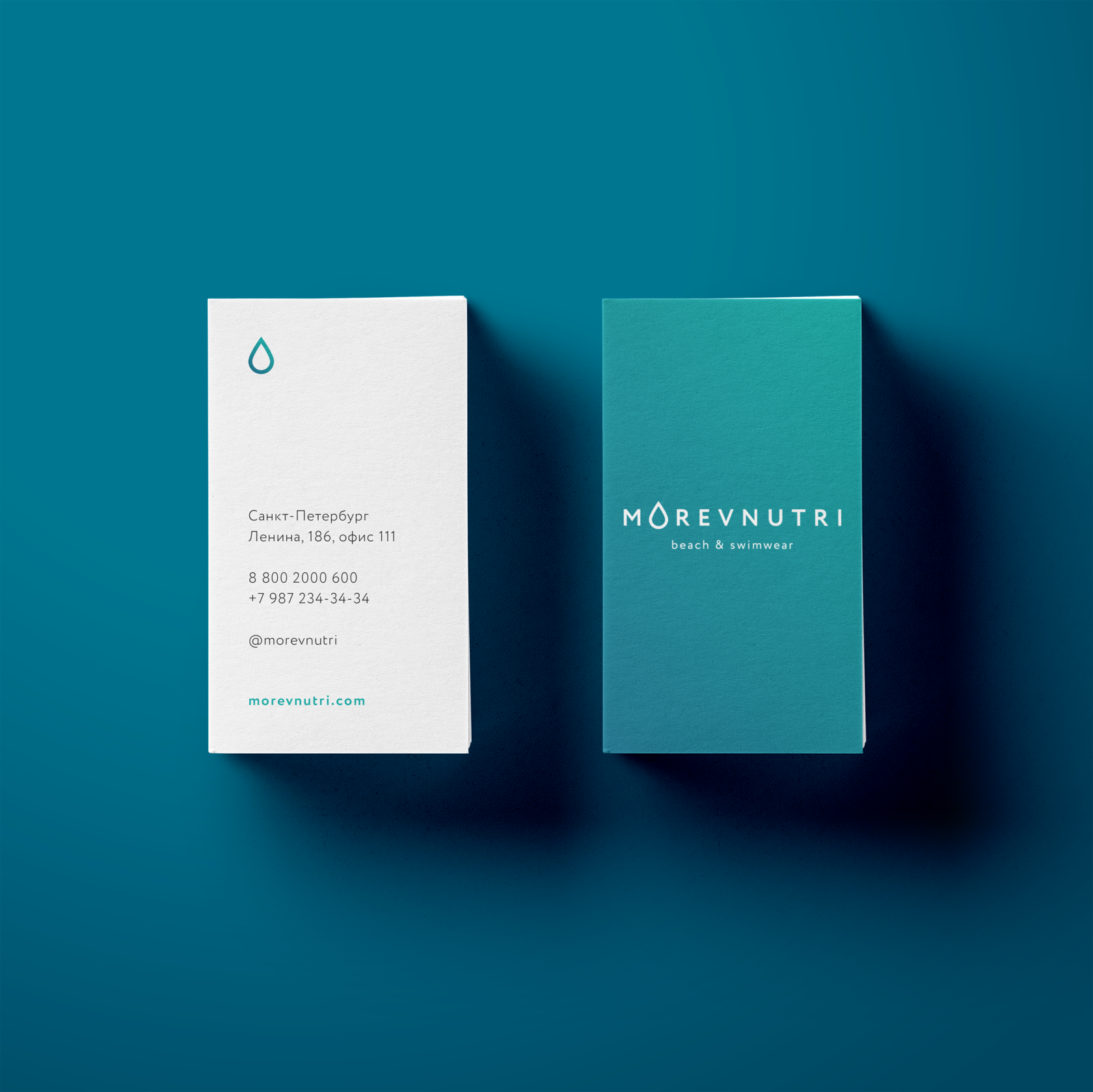
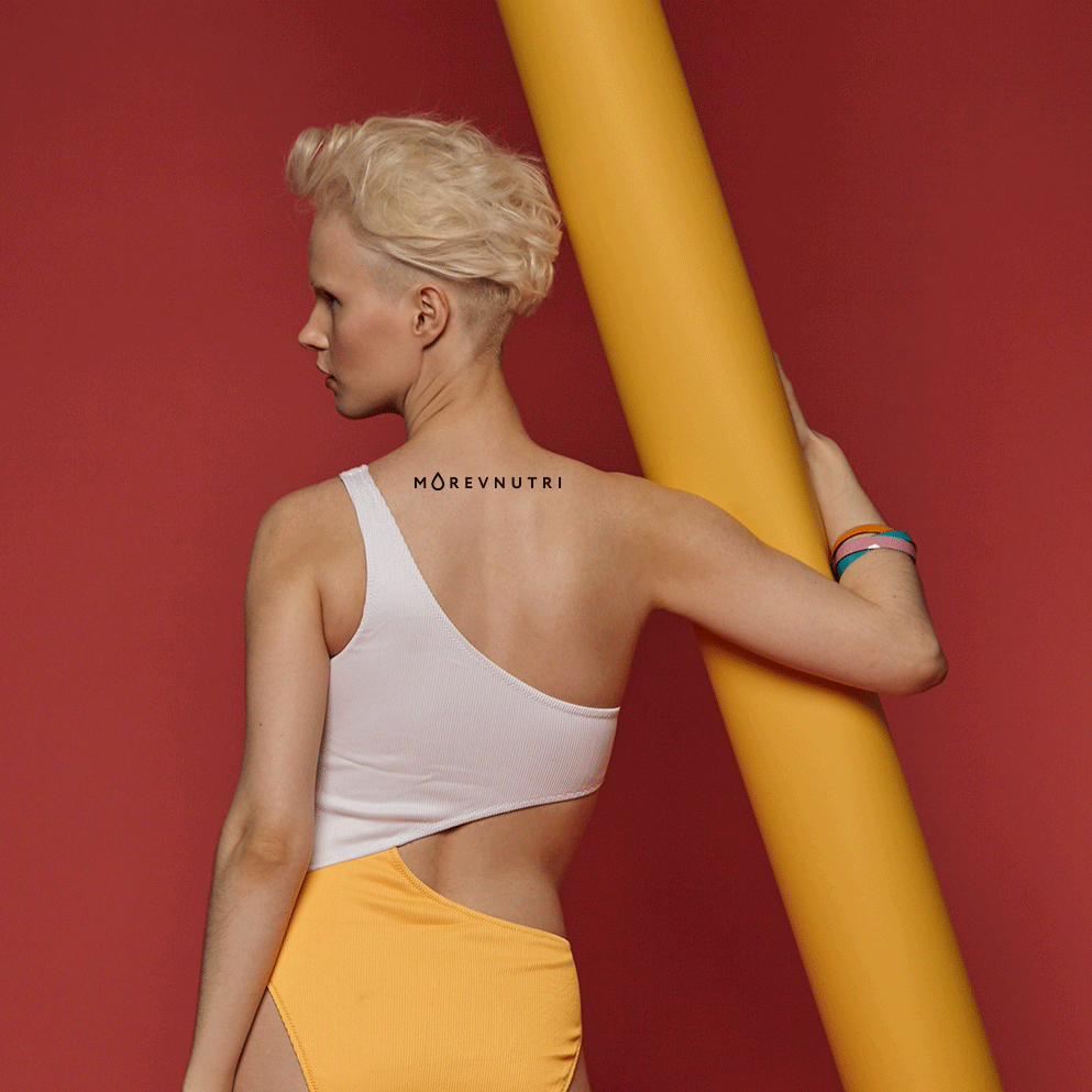
Morevnutri · Swimming wear brand
р.
р.
Branding & identity


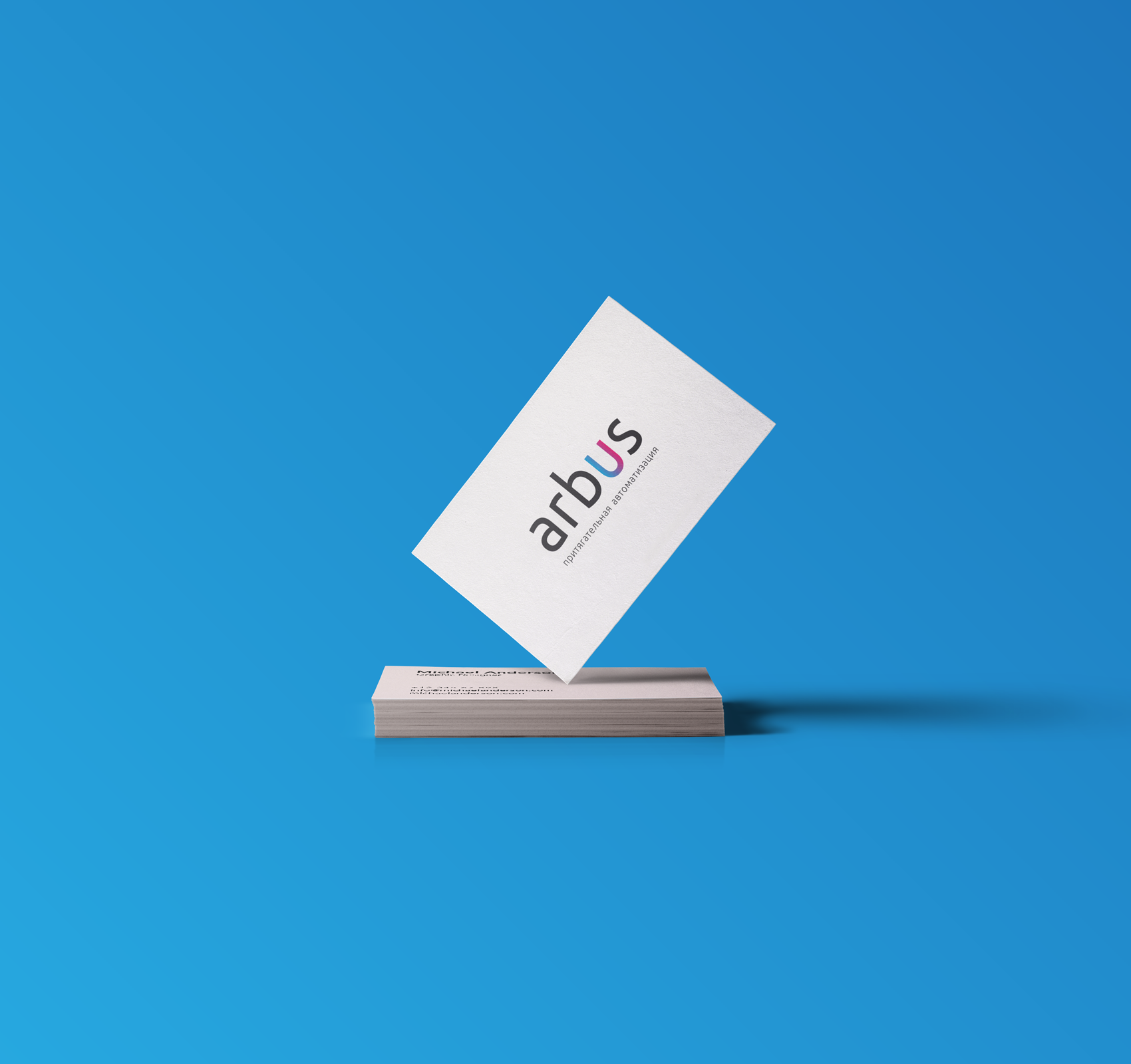
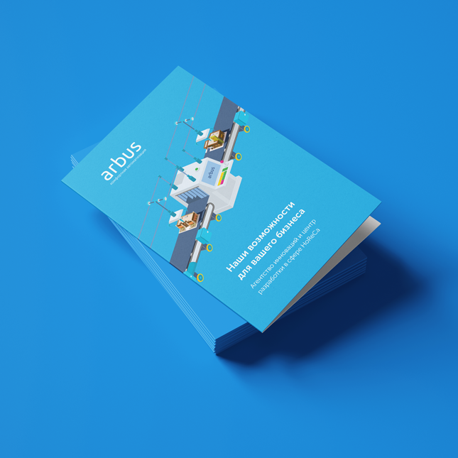
Arbus · Business automatisation company
р.
р.
Redesign identity


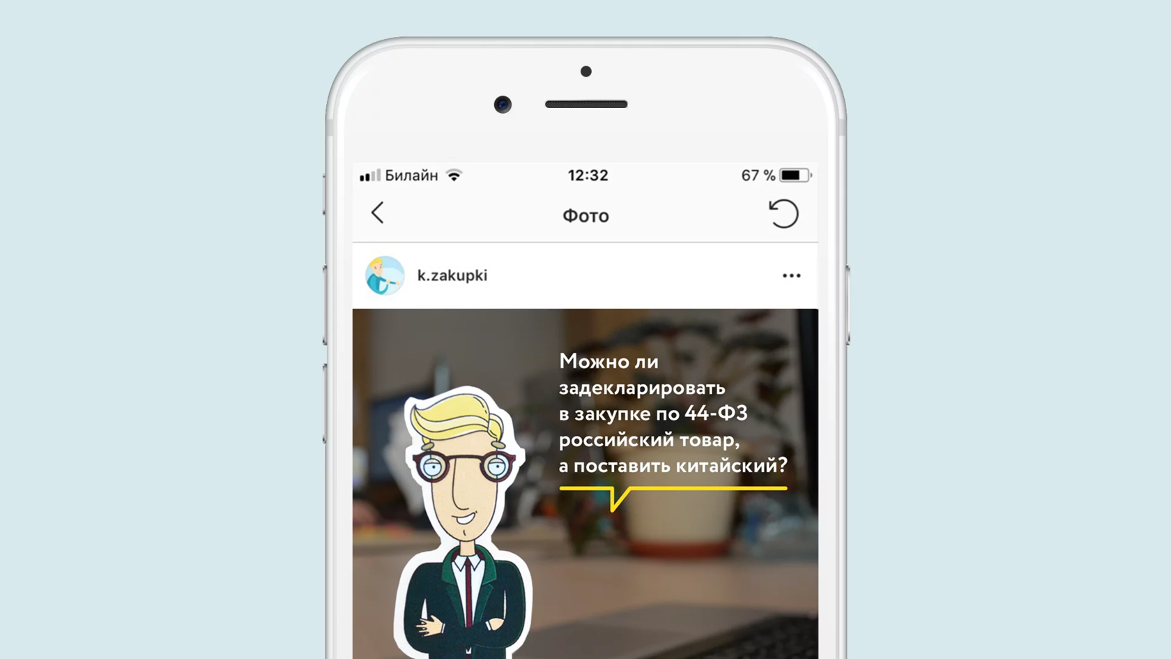
SKB Kontur · Instagram account design
р.
р.
Illustration and design


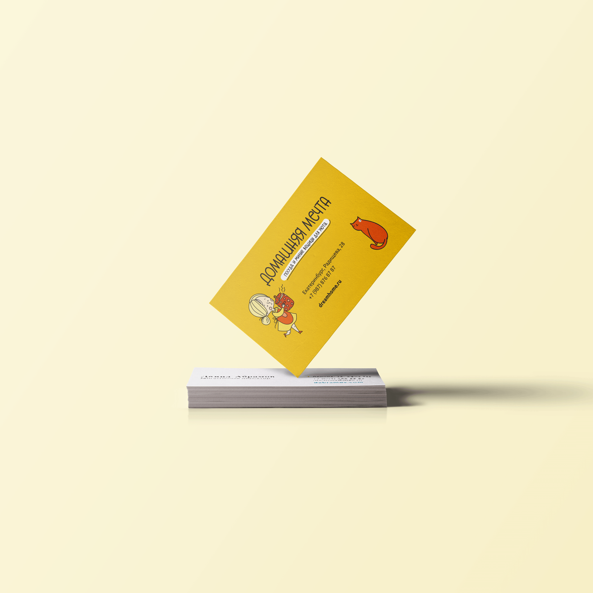
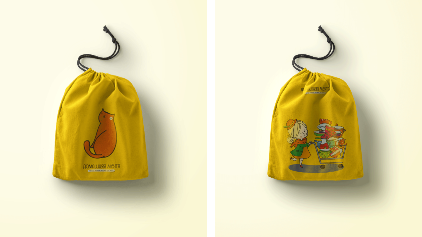
Homy Dream · Cozy shops
р.
р.
Branding & identity


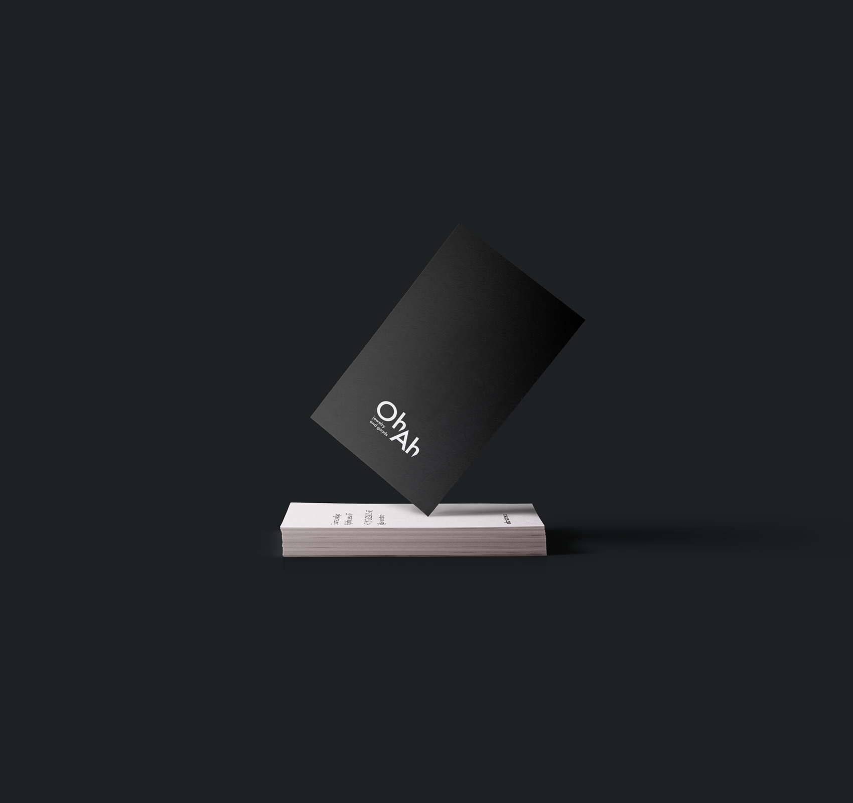
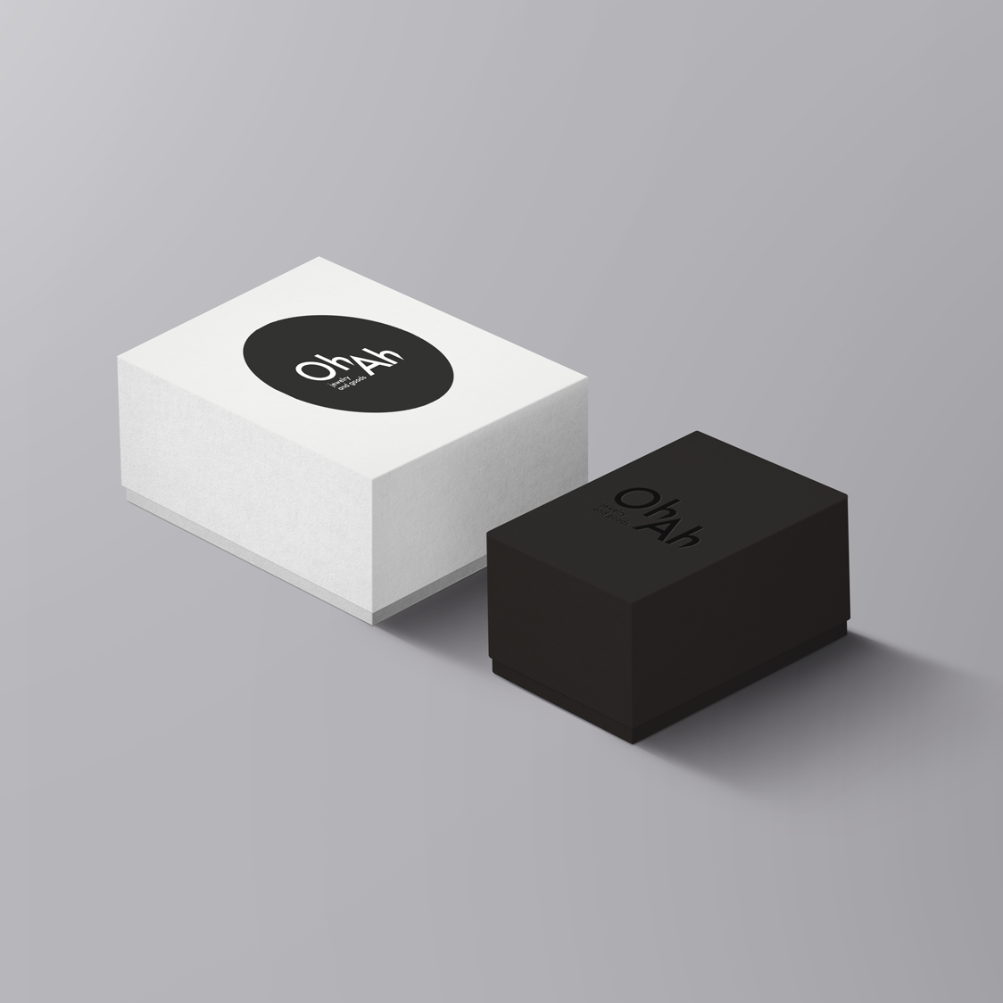
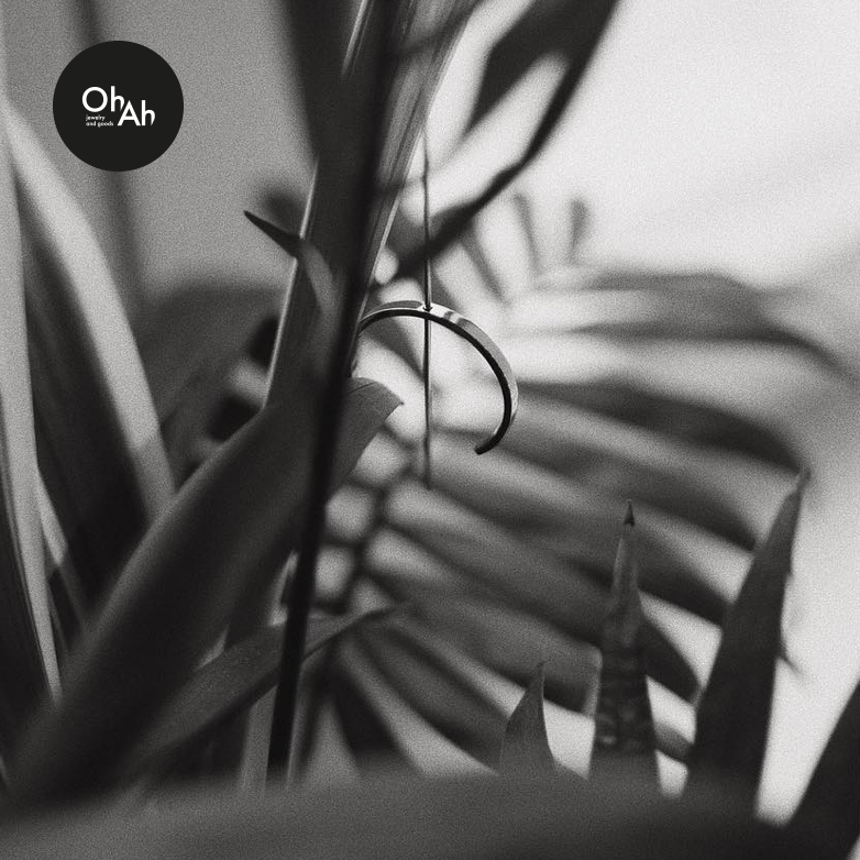
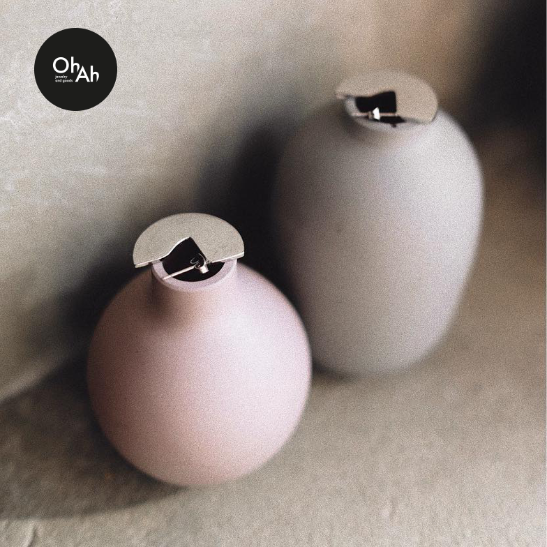
OhAh Store · Hand-made jewelry brand
р.
р.
Branding & identity


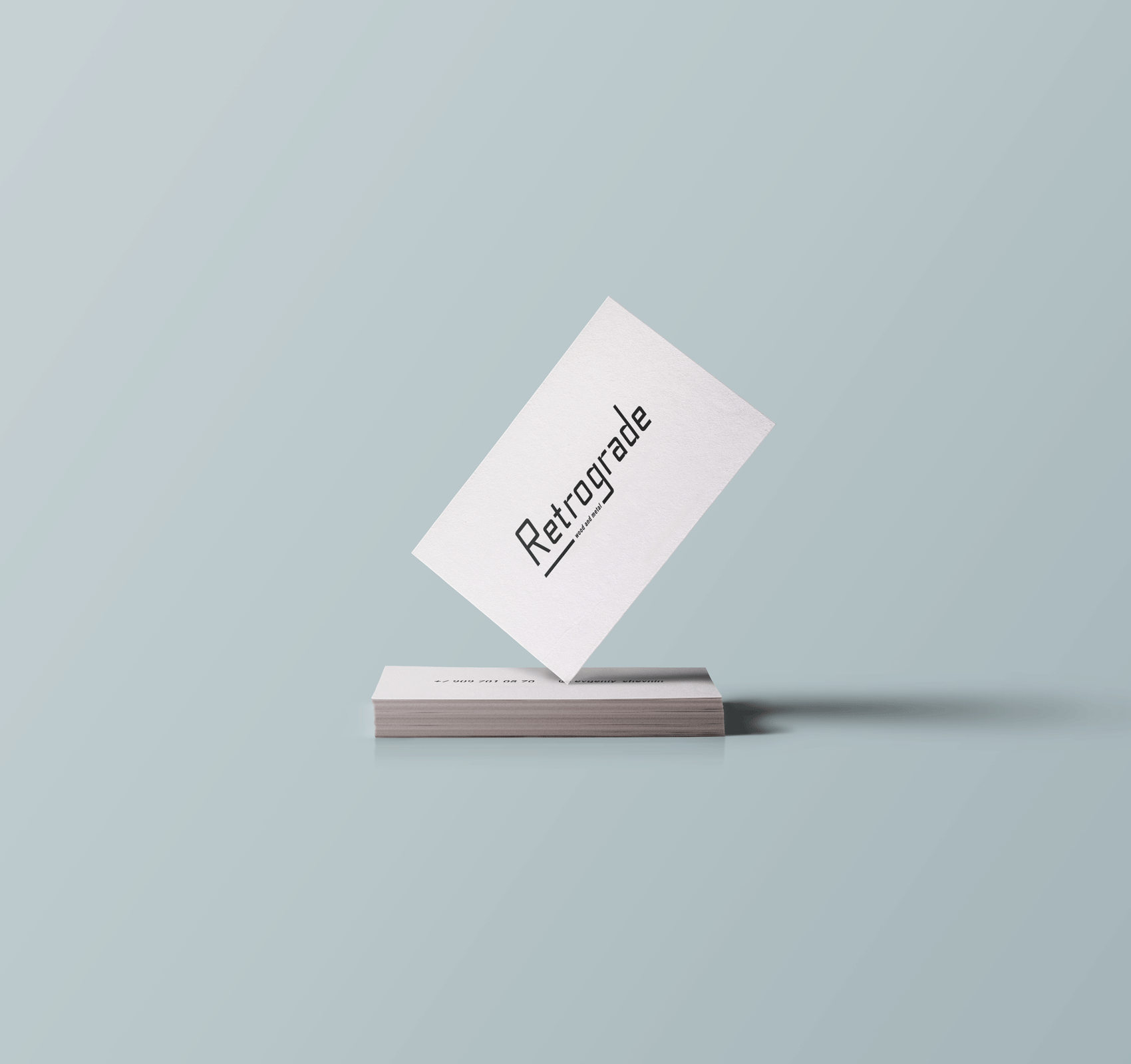
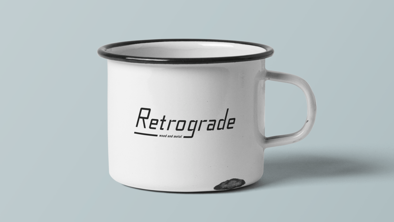
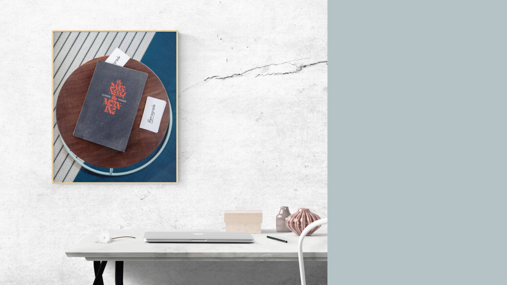
Retrograde · Wood and metall workshop
р.
р.
Branding & identity


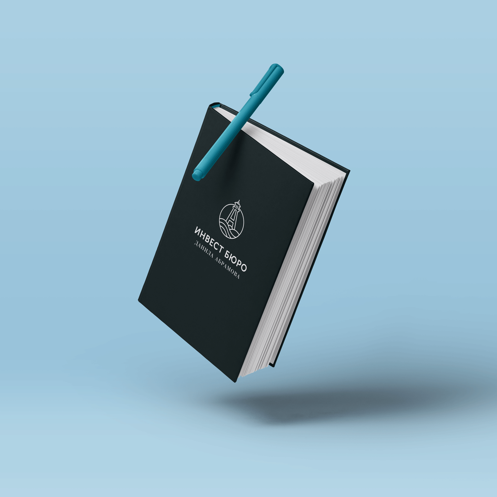
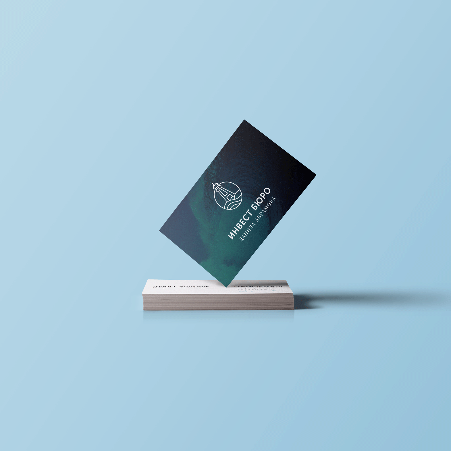
Abramov · Invest-bureau
р.
р.
Branding & identity


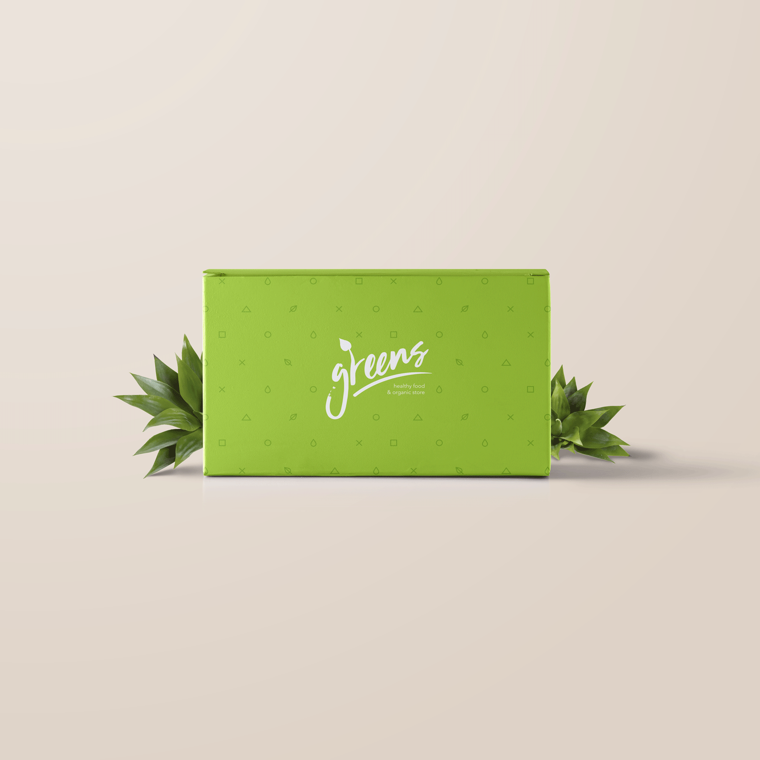
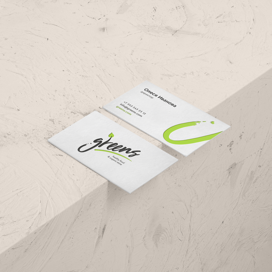
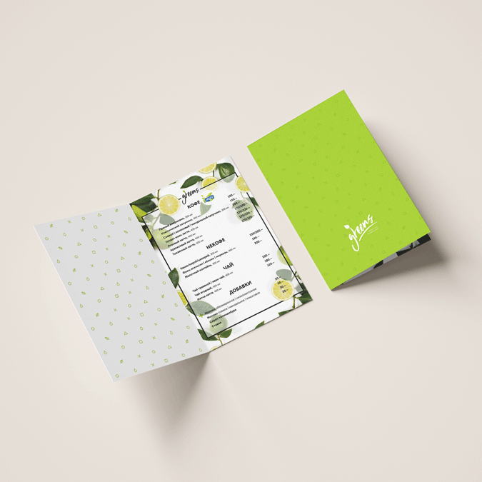
Greens · Health food store
р.
р.
Branding & identity


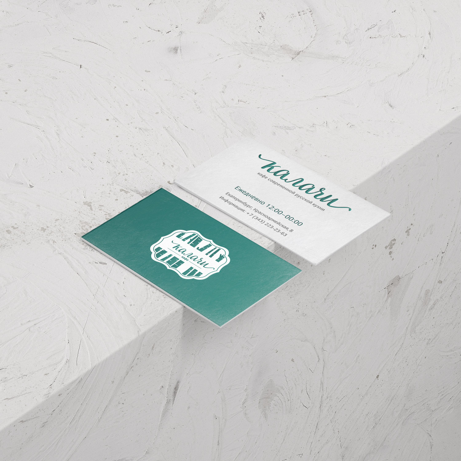
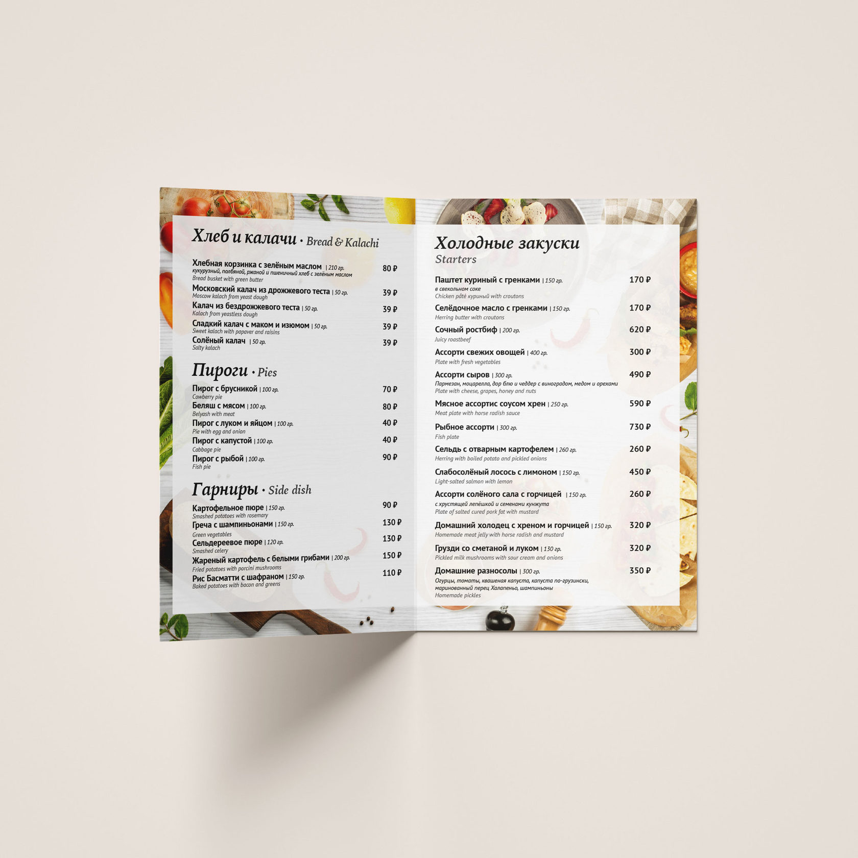
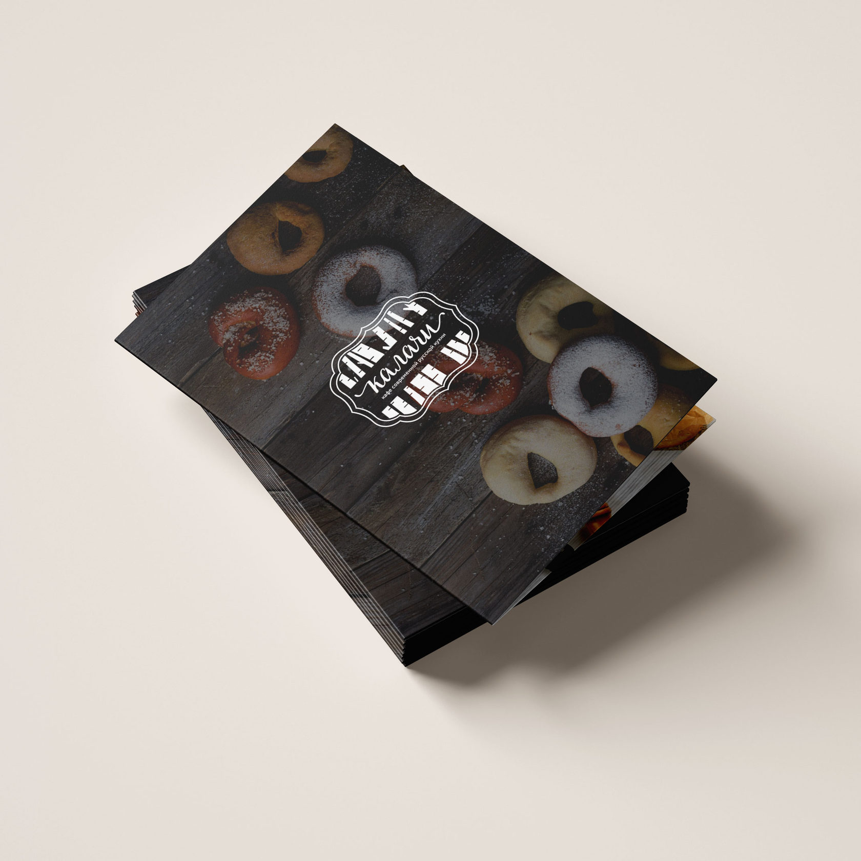
Kalachi · Russian kitchen cafe
р.
р.
Branding & identity
Вернуться


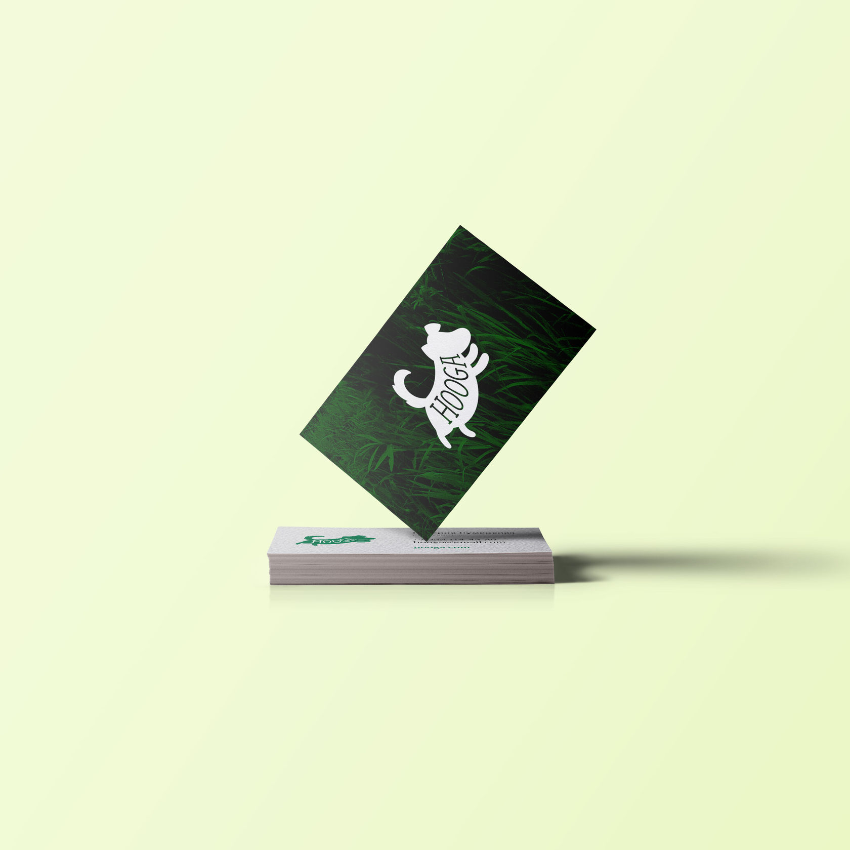
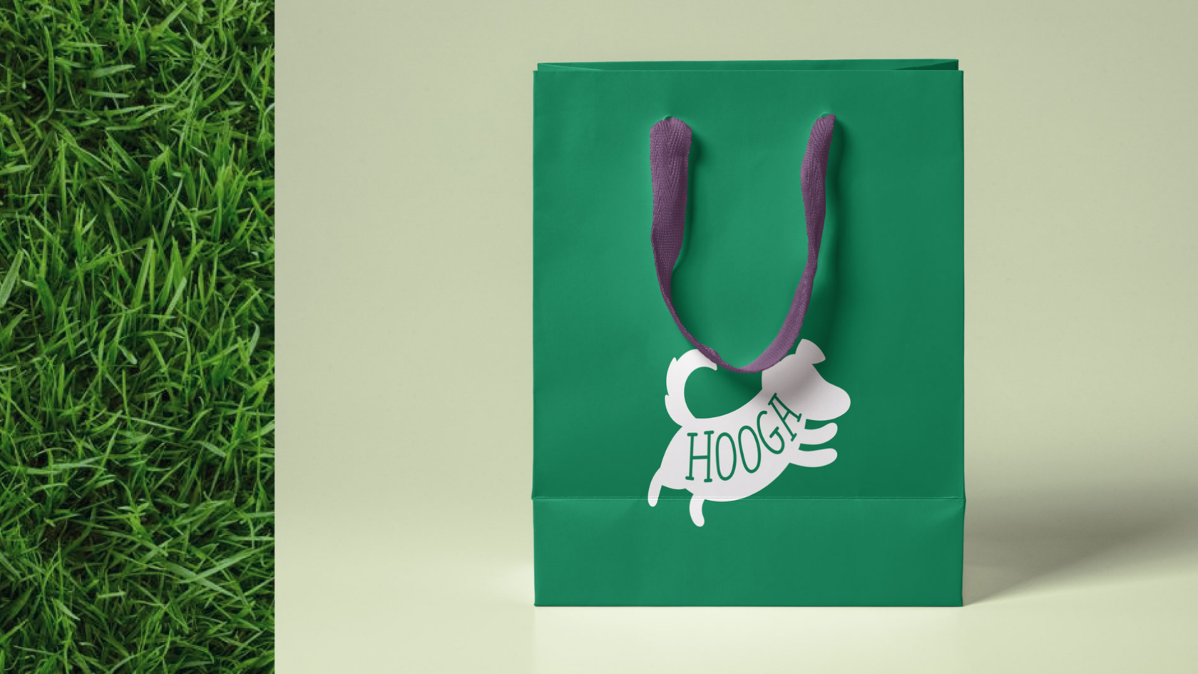
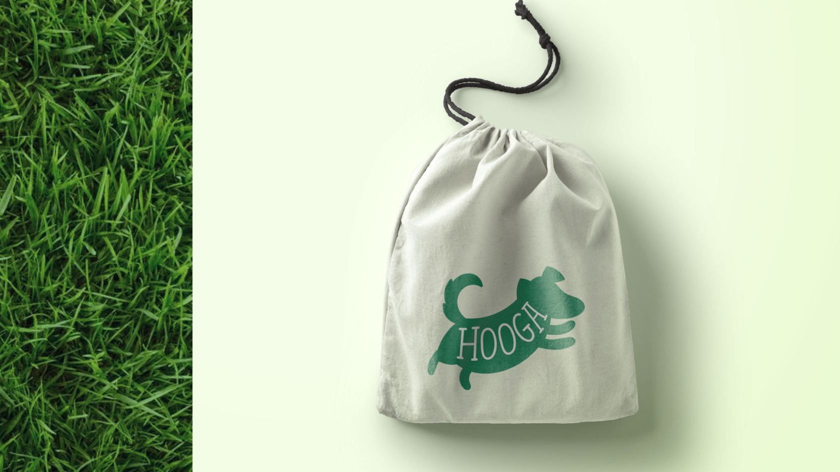
Hooga · Children's clothing brand
р.
р.
Branding & identity

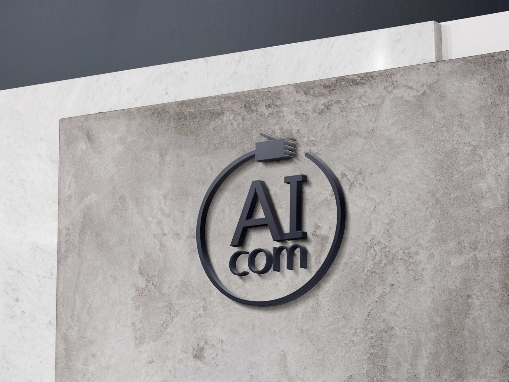
AI.com · Internet provider
р.
р.
Branding & identity


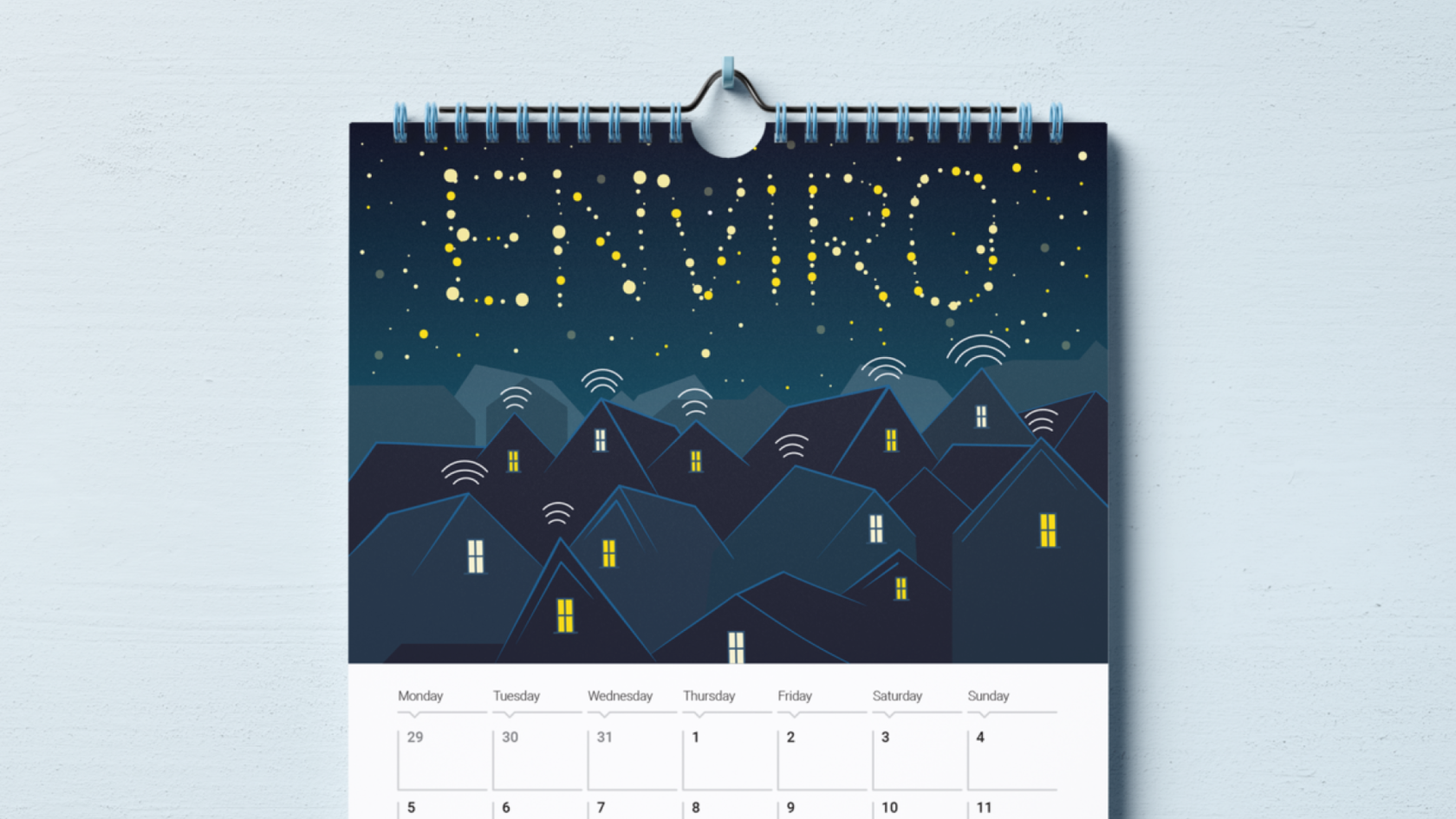
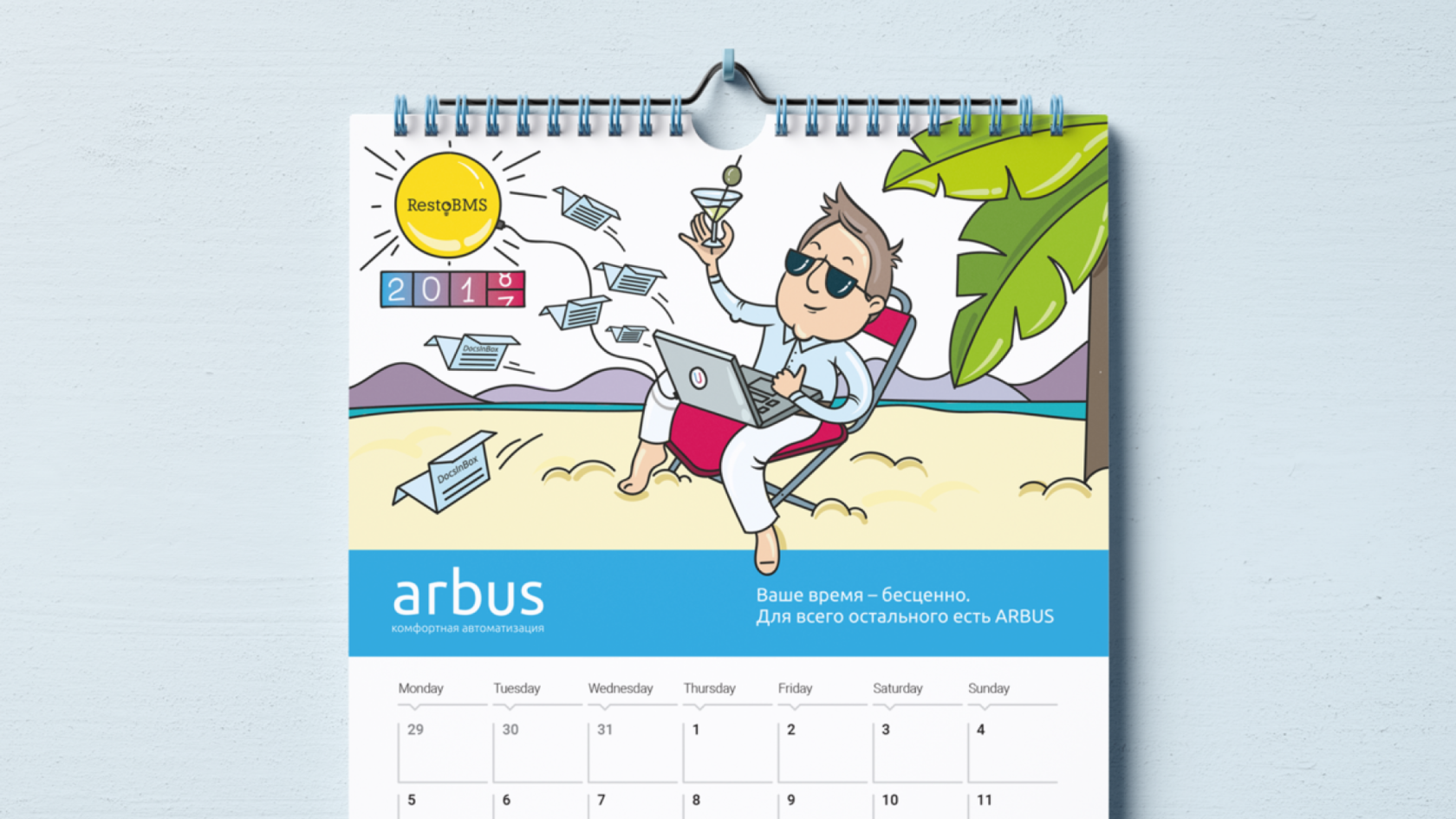
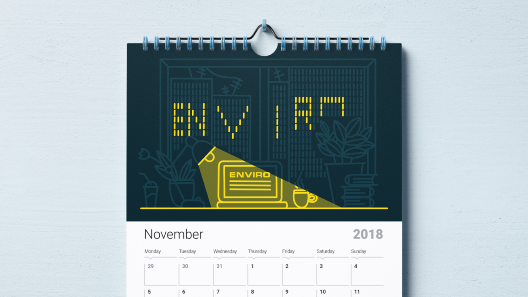
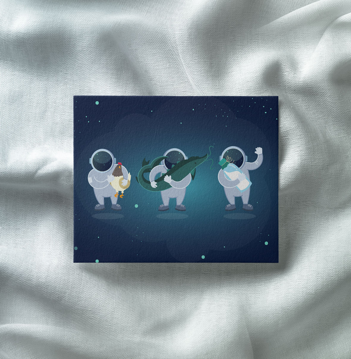
Arbus and Enviro · Calendars
р.
р.
Illustrations


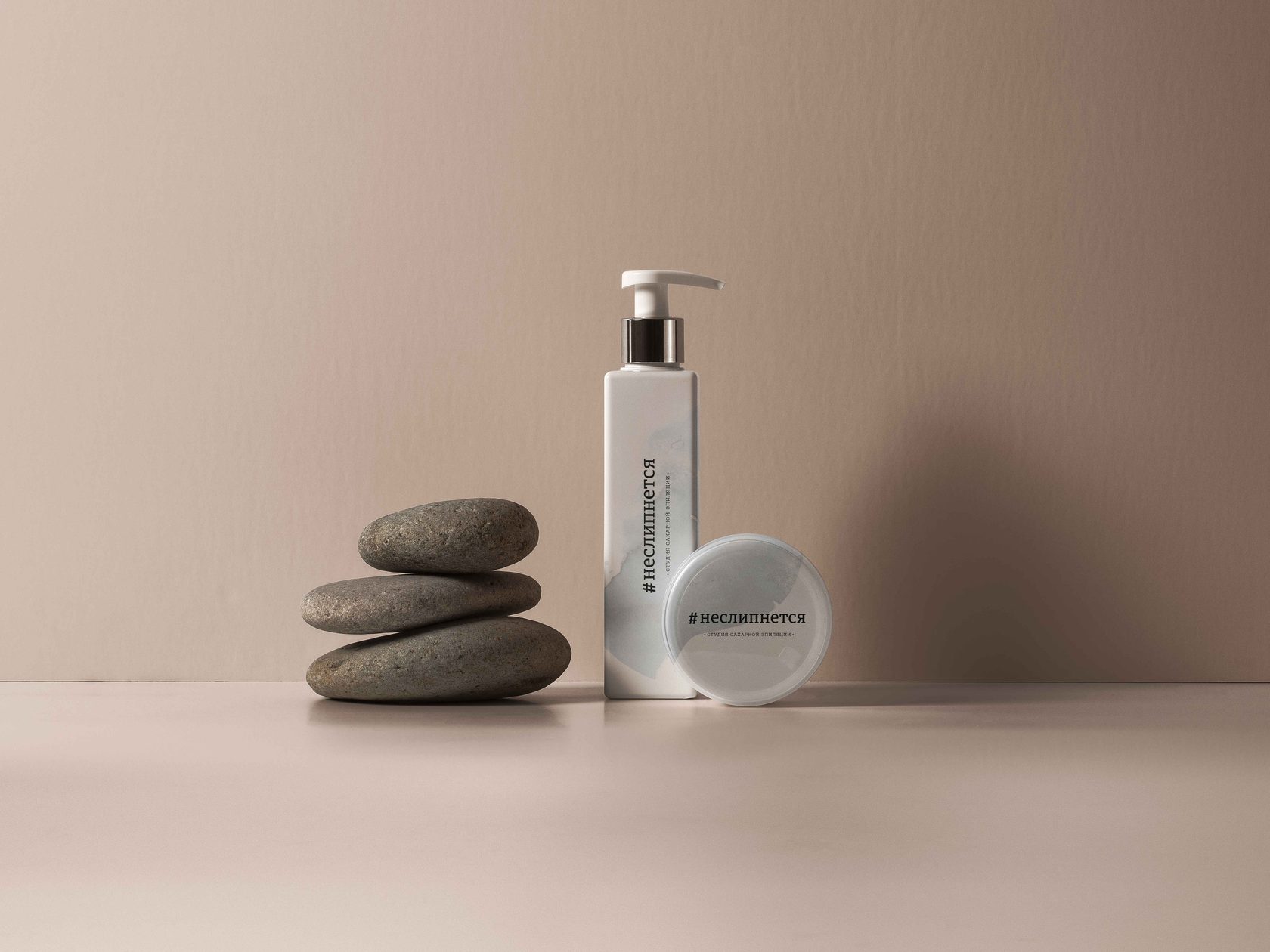
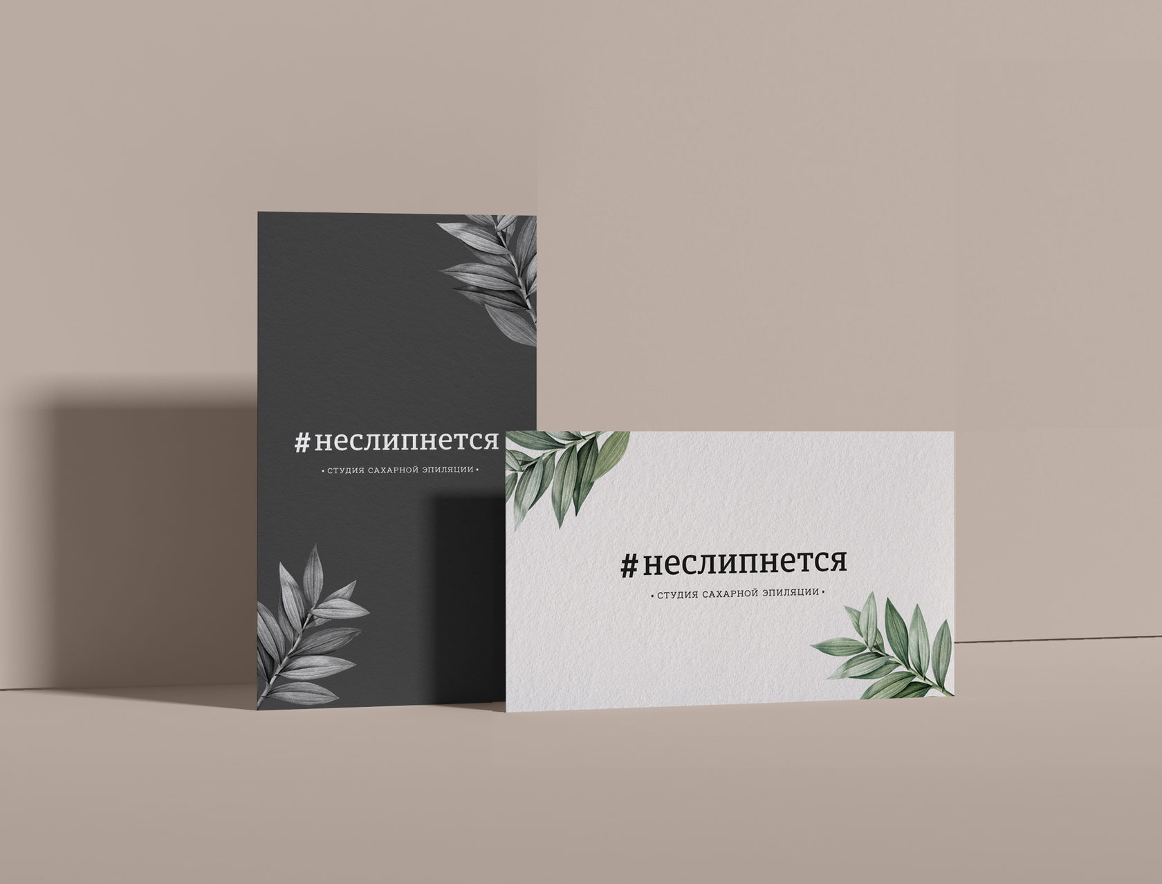
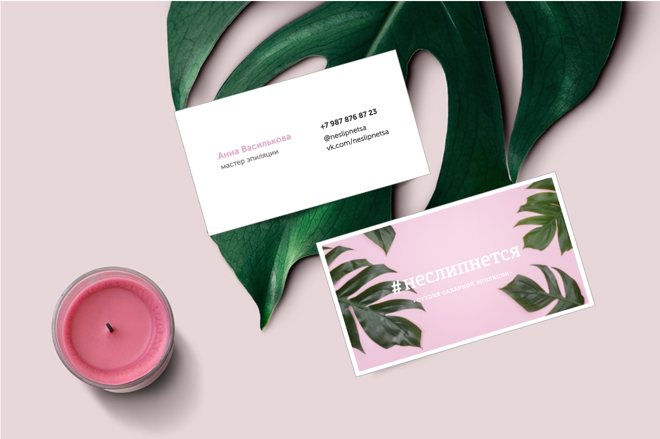
Ne slipnetsya · Epilation Studio
р.
р.
Branding & identity


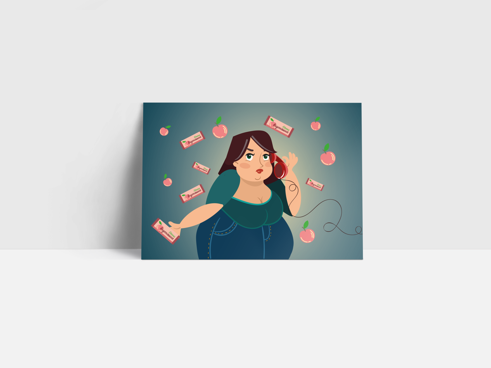
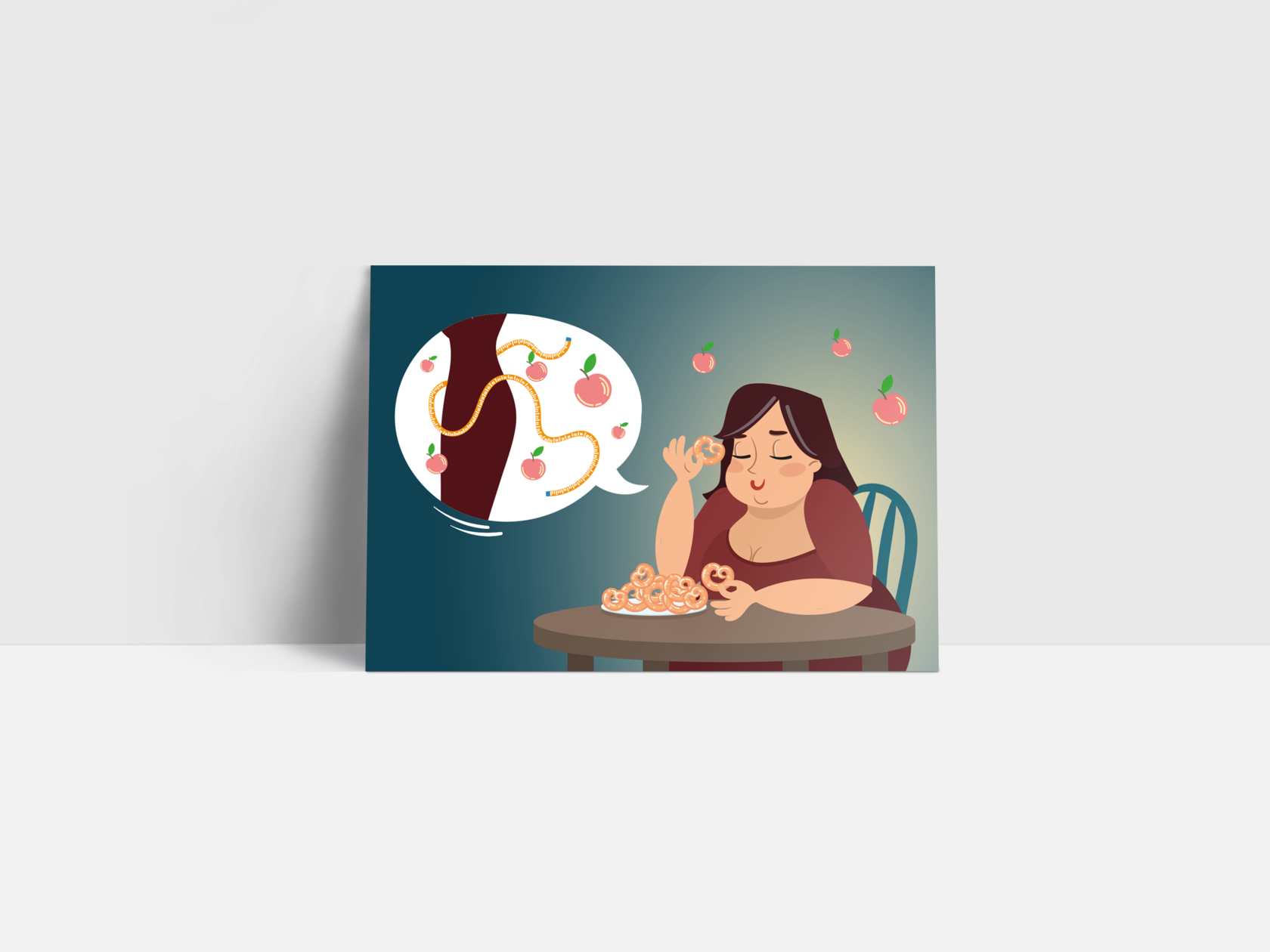
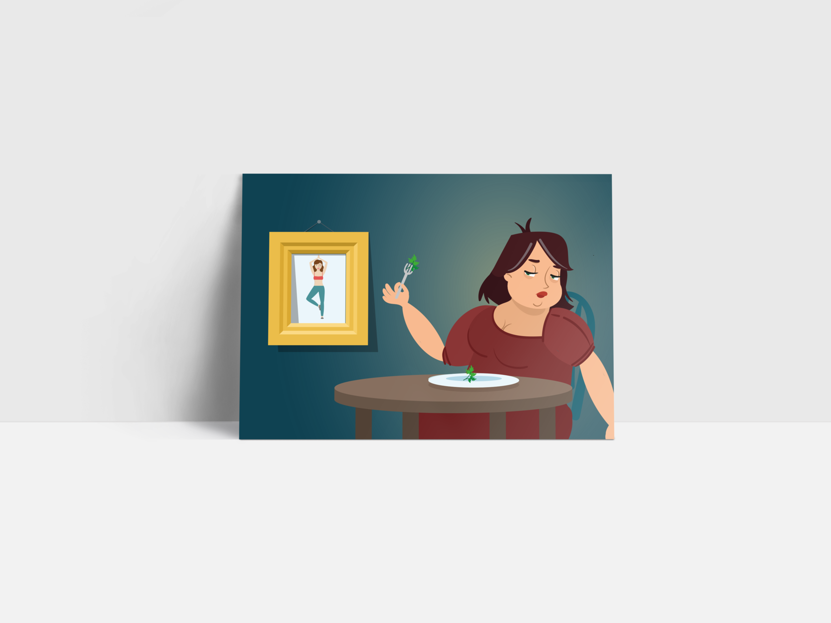
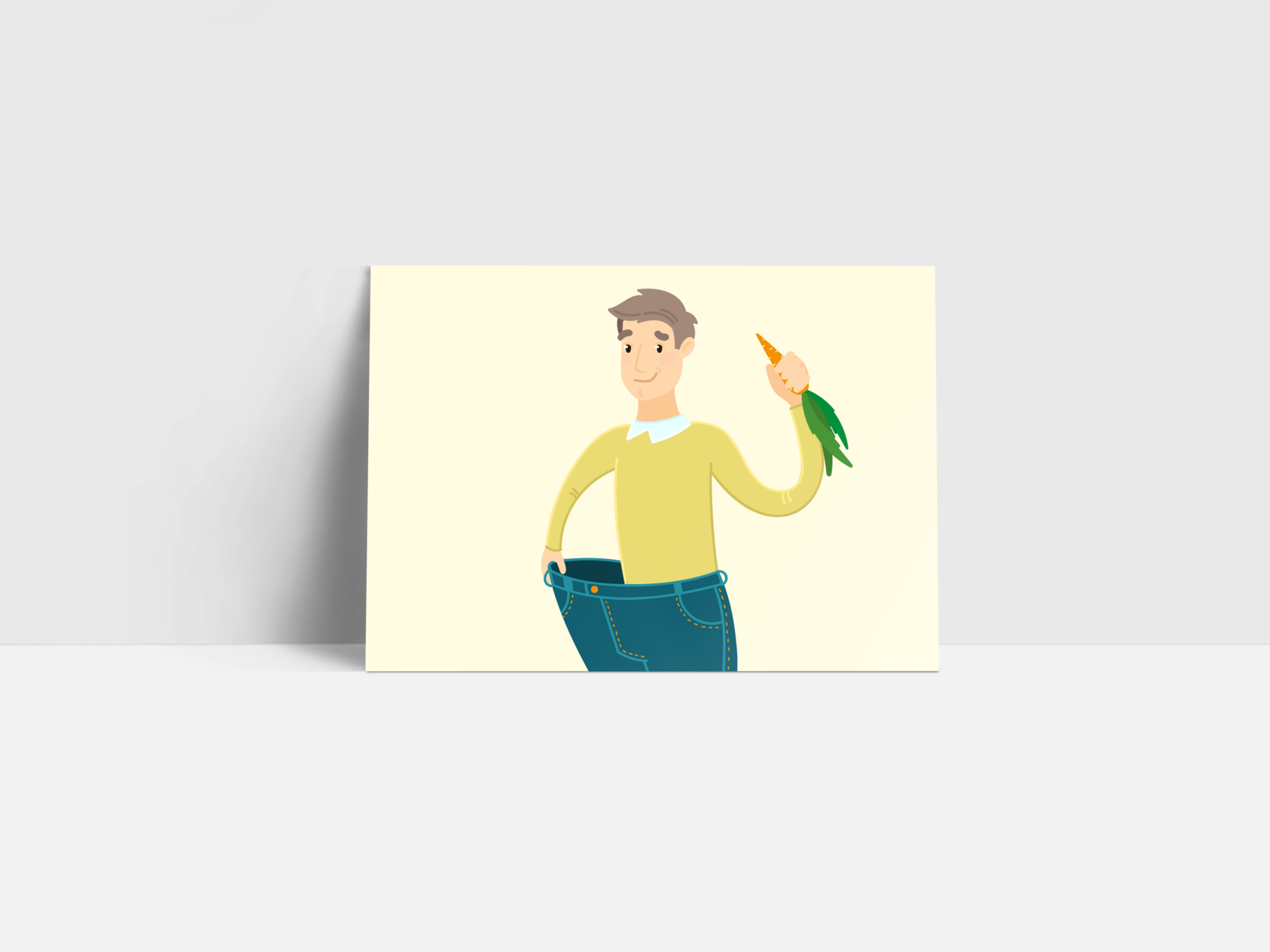
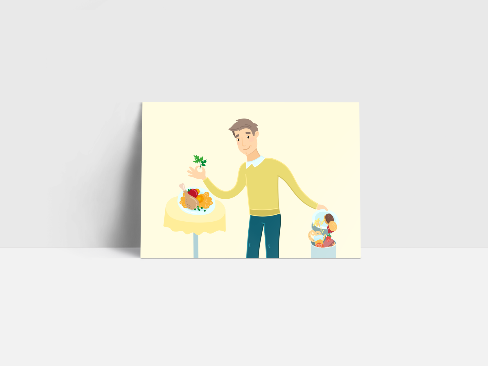
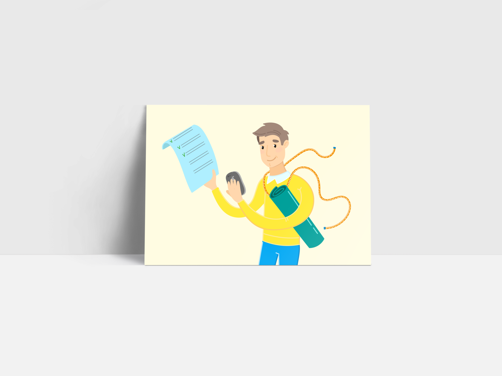
Kooc · Fitness consultant
р.
р.
Illustrations


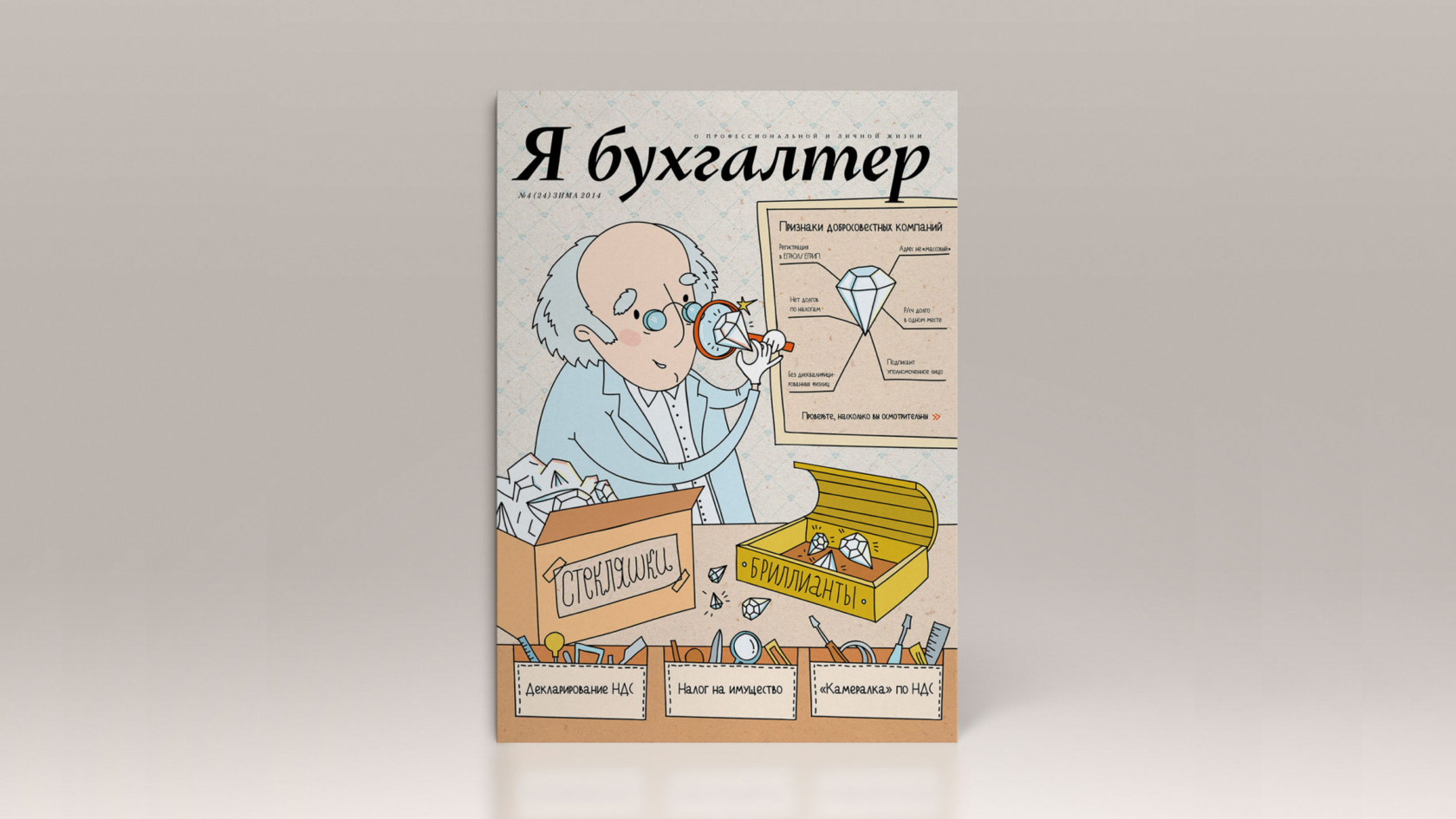
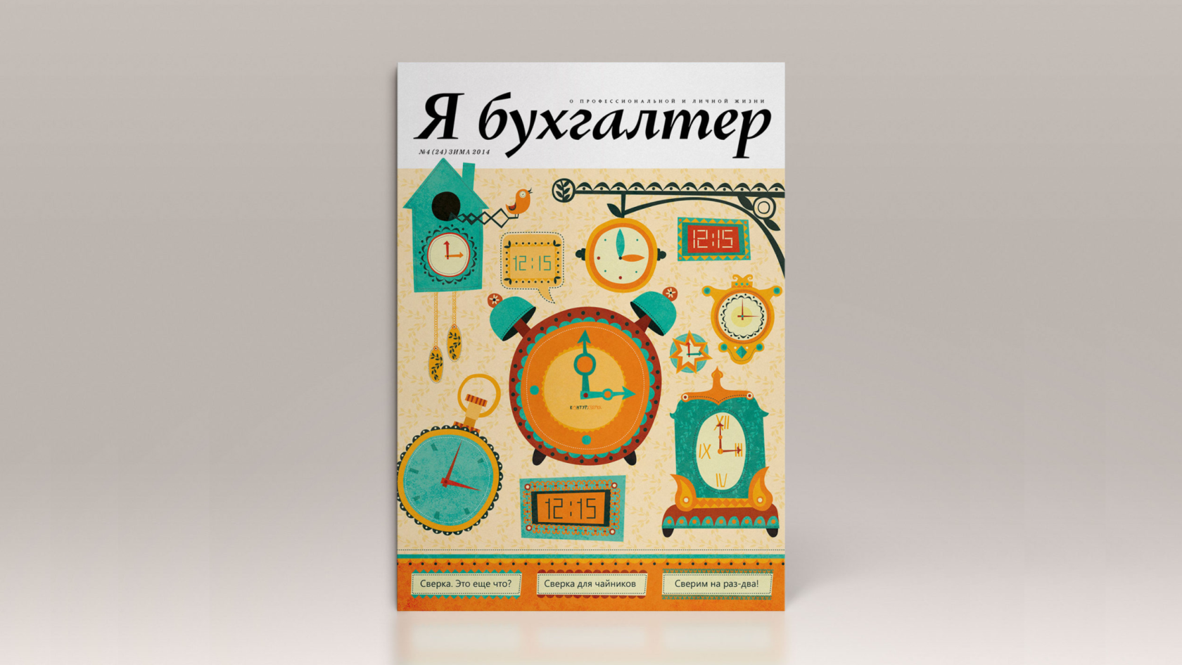
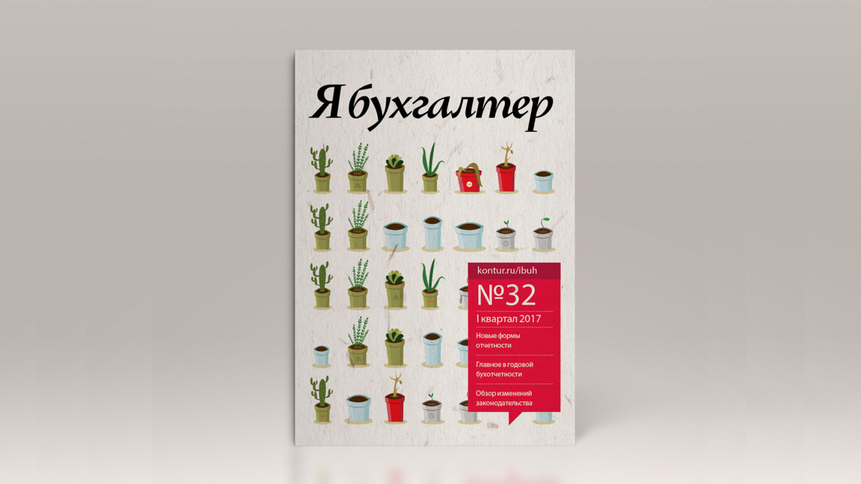
I am an accountant · Cover of the magazine
р.
р.
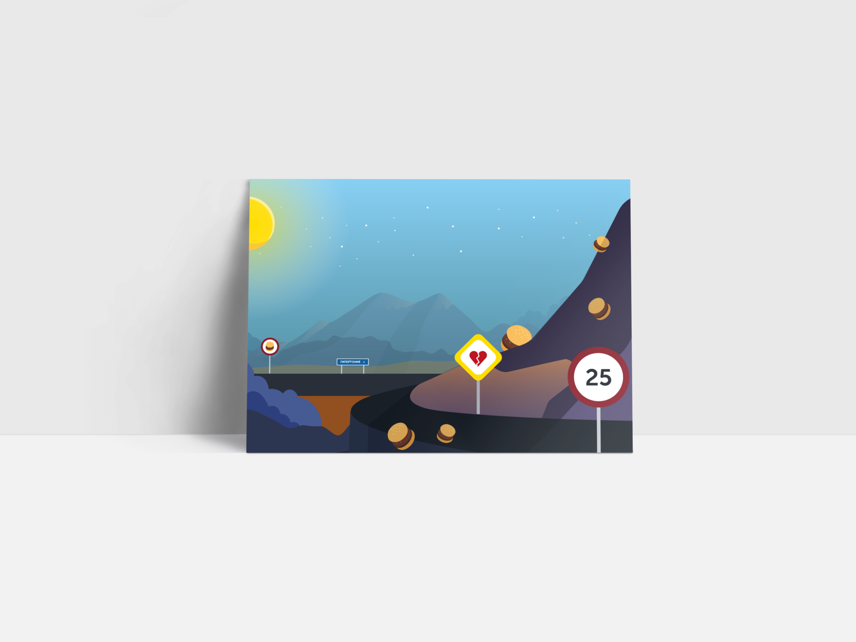
Illustrations


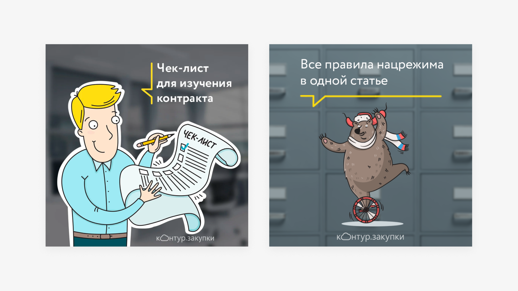
SKB Kontur · Illustrations
р.
р.
Illustrations


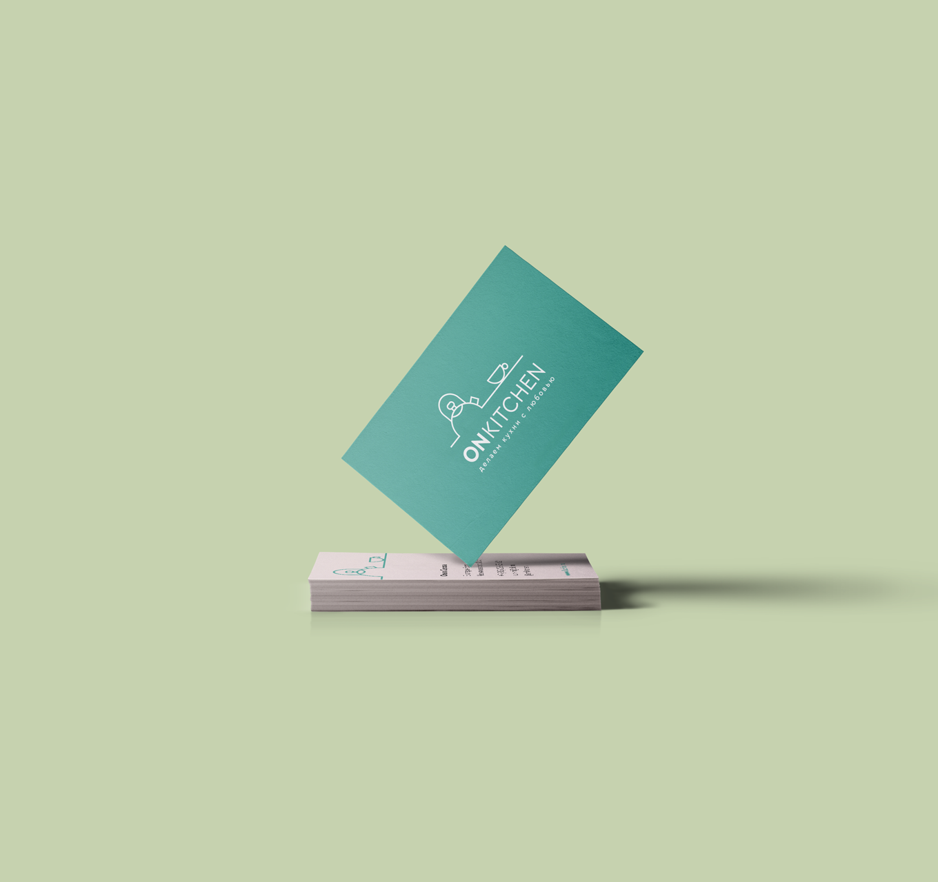
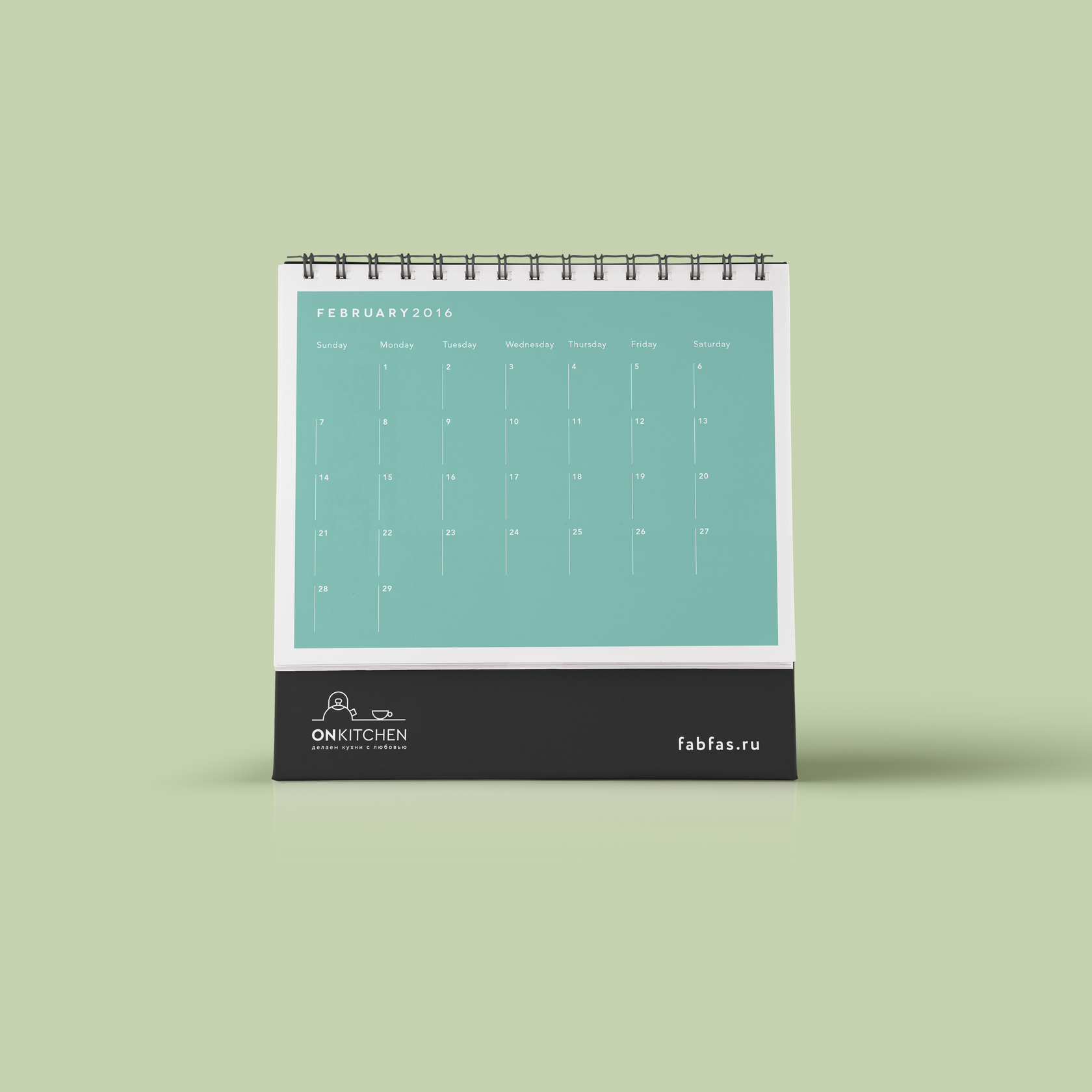
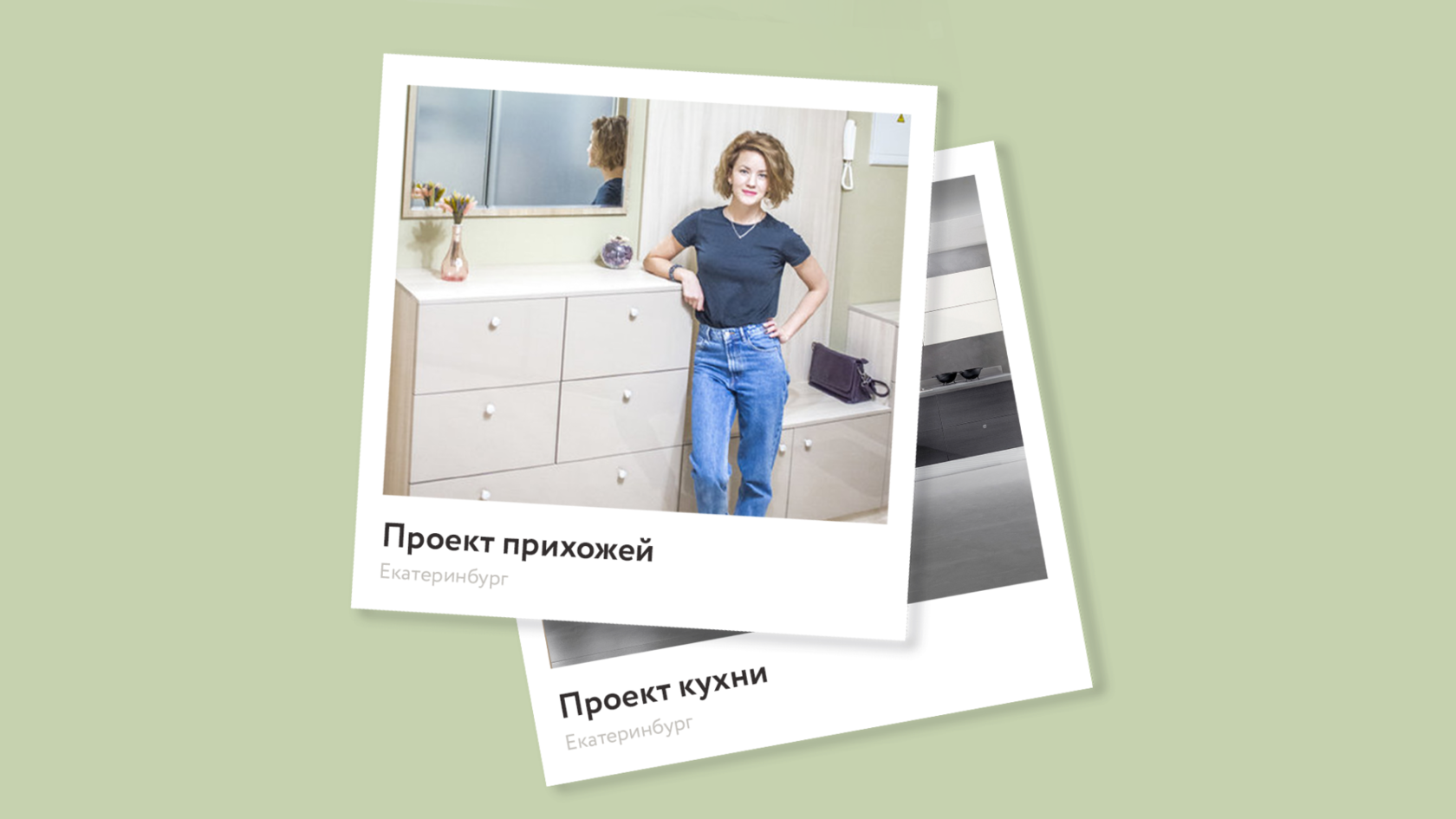
ONkitchen · Kitchen manufacture
р.
р.
Лаконичный и уютный фирменный стиль для фирмы по производству кухонь. Основное отличие — использование современных технологий, в том числе и при приёме заказа.
A concise and cozy corporate identity for a kitchen manufacturing company. The main difference is the use of modern technologies, including when accepting an order.
A concise and cozy corporate identity for a kitchen manufacturing company. The main difference is the use of modern technologies, including when accepting an order.
As a freelancer, I develop brand identities and guidelines, maintain visual consistency, and collaborate with in-house design teams.
In-house, I can act as a design lead and mentor, managing large projects from concept to production.
Lead graphic designer with 14 years of experience working with large businesses in IT, retail, logistics, and telecom. More details in СV
Hi, I'm Daria
Ural State Academy of Architecture and Art
Master's Degree in Arts
Experience
Since 2012 — present
Design Lead in SKB Kontur
Freelance designer & illustrator
Since 2012 — present
Сooperate with DPD, Sber, VTB, Lenta, Magnit, X5 Retail Group, Kontur, MTS, Rostelecom.

